Monday, 20 October 2014

Chapter 3

Ordered somke larger 100 + needle sizes and considered how to tackle this chapter.  
Always find small pieces of fabric difficult to work, particularly if its machine stitching, so considered a large piece of calico and squared it up with pencil and stitch outlines for easy viewing on both sides.  Also needed to consider the threads and colour sequences so that once I started I could get a flow.
Contemplating is probably the most important part before setting off, so STITCH
Ref 6.3.1
Simple, select
Thread, texture
Ideas, imagine
Track, turn
Coils, contrast
Handle, hazards
To get ideas for the mood of the movement in water and sky I chose words  such as: swirl, meander, ripple, choppy, lapping, ebb and flow, waves, undulating, reflections, pools and pinned them to my work board.  The calico and a variety of backings were used.
With even tension on top thread and spool, I started free machine embroidery. 
 Sample one
Ref 6.3.2 front
Row 1 selected Sulky as top thread and plain blue cotton as spool needle 70.  As sample d looked similar to c decided to unpick, but rather liked how the  'splash' loops from bobbin appeared ...so left it in place!
Row 2 change needle to 100 but kept threads and tension the same. Trying to get a rounded and wave like movement set of across the 4 squares
Ref 6.3.2 back
Row 3 change colour over to reverse sequence of top thread and spool for this series of tight and loose circles and error made on c which should have been in row 4c!,  
Row 4 using same threads needle and setting wanted to meander in various directions but left it looking open so decided to work it over with the new threads introduced in row 5 
Row 5 introduced new colour of bottom thread and worked fast and furious and the result a more gathered and condensed square.  I realised perhaps a thicker vilene would have held shape better.  Stitching in small squares was a challenge, just getting into feel of it and was over the edge!! 
Sample two
Ref 6.3.3 front
Thicker vilene placed behind calico to help prevent puckering, perhaps my stitching needs to be more controlled!Wanted to replicate the stitches in each row of Sample 1 in order to assess how the changing of tension affected the appearance of the stitch.  The idea in this sample was to loosen bottom tension and tighten top tension

Ref 6.3.3 back

Row 1 Keeping 100 needle tried a different colour combination, top tension moved up to between 8 and 10 and bottom spool tension reduced by half turn.  As I worked realised the bottom spool thread showed more as speed increased in speed of stitch - but how to control the speed of movement of fabric to get the look was becoming an issue.


Ref 6.3.4 front
Ref 6.3.4 back
Sample three was a complete disaster with trialling zig zag stitch, why does it look as though I kept doing the same thing when I was trying to improve it!!!Try as I might it kept having the same appearance and going over it again in row 4 and 5 did nothing to improve the situation!
Oh dear things were going from bad to worse in this series...
I had always enjoyed free machine embroidery but realised my forte was in larger areas. I often used zig zag stitch to cover fabric, but in most instances I colour fabric before stitching and go over the stitches in multiple directions.  The restriction of 3m squares was producing just a mess. I was trying to do different directions, speeds and tensions and it had just puckered.  Looking for an excuse decided Sample four would need to iron on a thicker vilene, but perhaps I should bring out the hoop and read back over my notes of good practise from previous DS chapters. I realised I had fallen into bad habits and had not experimented as much as I should have.  I left this sample in as a lesson with a note attached saying ...'when you are in a hole stop digging!'

Sample four from this sample on through to Sample 5 and 6 used needle 120.
Ref 6.3.5 front
Ref 6.3.5 back
So with all that in place what happened next... the puckering stopped and the result was cleaner but realised when I contrasted Sample 4 with Sample 1 there could be times when pucker was a design feature that could be useful!!  The use of thicker yarns provided more drama, and have shown back and front of samples to show contrast.  The pity of using the thicker yarn in spool is that it runs out very quickly, so did do an applique of thicker yarn that wouldn't go through the spool in Row 1 D. Thicker cotton perle, silky rope and knobbled silk threads were used in spool with thinner sulky  and cotton yarn threads.

Sample five Was a little more adventurous with yarns in this sample but had a multitude of
Ref 6.3.6 front
Ref 6.3.5 back


problems with rayon yarn that kept breaking if I tried to increase tension on top thread.  The pink perle shown in first row samples A,  B and reverse of C and again in row 5 was susceptible to distorting and run out very fast. The hand dyed string Sample 1D, sari yarn Sample 2A , 2D and 4 C were appliqued as was embroidery floss in 4C


Ref 6.3.7 front
Ref 6.3.7 back
Sample six did this sample see me coming out of the tunnel? It seemed that It produced

better images and I felt that by turning fabric over and showing contrast of back on front on one square Sample 4B and 5 A I achieved an interesting result that gave contrast of movement and colour.


Ref 6.3.8
My critique on this chapter would be that the series looked a bit repetitive and while I noted how I had done the stitch the variations were not always that visible.   I feel that a larger square would allow more experimentation and was happy to see in Chapter 5 we can have 10cms squares

Monday, 6 October 2014

Chapter 2 Designing with shapes and layers

Focusing on the colour palette  selected photos and coloured papers to bring life into the shapes that I would sketch.

These images above from Chapter 1 gave some key highlights of double split complimentary colours taken from 'Colorworks' with the possibility a half clockwise twist of the wheel.


Ref 6.2.1
Ref 6.2.1 and 1a  are taken from Image 2 in Chapter 1 and shows the use of a scrunched acrylic glazed paper as the top image and a base paper of dyed paper using brusho and tissue paper and a handmade paper coloured with acrylic veined print.
Image shows 6.2.1b the two sequences perhaps going through the depths of the water. 


Ref 6.2.1a
Image 6.2.1c shows the two images  photo copied and then cut again - despite gluing papers together I found that small pieces dropped off so photocopying seemed a solution even though the colour was not as per original.


Ref 6.2.1c


Ref 6.2.2 shows the image 4 from Chapter 1. Interpreted in 6.2.2a with a top layer of scrunched acrylic glaze paper placed on tissue paper and sponge printed paper before cutting them up I wanted to record the three papers used to replicate the sketch, shown sideways - had used the line to run through the photo taking the cloud shape down into its shadow in the water rather than breaking it up with landscape.
Ref 6.2.2b
Ref 6.2.2a
Continuing on with images and interpreted shape image 6.2.2b shows the result

Ref 6.2.3
Ref 6.2.3a
Ref 6.2.3 and 6.2.3a shows image  3 from Chapter 1. In these interpretations I wanted to get warmer colours into the palette. I choose a yellow abaca paper stuck to an acrylic painted card, another crunch acrylic painted newspaper and a printed and scratched sketch book paper. Again examining the positive negative images of my sketch. The designs seen in 6.2.3a provided material for cutting and developing new shapes. 6.2.3b showing each sequence separately before turning some pieces upside down and running the two colour sequences together in 6.2.3c
Ref 6.2.3b
Ref 6.2.3c


Image 6.2.3d shows the two sequences cut into shapes and place on a new background- the one used to show bleach effects in chapter 1


Ref 6.2.3d

Ref 6.2.4
Ref 6.2.4a
Ref 6.2.4 and Ref 6.2.4a shows the header image to this module and the papers and in 6.2.4b the shapes.  Keeping this sketch and colouring simple I used a rather random energetic painting technique on magazine paper, I also place pieces of tissue on the wet surface to add texture.  The two yellow papers were, a printed and coloured copy of a limestone wall that was uncovered in a local hall and a printed paper made from a lace edging!
Ref 6.2.4c
Ref 6.2.4b
The two sequences were combined in 6.2.4c but kept within their own group.  Now was the time to interchange the shapes and combine the various colour sequences, Ref 6.2.4.d.  As I played I rather liked changing it to its side and then I tried a gimp adaption.


Ref 6.2.4d
Side view 6.2.4d

 Ref 6.2.4.d.Gimp variation on a theme


Chapter 1 Drawing Methods

Surrounding myself with drawing implements and ideas of colour for this chapter I also collected together various papers on which to trial drawn marks that complemented the photos. 
Ref 6.1 colours

Drawing implements: pastels, oil pastels, biro felt tip pens, pencils, charcoal, a rubber, coloured inks and ink pads, bleach, stiletto, sticks, sponge
Papers: watercolour board, Copy paper 70g, sugar paper, greaseproof paper and sketch pad paper 135g, acetate, bubble wrap, food wrap.  
Trying to relate marks to textures and patterns in photos  I made two L shaped frames that I moved around the photos to look at detail as well as the whole picture. 
Image 1 The reflections from the shore in Ullapool. 

Ref 6.1.1
Ref 6.1.1a
First tentative steps with felt tip pens.. a bit feeble, top right in 6.1.2 achieved best result of the three options as it was on textured watercolour board that diffused the lines.  The oil pastel and soft pastel on grey sugar paper gave a pleasing effect but enjoyed tearing of a strip of watercolour paper and using it to build up lines of oil pastel on greaseproof paper. Before experimenting with other implements decided to look at next four photos using same implements
Image 2 Turkish water over a stone
Ref 6.1.2
Ref 6.1.2a
Ref 6.1.2b

 Think the must successful interpretations are the one on left of 6.1.2a using  fine felt tip on plain photocopy paper that takes it inspiration from small ripple and then the same effect being worked over with pastels on the bottom right. I also enjoyed the bottom image highlighted in detail on 6.1.2b where I changed the angle of the pastel to achieve a sweep and then a detailed 'stitch'.  In this instance the top image on watercolour paper didn't capture the mood of the water over the large stones

Image 3 The Skye Bridge at sunset
Ref 6.1.3
Ref 6.1.3a
Using just pastels on the strip of samples below the photo in 6.1.3a I started with greaseproof paper on the left - an interesting oily effect on one side of the paper and dull on the other, pastels on sugar paper  and then watercolour paper and copy paper, with  pencil marks on copy paper to the right of the picture
Image 4 Storm clouds rising in Turkey
Ref 6.1.4
Ref 6.1.4a
Concentrating on the power of the cloud 6.1.4a shows top drawn image using side of a pencil which was then replicated below with a pastel over which I used small square silver stamp pads which I swept over the pastel. The swirling oil pastel which looked for a similar effect on watercolour paper was then scratched with the top of the pencil with a small stroked pastel used on the sugar paper.  The image on the left  used the edge of a paper  gradually moved down the paper to reveal unworked areas of paper.
For the next series of photos I decided to try heavier markings of crayon to explore the techniques of sgrafitto (scratching) and frottage - rubbing.
Image 5 Reflections Loch Fyne

Ref 6.1.5
Before using a stiletto to etch the sketch used the combinations of contrasting  oil pastels on watercolour paper, then using same paper with felt tipped pens over rubbed with oil pastels  and then on copy paper watercolour pencils over rubbed with oil pastels produced some textured effects but the photos don't seem to reflect the potential.  A reminder to self when using felt tip pens as under layer leave some paper uncovered for reflection as getting through to bare paper with stiletto was extremely hard! The final piece ,which was march larger when started, used just one colour of oil pastel on coloured sugar paper .  Using different pressure to make the mark I then scratched a shoreline!
Ref 6.1.6a
Ref 6.1.6
Image 6 Silhouettes off Oban, for this sample decided to concentrate on the sky colours for my experiment, building up layers of oil and watercolour pastels and washing with ink pad. As I worked pencils into the surface their scratches left a marks, hardly noticeable in photos they gave an impression of long stitch marks. Pleasing but not as dynamic as Sian's samples, perhaps I should try some frottage. Taking the silhouette of the hills and the sky a string sample card was made on which I then proceeded to rub pencils and pastels across the surface. The most successful being the pencil as I liked the way the colours defined strokes but also merged, the pastel looked a bit messy. The turquoise ink stamp rub with top layer of pencil was more dramatic but less detailed.
Image 7 Shoreline looking to AnTellach.  
Ref 6.1.7
Ref 6.1.7a
For this sample I had done an ink and oil pastel 'sketch' which I had scored but rather unsuccessfully ( see top left of 6.1.7a) and decided to us a plastic embossed stamp that I had in my store cupboard, it captured water marks but how would it look?  With copy paper, a candle,  and various inks, oil pastels to hand placed copy paper over the plastic and rubbed a candle over the paper. The first rubbing, left under the photo, looked more like pebbles than ripples so more energy was put into the rubbing and then oil pastel and ink laid over the rubbing. As  a contrast I inked the plastic stamp and then pressed it onto the paper (bottom of storyboard)... it does look more manufactured.  The rubbed sample has an impression of authenticity and is much more tactile! A candle will now be a permanent implement in my art box.
Ref 6.1.8
Trialling bleach marks my first attempt on watercolour paper was singularly unsuccessful with no impact being made, except a bleeding of colour when using a cotton bud.  But success with brusho coloured copy paper, a thin cardboard edge dipped in bleach produced not only clear patterns but a revelation of a range of contrast tonal colours.  Note for a later date to go in my dyeing book, examine the colour contrast within the brusho range of inks and bleach...


Ref 6.1.9

Looking at other 'papers' for drawing onto the concept of bubble wrap offered something I hadn't done before. Setting off with a green, light and dark blue oil pastel the fun began - bubble side up! Rubbing produced interesting colour mixes but also drew round the  'bubbles' to emphasise the shape.  Then turned paper over and rubbed the surface onto copy paper, not only the addictive sound of popping bubbles but a pleasing sequence, 6.1.9.


Ref 6.1.10
Ref 6.1.11
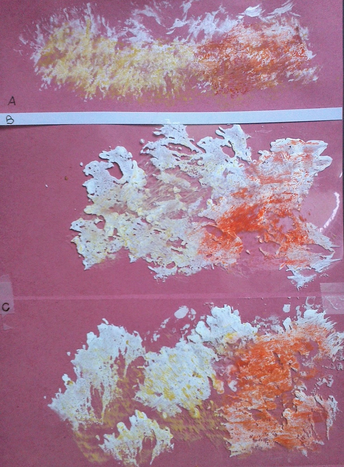
 Using acetate from overhead projection slide tried sponging emulsion using both sides of the sheet and also cutting a stencil in image 11. The bottom image of each of these images was sponged on rough side of acetate, the top image was sponged and printed from acetate onto paper.  I enjoyed the stencil in image 11 and felt that adding oil pastel to edge allowed me to imitate stitch marks.

I had emulsioned a child's cardboard book to give different surfaces and the resultant oil pastel rubbed surfaces are shown below, 6.1.11, a,b and c.


With all this rubbing I had lots of  'crayon crumbs'  and crayons that needed cleaning off as they had traces of other colours on them, so placed them on polythene wrap and included some threads and pressed them into a sandwich! 6.1.12 .