 |
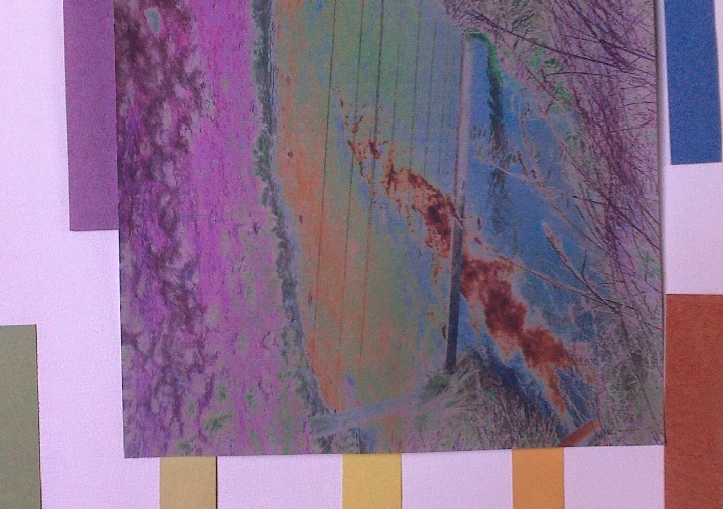
| Ref 6.9.1 |
 |
| Ref 6.9.2 |
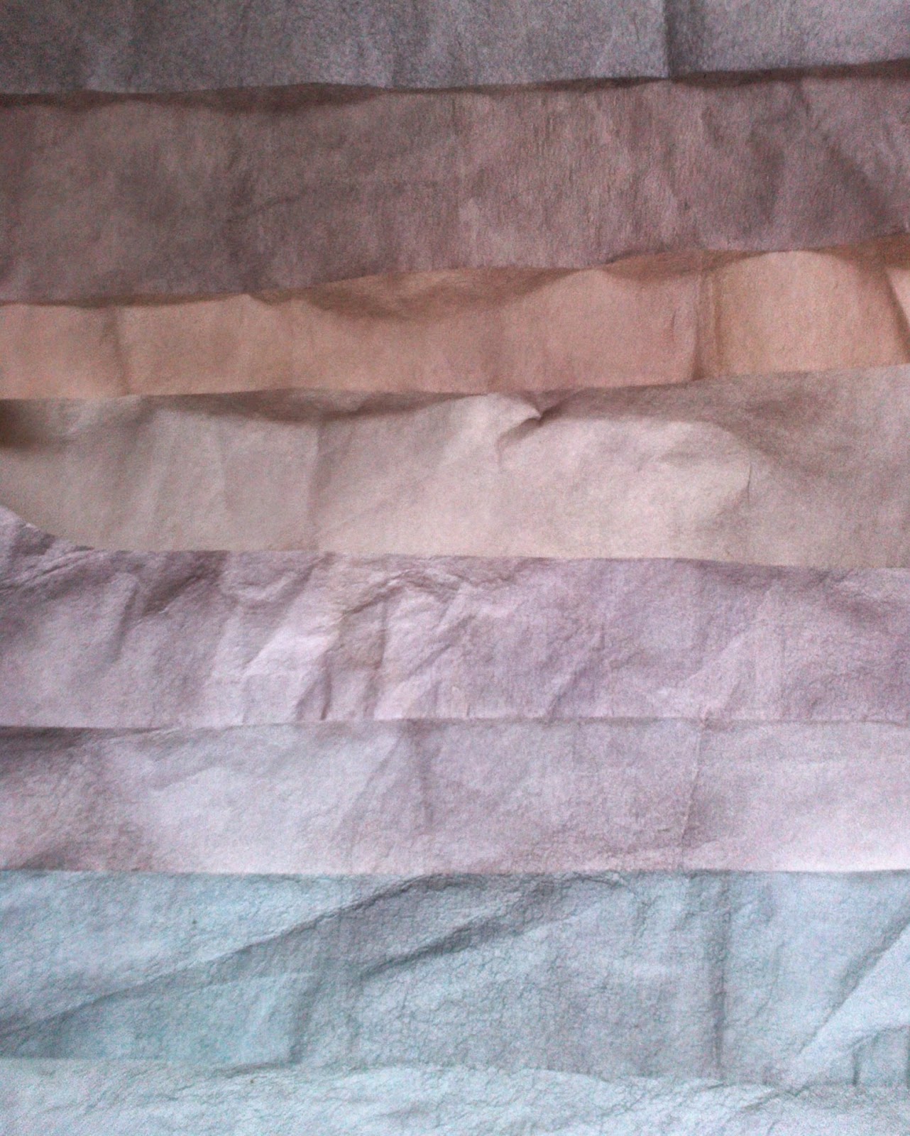
Working through Chapter 8 the following key colours in 6.9.1 were selected to make into A3 papers. While the colours on right, 6.9.2 were perhaps more reflective of the landscape in December felt I should try to introduce a bit more colour. Perhaps the balance between bright and muted will vary as I move along but wanted to give myself the option of bright tones. Using brusho inks I set out four themes of colours, purple through crimson to scarlet, blue through to turquoise, lemon through yellow to brown and greens. Not all papers were included as I seem to have made rather a lot!!! At the same time I collected various papers from previous modules that could give spots of interest.
 |
| Ref 6.9.3 a,b,c,d |
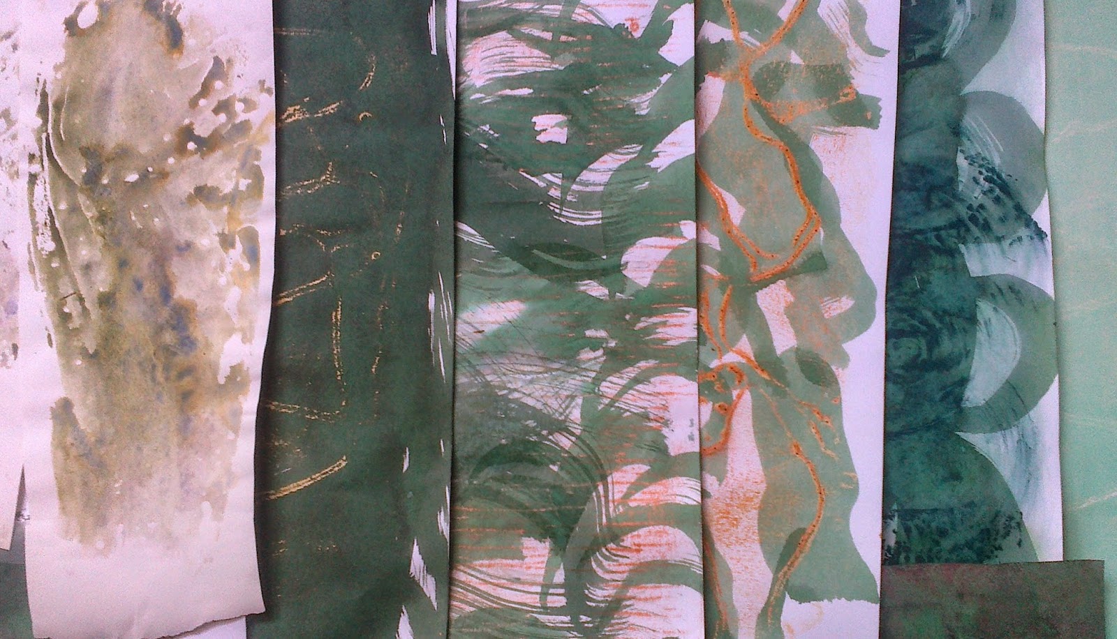
 I selected three images to inspire my cutting, tearing and layering:
 |
| Ref 6.9.4a |
 |
| Ref 6.9.4b |
 |
| Ref.6.9.4d |
 |
| Ref 6.9.4c |
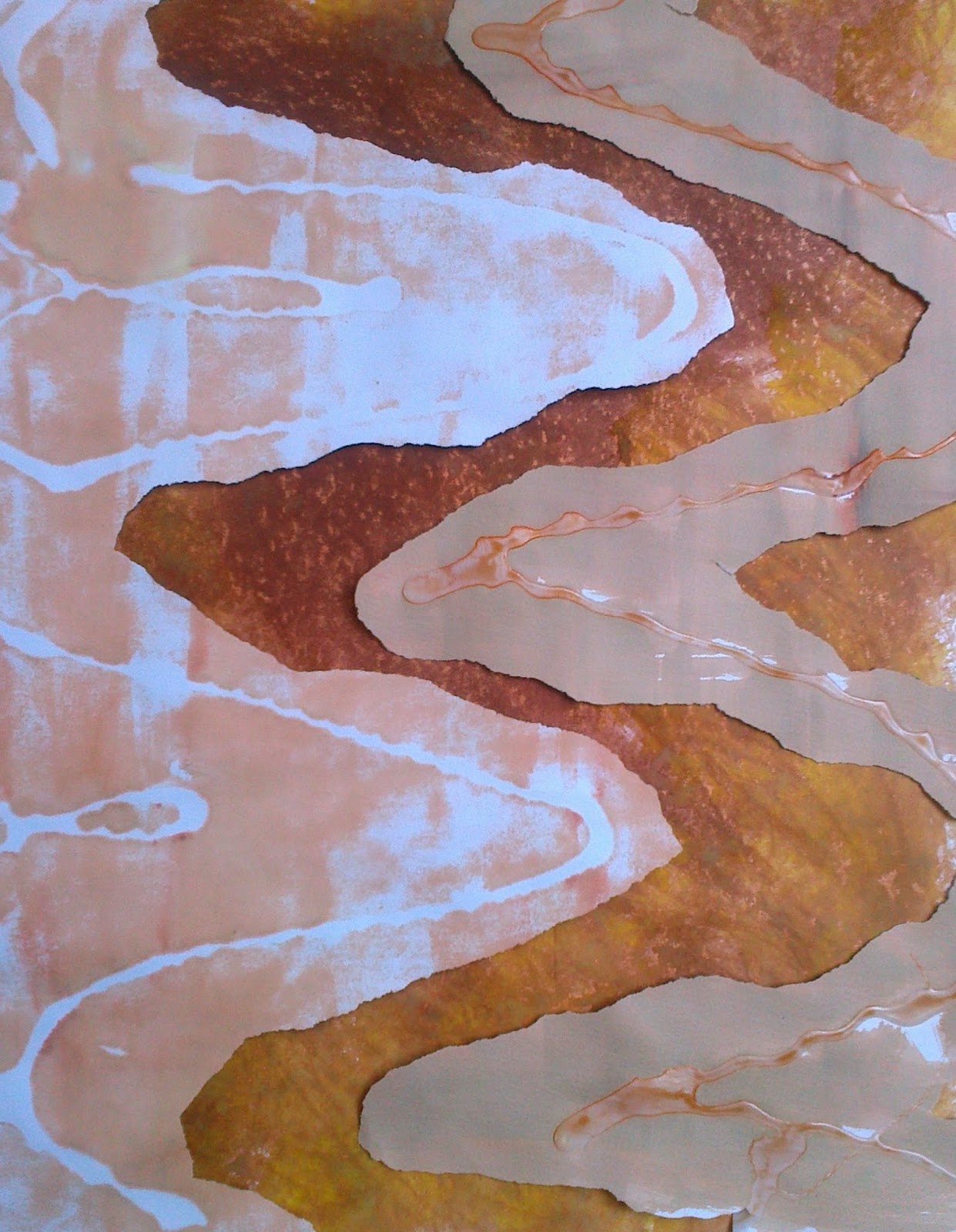
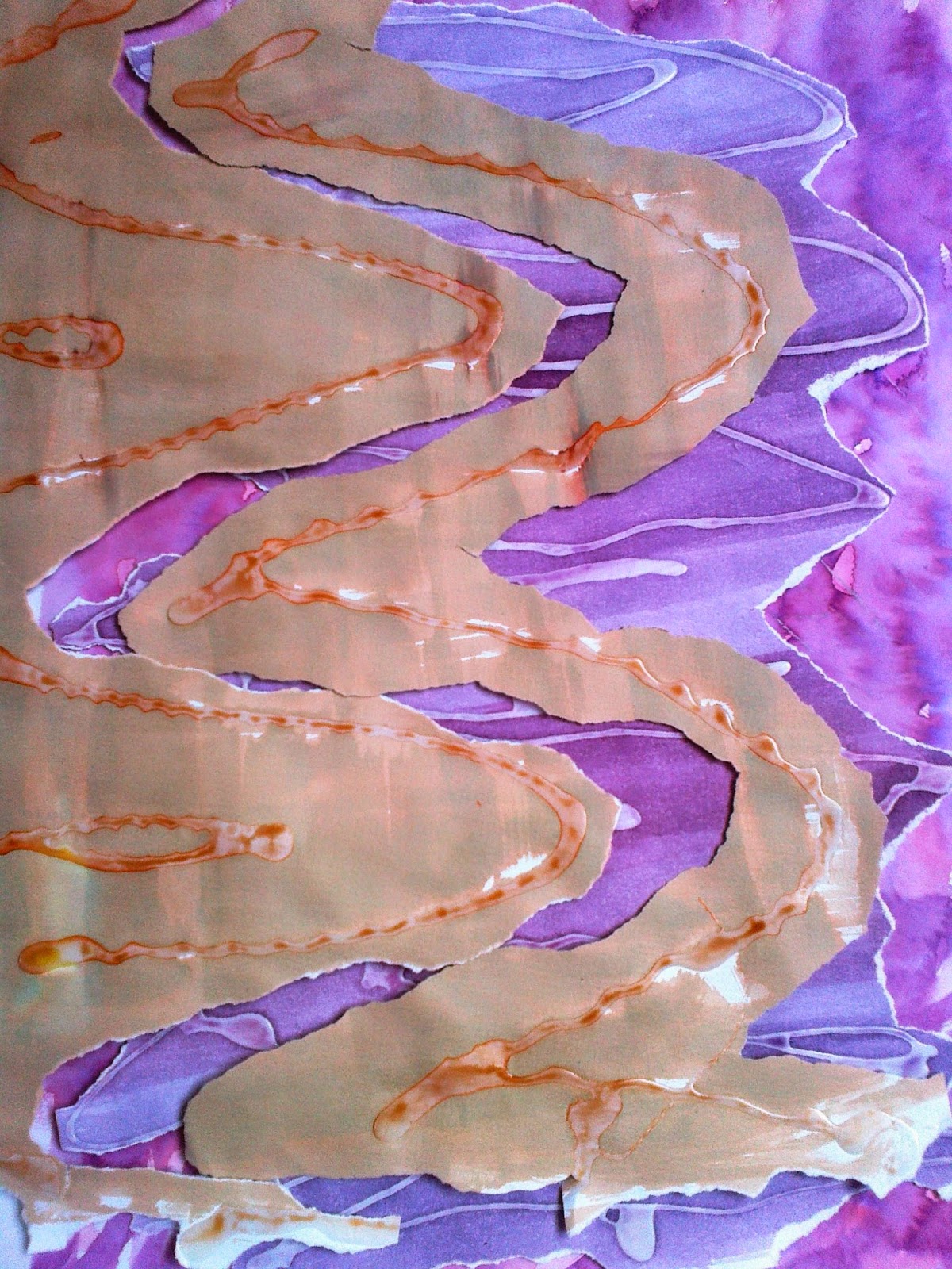
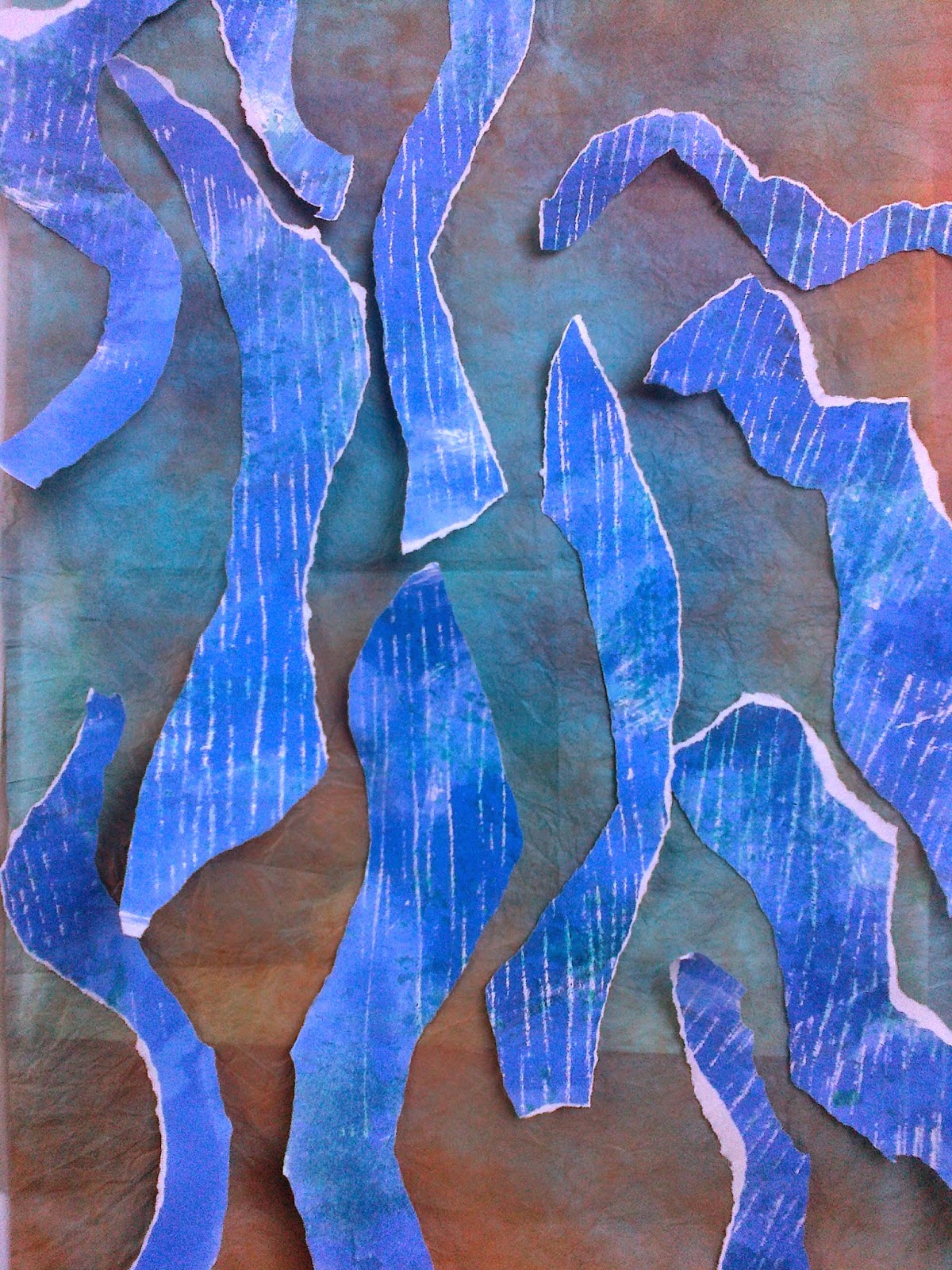
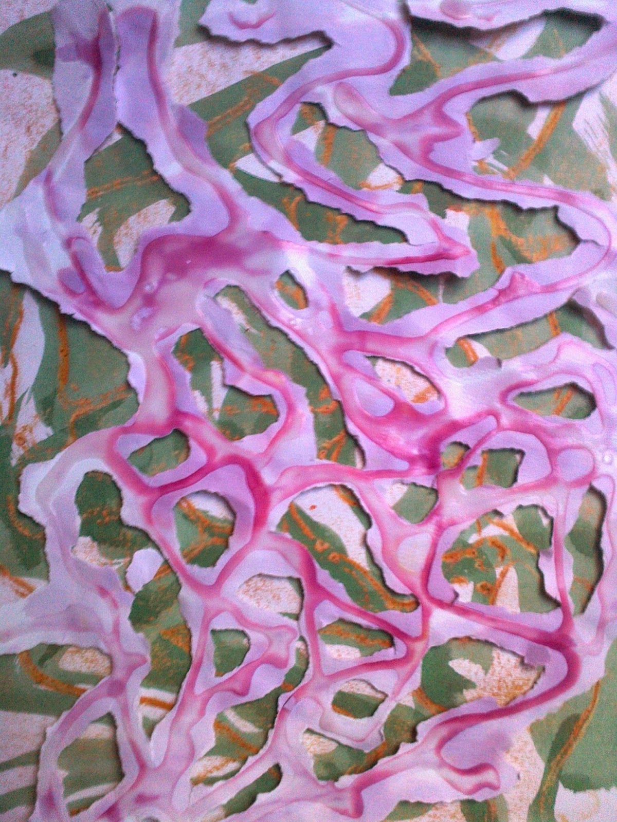
Meander was the first: Tried to look at the range of colours and combinations but to also make the meanders a little bit more meandering! In image 4 a have reversed the papers to give more tone to the colour -the top paper had use PVA glue to give a resist before using a brusho wash. Note to self when using brusho: a)don't overwork the brusho colour as it has the capacity to fill in and expand! b) wonderful bleed effect if you mix two colours together before placing on paper.
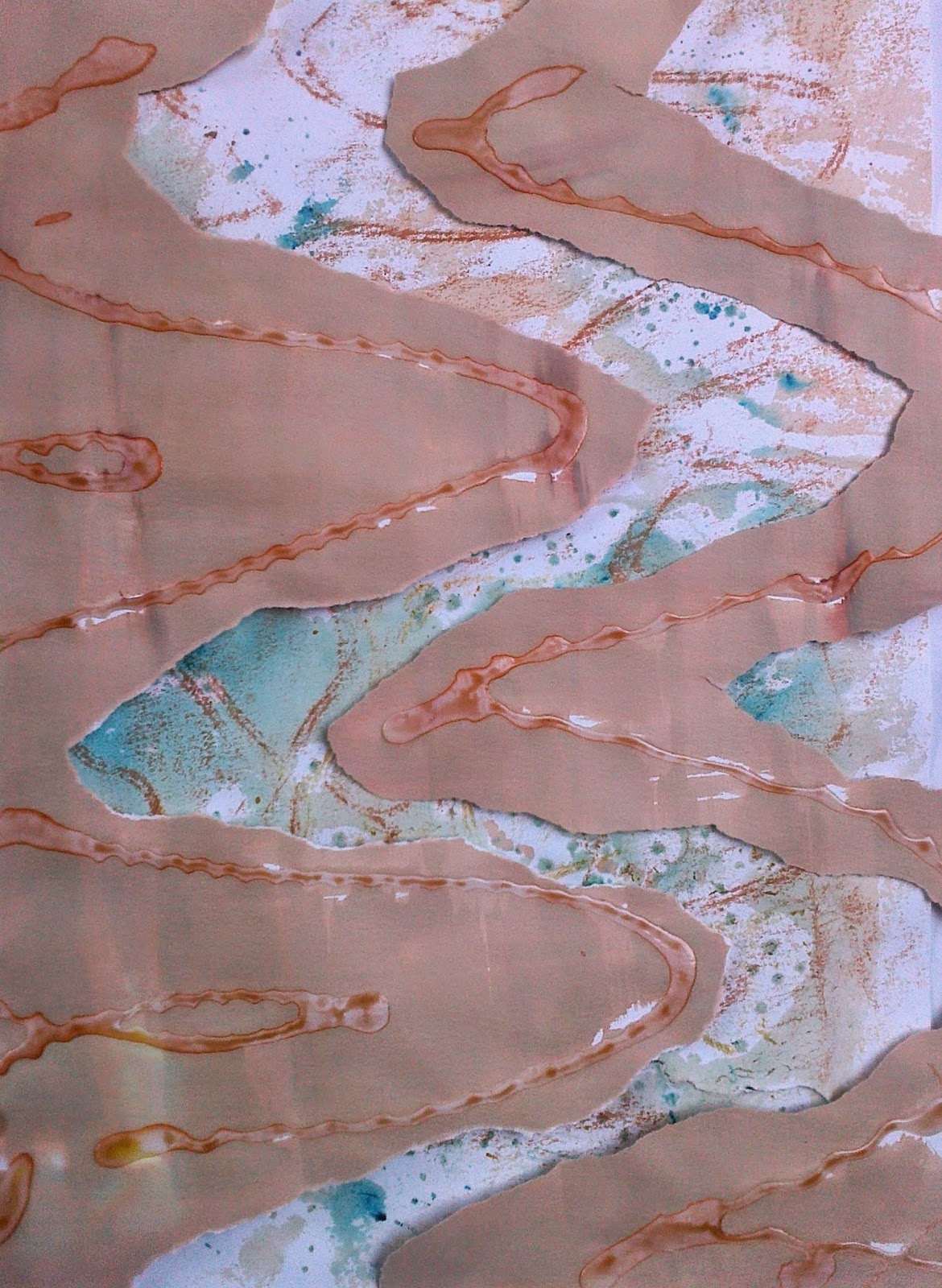
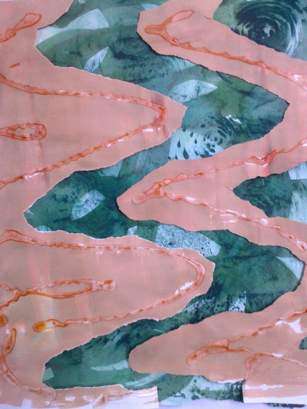
The lower paper had used a candle resist before brusho colouring. Image 4b uses 3 papers the top two using acrylic resist - with brusho and acrylic paints on layer 1 and 2. The bottom paper a silver crayon was rubbed over a texture wallpaper and then brusho painted Image 4c shows sponge effect with brusho. Image 4 c shows gold rubbed over an acrylic pattern where the paper was a second print from c.
 |
| Ref 6.9.5a |
 |
| Ref 6.9.5b |
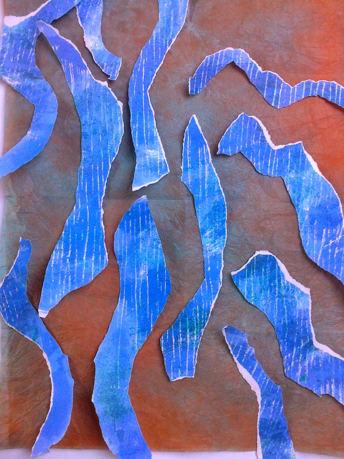
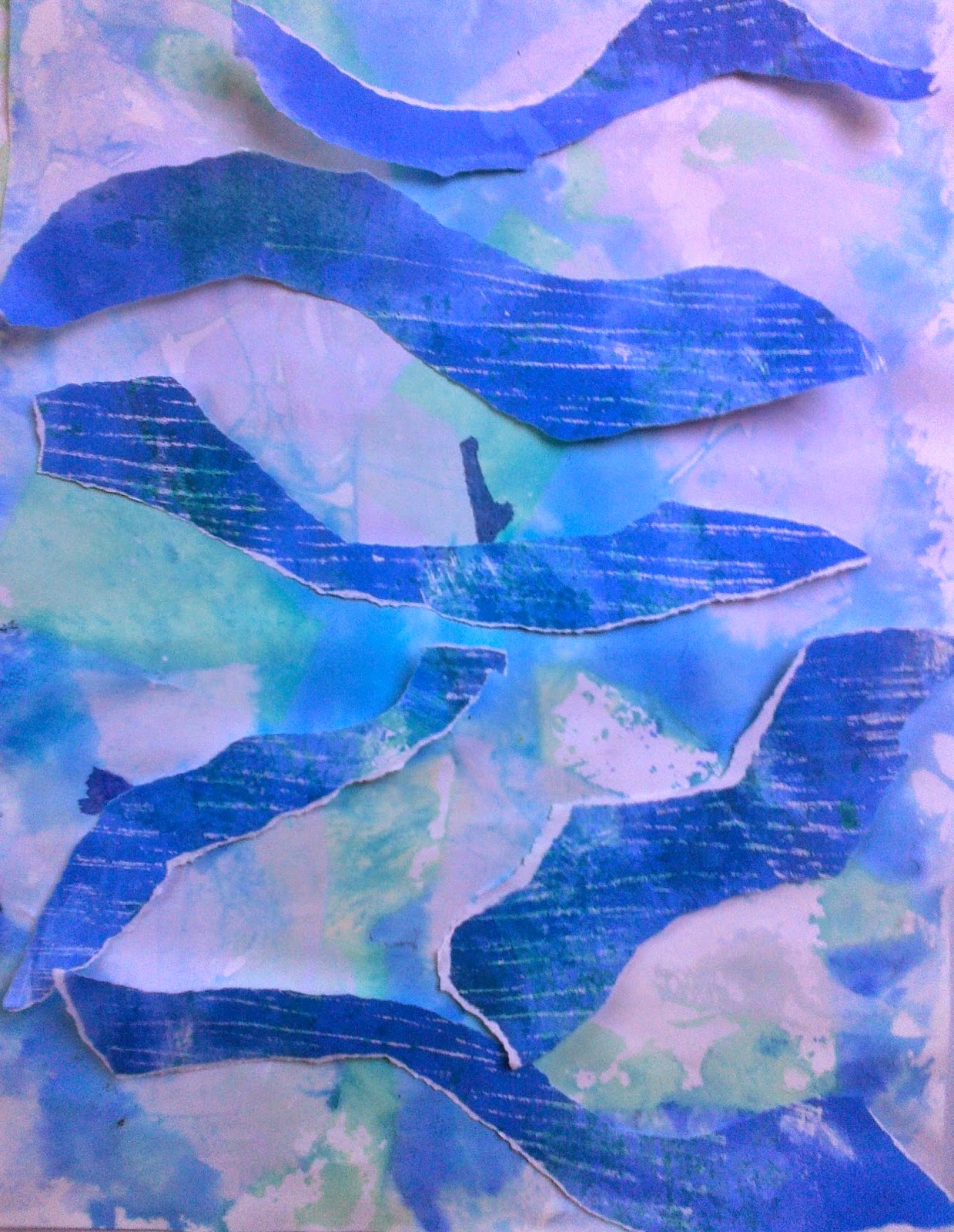
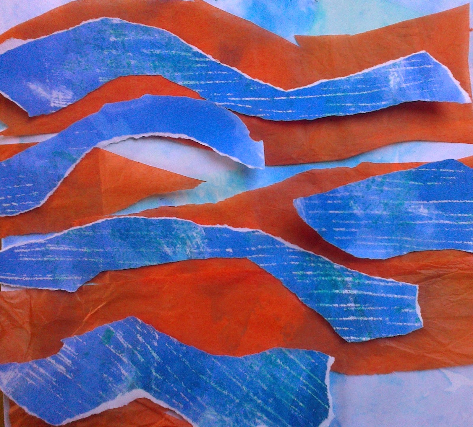
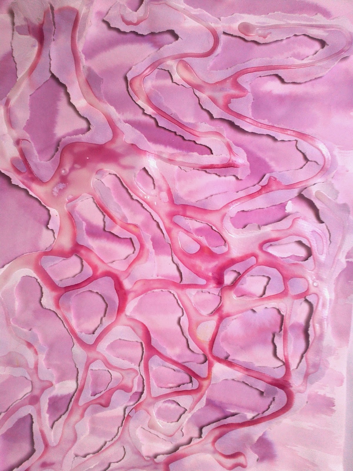
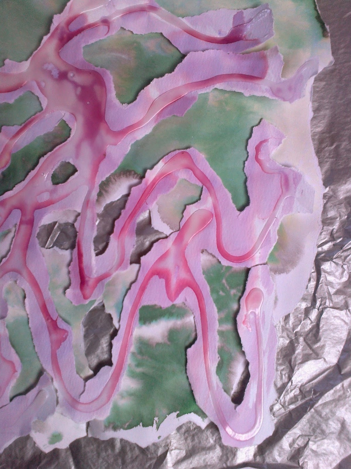
The next series meanders over three layers of changing backgrounds. Image 6.9.5a is an orange layer over tissue under a layer of blue and orange abaca paper topped with strips of blue brusho paint over silver rubbed paper, image 6.9.5b the bottom layer is blue under the same abaca paper. Image 6.9.5c are the same strips but placed over a brusho washed paper that was saturated and then 'dyed' with pieces of tissue paper that was peeled off when dry. For image 6.9.5d orange tissue was placed under waves.
 |
| Ref 6.9.5c |
 |
| Ref 6.9.5d |
 For sample 2 cross currents had taken on a new life:
 |
| Ref 6.9.6a |
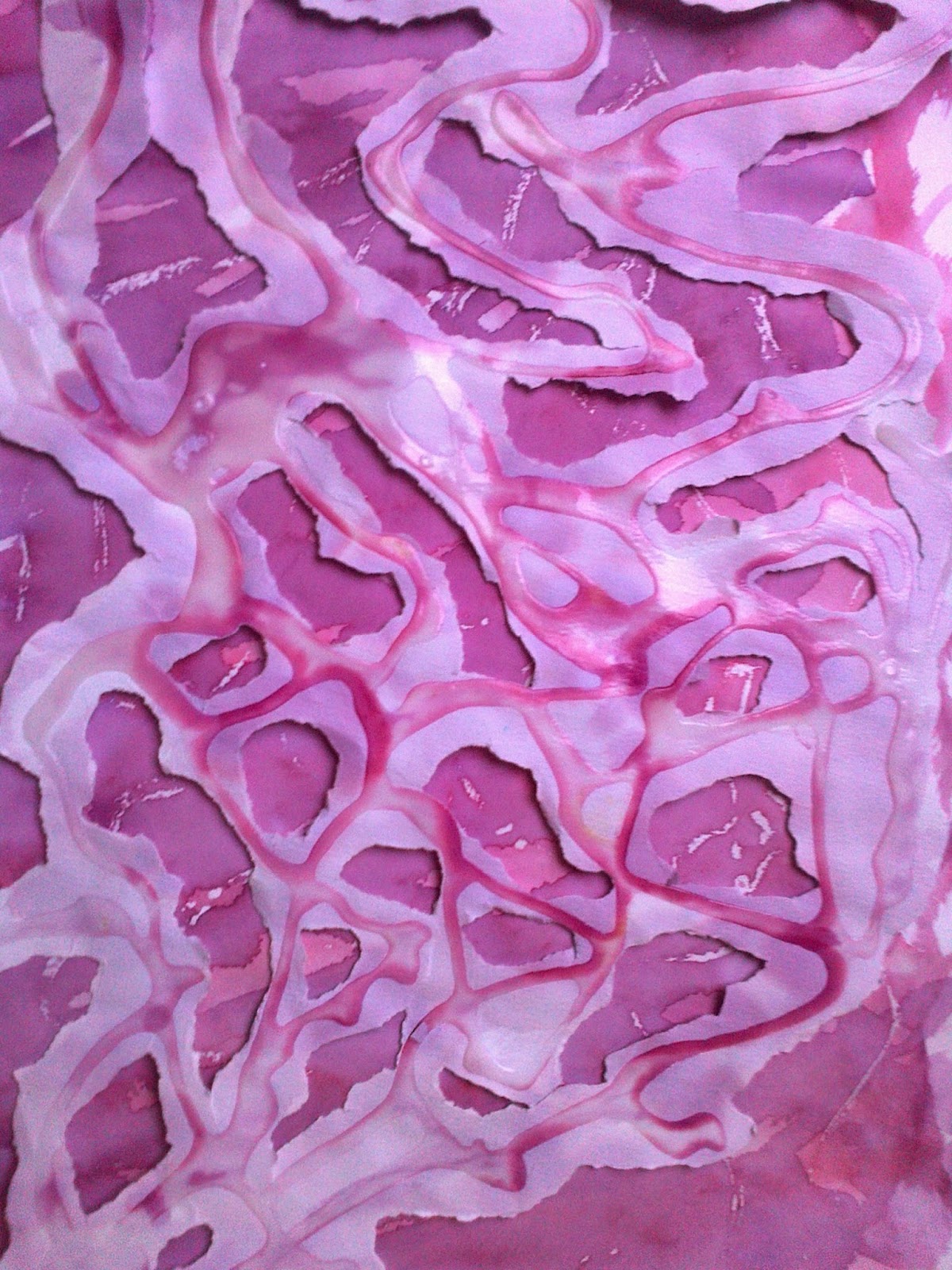
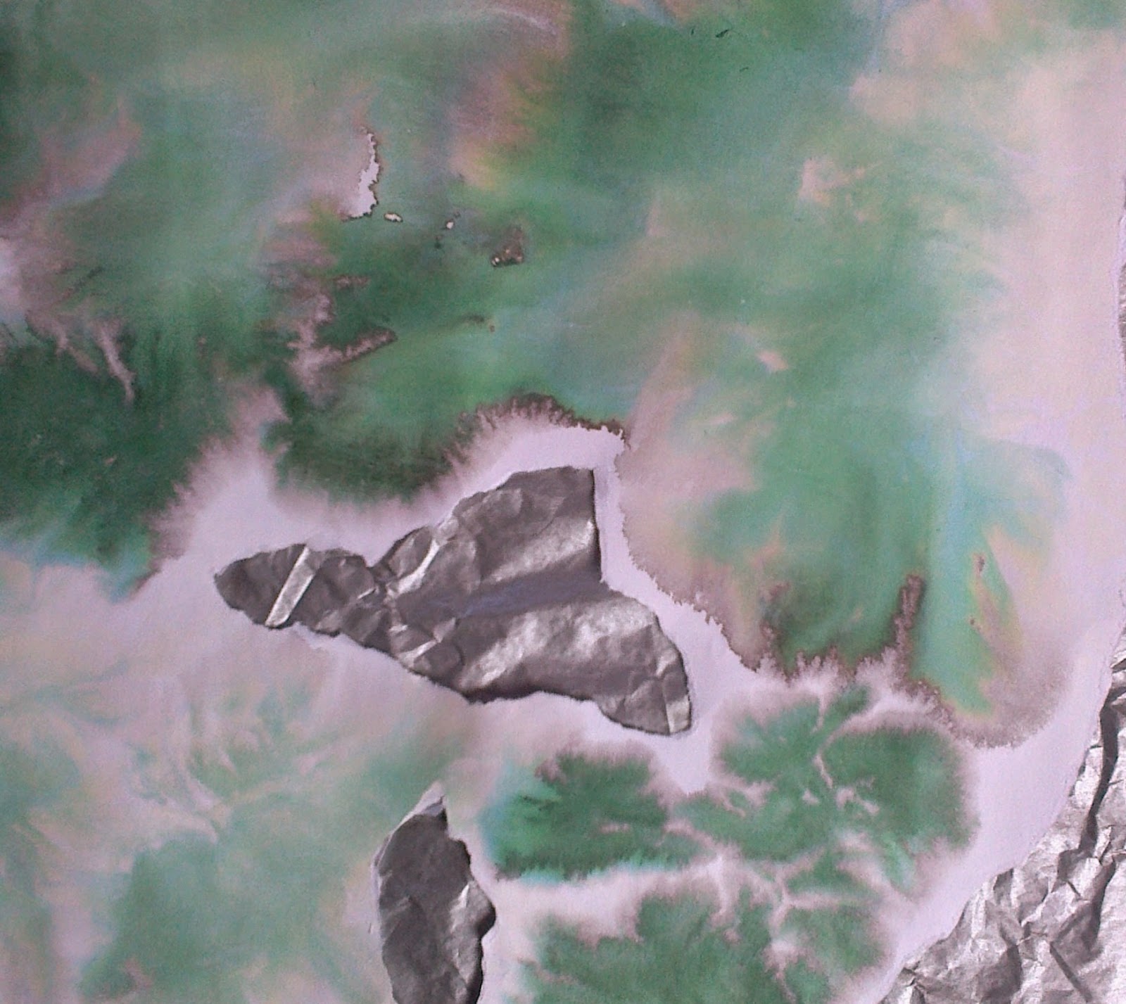
As the original sketch could be conceived as too close to meandering chose a more random design where I concentrated on the 'holes'. For sample 6.9.6a the top layer of PVA resist was cut and torn and placed over the lower layer of brusho painted over a silver wax resist.
For sample 6.9.6b the bottom layer was rubbed over the original top layer paper of PVA resist with a gold wax crayon. When tearing the top PVA layer resist it was apparent that another note to self was consider how this would translate into fabric and stitch? Layering was going to be an important in the finished piece and was beginning to see that three separate but sometimes touching or alternating layers would need floating threads would play an important part in maintaining some sense of fluidity but also support. It was also important that texture as well as colour would be seen on the bottom, revealed layer. samples 6c and 6d were about showing the contrast and tone.
 |
| Ref 6.9.6b |
 |
| Ref 6.9.6c |
 |
| Ref 6.9.6d |
 |
| Ref 6.9.6 d(i) |
For d I have shown the 'bleed' that I like so much when using brusho and wondered on how this could relate in fray or stitch?
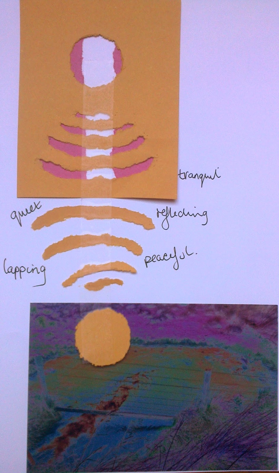
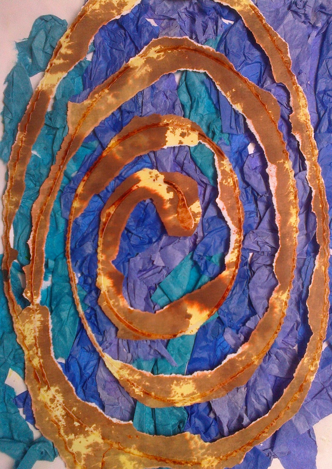
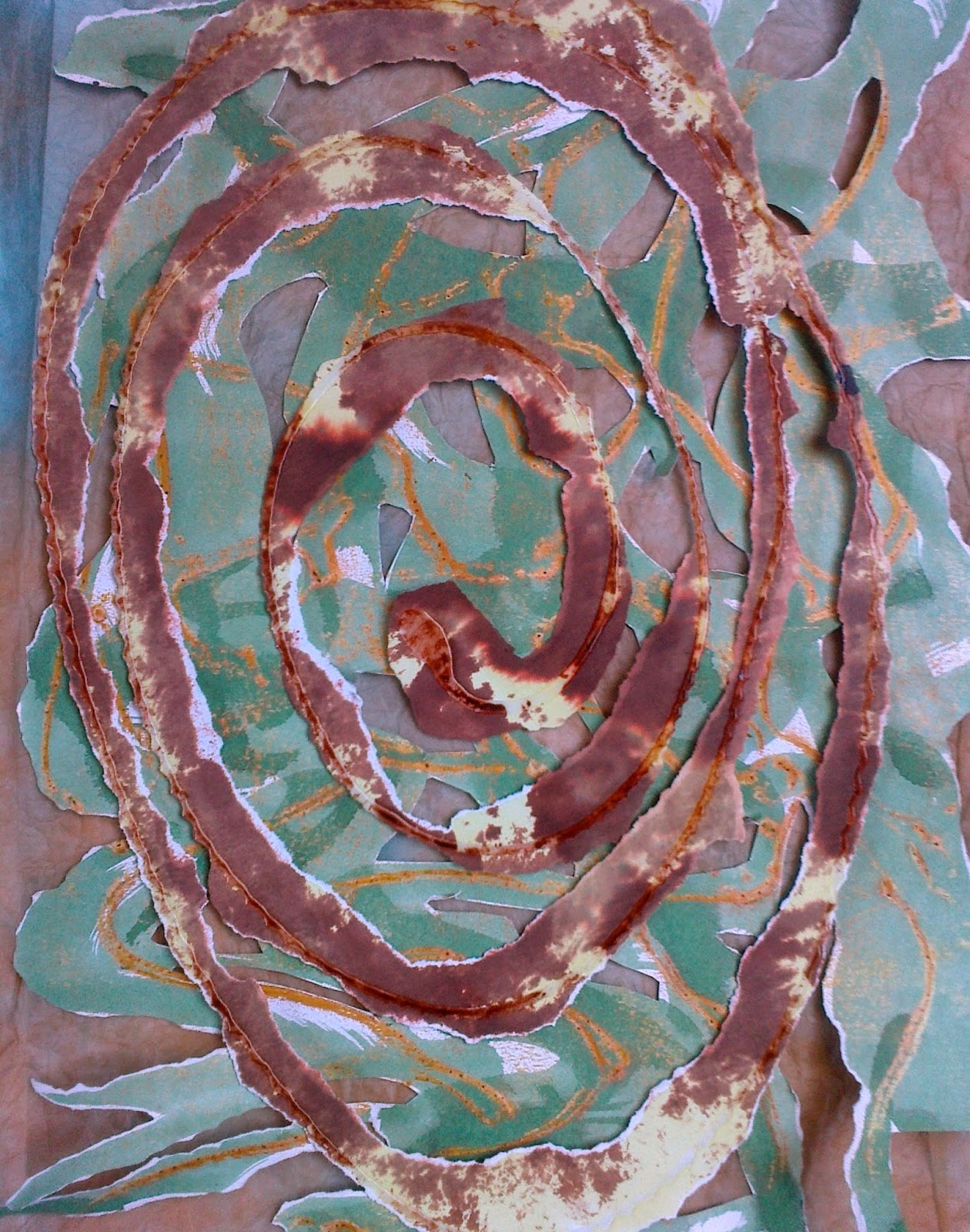
 For the third image, reflection and rhythmic were in my mind...is this cheating! I wanted it as much for holding in mind as a sense of place as much as an image. So my answer to combining was to elongate or distort the perfect circle. The issue of light in the finished piece would need much thought not least because it would effect the palette across the piece but in the meantime on with the tearing...
 |
Ref 6.9.7a
|
 |
| Ref 6.9.7b |
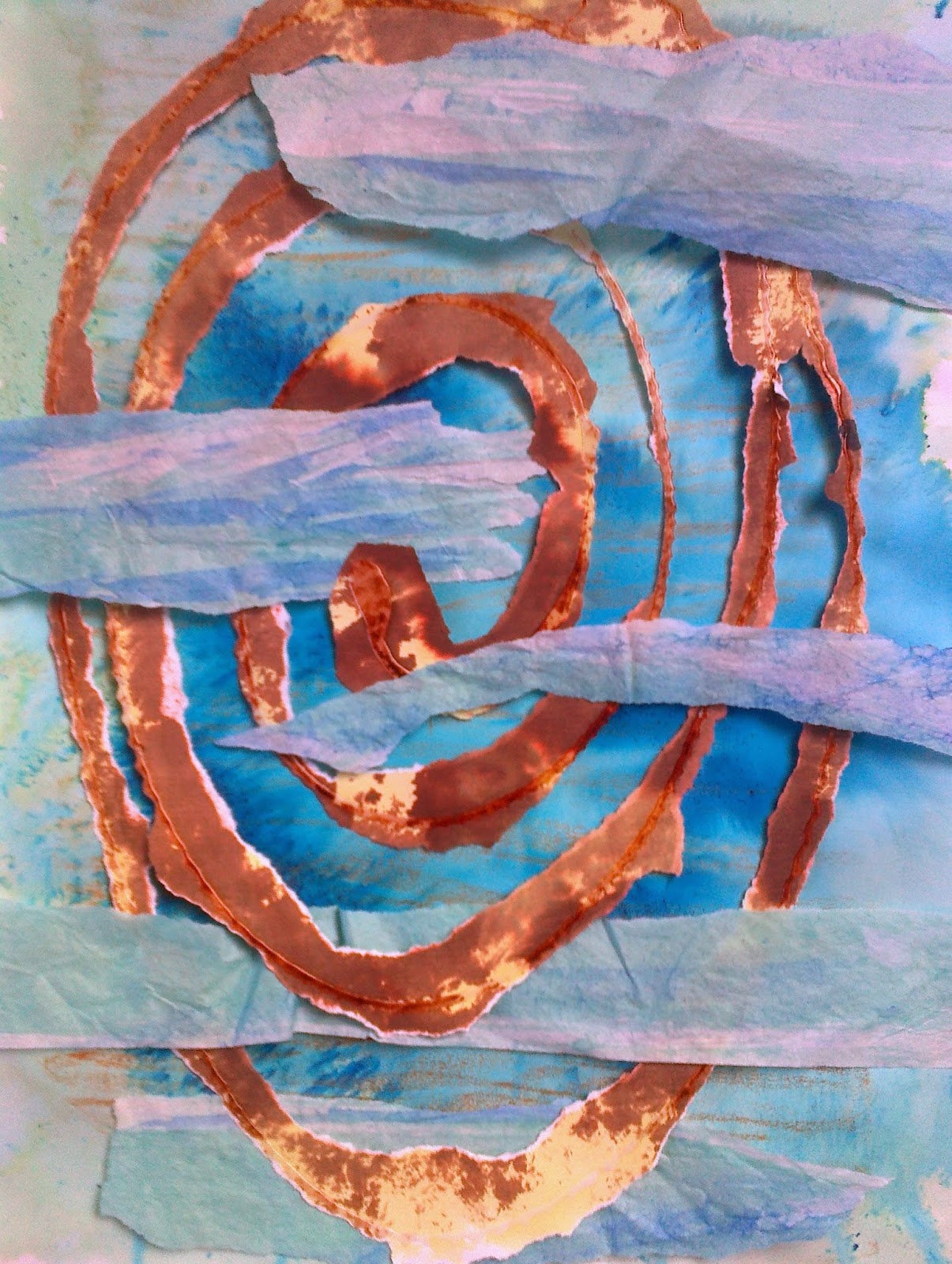
Image 7 shows the same paper using PVA on the top image and wax rub on the bottom as in earlier samples. In 7b the inclusion of tissue that was pleated dyed and opened was included.
 |
| Ref 6.9.7c |
 |
| Ref 6.9.7e |
 |
| Ref 6.9.7d |
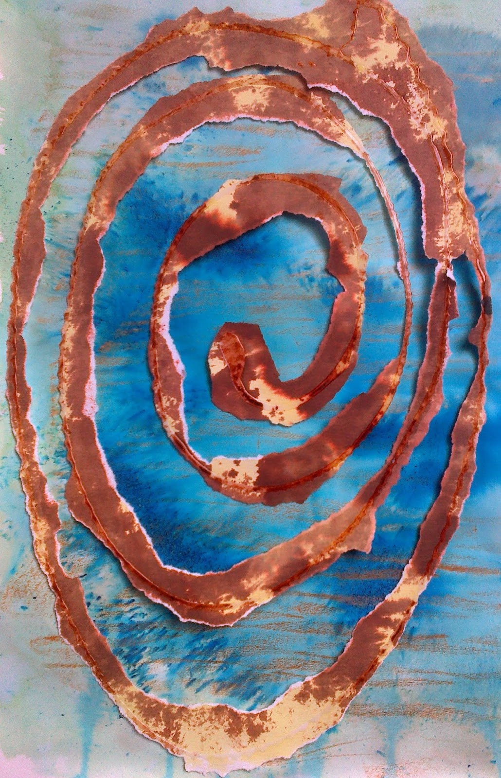
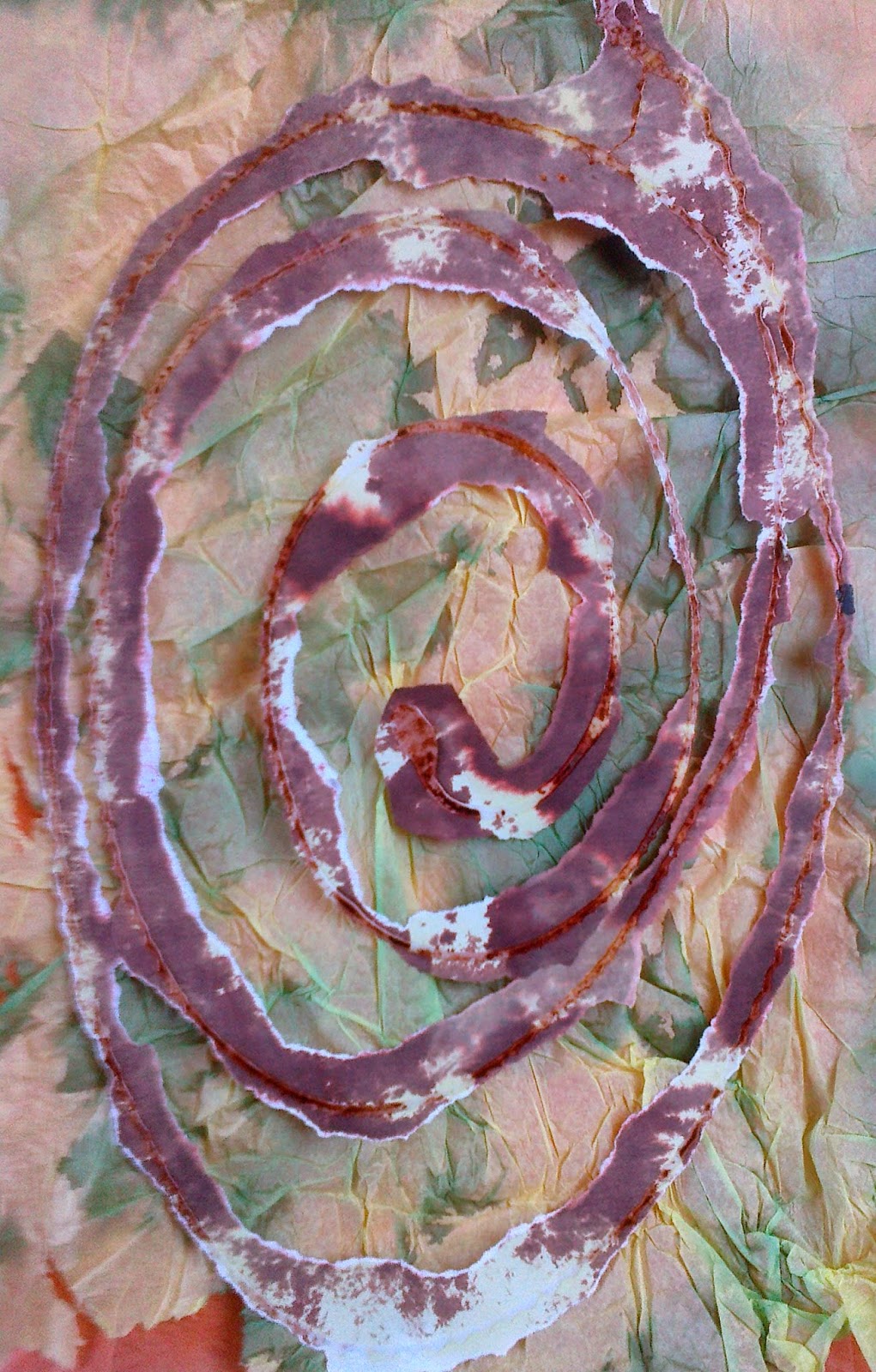
For the remaining three images I feel that the swirl should be more diffused, as in b, and was beginning to see that the swirl would be best used as a raised shape or texture rather than a predominant colour feature.
As this was happening tried to put some thought of the practicalities of making the final piece so took a pause to look back over the chapters to get a feeling for how to proceed to Chapter 10. It was difficult not to be too prescriptive but as I had so many ideas realised I need to simplify design ideas and concentrate on the essential nature I was trying to portray. The five words to the module after Conservation were shape, colour and now I needed to concentrate on texture, line and form as well as my conservation theme diversity. My thoughts on the final sample had drawn me to an idea of using three panels on a 1:2:3 ratio and while the image below doesn't show that it is something for my work board that says, 'keep it simple but moving across the piece'.
 |
| Ref 6.9.8 |


