Ref 4.2.1
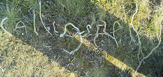
 Thank you Sian for your close up from my image in Chapter 1 and allowing it in as my first design for this chapter.
 An evening walk in the hills of Glenbuchat inspired the word I would use for my lettering designs, calligraphy. Ref 4.2.2
Before getting into my designs I forgot to put an image into Chapter 1 of the Arbroath Declaration. I went to Arbroath to research Mike's relatives and saw this on display in Arbroath Abbey. It is an impressive document not only for the historic significance and lettering but the wonderful seals at the bottom . I have some sealing wax somewhere and feel in later chapters...once I find it, that it may appear in some format! Ref 4.2.3
 |
| Ref 4.2.4.a |
DRAWING METHODS See left some additional drawing utensils Ref 4.2.4 to the conventional ones shown in Chapter 1.
Using positive and negative version of the word calligraphy both diagrams 4.2.4a and b show from top line A. a glass nib, B. a quill pen, cut from a feather, C. a cotton bud, for D , E, and G. edge of card , F. cut edges of card. On the left my father's blotter. While the quill, my first attempt at cutting a 'nib', gave a spluttery start I rather liked the randomness but will have to perfect the nib making if I am to write an old fashioned manuscript!
Ref 4.2.4b Ref 4.2.4c

Ref 4.2.5 Method F was used on the inside of an envelope which gave a feeling of a material background, dipping of the card was restricted to allow a difference intensity of ink.
Ref 4.2.6 a Ref 4.2.6b Ref 4.2.6c Ref 4.2.7
 For image 4.2.6a the card E method was used on an inked surface with bleach used as the dipping agent . In 4.2.6b PVA was used as the writing agent with ink and bleached then dragged across, the PVA was hard to control but I rather liked the pools that formed - later in the chapter I tried again with this method. Image 4.2.6c was made by writing with a candle on paper that was placed on top of a tapestry canvas. Black ink was then dragged across the writing.
Image 4.2.7 shows the reverse of 4.2.6b and c. which gave a soft antique look.
With plenty of ink left and a desire to use up all the bleach I had poured into a container a sudden rush of inspiration and the desire to use a short word resulted in:
Ref 4.2.8a Ref 4.2.8b.
 The idea of 'mail' as an easier word came to mind. Choosing a sheet of watercolour board 3 SWB, I had previously used A4 printing paper, and a foam brush it was nice to have a larger scale. It did take a moment to get a rounded feel but the 'm' in 4.2.8b was a very pleasing result. The straight black lines caused by a bleach dribble I had not seen!
 |
| Ref 4.2.9 Ref 4.2.10 |
The next tests were introducing colour; in 4.2.9 PVA writing dragged with ink and rubbed with a red oil crayon inspired a title that was stencilled which in turn led to
4.2.10 continuous writing and then filling in the spaces with other letters.
BLOCKS OF WRITING For this exercise I used six different weights of paper 80 gram A4, 120 gram sketch pad, 160 gram paper, 100 gram paper, Watercolour board 3SWB and tracing paper.
 |
| Ref 4.2.11a |
 |
| Ref 4.2.11b |
Reverting to my shorter word for experimentation I investigated a rotas or sator image. These images are palindromes which read the same in either direction . While the original meaning of the five letter word is much disputed these squares, carved in stone, have been found in many historical sites.
A pleasing event happened with my four letter sample, in each instance the word was meaningful...not always in English but Almi means 'blessed ' in Swedish and Imla means 'spelling' in Turkish! Using basic A4 paper I was delighted to find that I had covered my desk with 3SWB paper and a faint image appeared! It encouraged me to look again at one of my PVA samples and do a muted stone colour to emphasis the transparency rather than colour the writing
Ref 4.2.12a
 |
| Ref 4.2.12b and c |
Choosing 160 gram paper this experiment quickly moved into a disaster area but was pleased to have a feeling that I could destroy something and had the good fortune to take a photo! Writing with thick felt tip pen I sprayed the image with water and encouraged it to run by lifting the paper. Then I used the ink blotter and it smudged to went a step further and covered it with 120 gram paper, rather intrigued by negative spaces
 |
| Ref 4.2.13 |
 While this piece had been made during the bleach and ink stage I had been very cautious after completing the first phase of marking the paper with ink card marks. Encouraged to drag with ink and then bleach I had let the original marks to dry before diffusing with more ink and bleach and the hesitance was rather obvious. As it eventually dried I liked the lettering but feel the background leaves something to be desired. However in changing direction I seem to have chinese writing!
 |
| Ref 4.2.14 Ref 4.2.15 |
With cardboard as writing implement the writing continued trying a series of colours but these were the favoured ones
Doodles
It seemed like a good time to doodle and play with size, colour, thickness and shaping. Images 4.2.16a , b and c produced some unexpected images and started a much more clustered range of images to follow
 |
| Ref 4.2.16a |
 |
| Ref 4.2.16b |
 Ref 4.2.16c
 |
| Ref 4.2.16d |
Before going onto next section took a chance to play with some more images. The top line is a copy of a type face- unnamed- in the' abc of lettering book' by Carl Holmes, The second line is my take on the idea with my take on a boxed negative for line 3. The wobbly lines would be more corrrect if straight but just had to have a go and move along! The idea of stitching lines or stitched tucks came into my head - I knew it was time to really get a move on! I would like to explore the sticks and strings, highlighted on the British Library section highlighted in Chapter 1 but feel it would be something to experiment with over a longer period of time - watch this space for two letter or maybe three letter designs appearing in later chapters.
Pattern Making
Using my pen and a range of different letraset scripts the two images show how a change in size of script can bring interesting results. The letraset produced its own texture to the page as it was old and already had a crackled appearance. Not wanting to detract from that I restricted an original idea of using the negative letters to fill the gaps to a minimum..
 |
| Ref 4.2.17a |
 |
| Ref 4.2.17b |
 |
| Ref 4.2.17b(i) |
 |
| Ref 4.2.17b(ii) |
Using the gimp programme on my computer even more contrasts appeared. I had to stop as the range was limitless. The two chosen used the distort and seamless programme.
But before going onto next section had time to play with some more images.
 |
| Ref 4.2.18a |
Rubs
 |
| Ref 4.2.18b |
My initial foray into using PVA to provide a surface rub had been initially disappointing but it made me consider two other methods, a) using a Tulip Pearl fabric paint pen for drawing on T shirts b) mounting string on cardboard.
The pen, which was old and hadn't been used before, produced a rather erratic line which did not harden well and was too soft a surface to be used on a printing plate but I rather liked the effect left on the paper seen in 4.2.18a. The results of the string are shown below:
Ref 4.2.19a Ref 4.2.19b Ref 4.2.19c
 For a final rub I used tracing paper with oil pastels and pencil on the string and PVA writing. The staggered effect shows up well when held by window but seems to have become flat in this scan. Ref 4.2.20
The next task was to play with computer images. After several attempts to writing with computer pen I decided to try a new programme-Scribbler programme - thank you Ros for introducing me to this several months ago! I have still not been able to find out how to elongate a word so will keep looking but in the meantime:
Computer images
 |
| Ref 4.2.21 |
The Scribbler programme, www.zefrank.com a drawing brush which has connections, strokes and radius which vary in intensity. Going for a relatively easy stroke I then worked by printing onto overhead plastic sheets to allow me to easily work images back wards and forwards.
 |
| Ref 4.2.22a |
 |
| Ref 4.2.22c |
 |
| Ref 4.2.22b |
After the folding in 4.2.22c tried a bit of weaving produced these final images. Sadly I had not appreciated that the ink and the lines of the plastic edges would show up so much in the printing.
Ref 4.2.23a Ref 4.2.23B
 Thank you Sian for your close up from my image in Chapter 1 and allowing it in as my first design for this chapter.
 An evening walk in the hills of Glenbuchat inspired the word I would use for my lettering designs, calligraphy. Ref 4.2.2


 For image 4.2.6a the card E method was used on an inked surface with bleach used as the dipping agent . In 4.2.6b PVA was used as the writing agent with ink and bleached then dragged across, the PVA was hard to control but I rather liked the pools that formed - later in the chapter I tried again with this method. Image 4.2.6c was made by writing with a candle on paper that was placed on top of a tapestry canvas. Black ink was then dragged across the writing.
 The idea of 'mail' as an easier word came to mind. Choosing a sheet of watercolour board 3 SWB, I had previously used A4 printing paper, and a foam brush it was nice to have a larger scale. It did take a moment to get a rounded feel but the 'm' in 4.2.8b was a very pleasing result. The straight black lines caused by a bleach dribble I had not seen!


 While this piece had been made during the bleach and ink stage I had been very cautious after completing the first phase of marking the paper with ink card marks. Encouraged to drag with ink and then bleach I had let the original marks to dry before diffusing with more ink and bleach and the hesitance was rather obvious. As it eventually dried I liked the lettering but feel the background leaves something to be desired. However in changing direction I seem to have chinese writing!


 For a final rub I used tracing paper with oil pastels and pencil on the string and PVA writing. The staggered effect shows up well when held by window but seems to have become flat in this scan. Ref 4.2.20


No comments:
Post a Comment