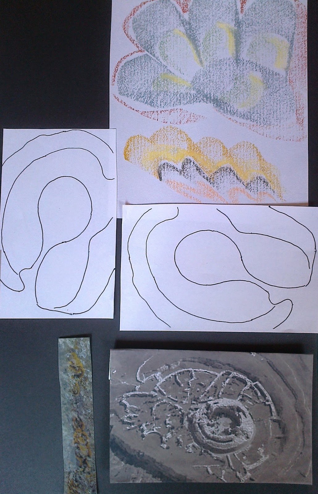
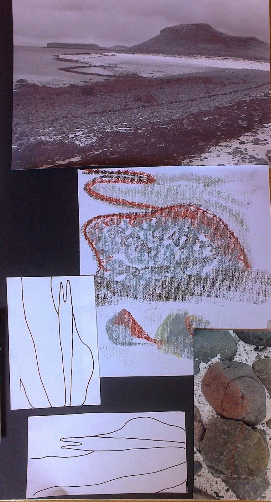
Selecting three images from my original design ideas board I included variation of shapes for possibilities of flat and raised texture.
The choices: Coral beach, Skye; Broch of Gurness, Orkney; shore line of Mull of Kintyre
As well as the main picture close up views were used as we had done in Chapter 4 of Module 2.
 |
| Ref 5.11.1a |
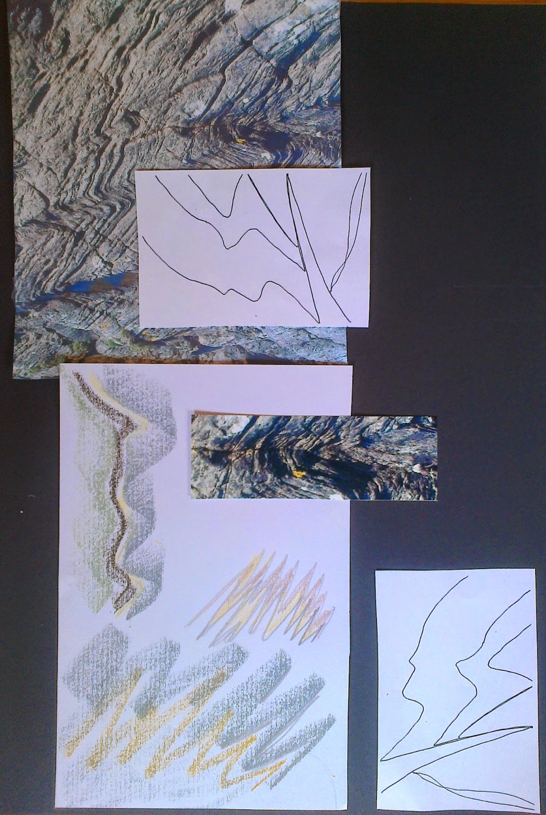
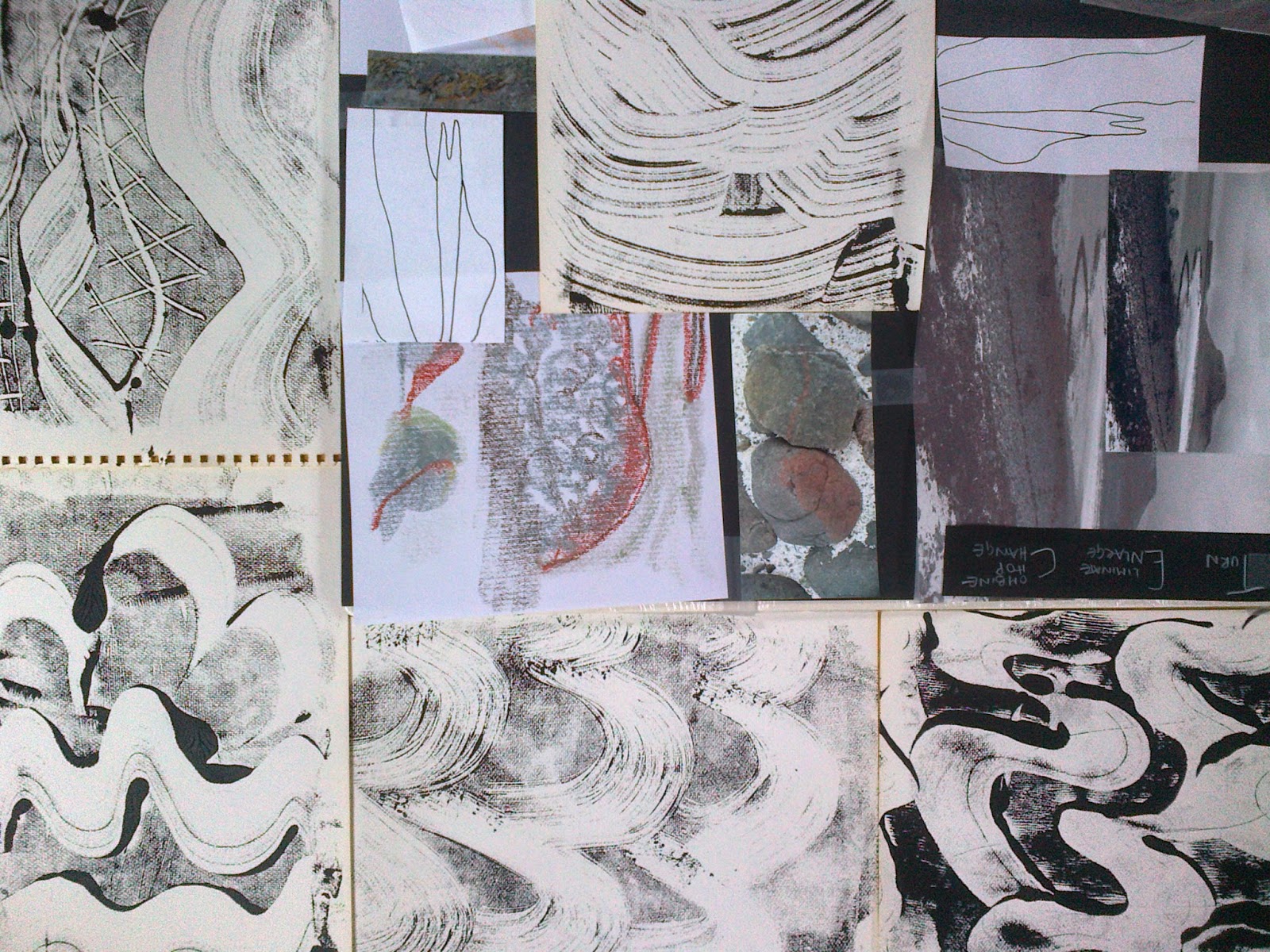
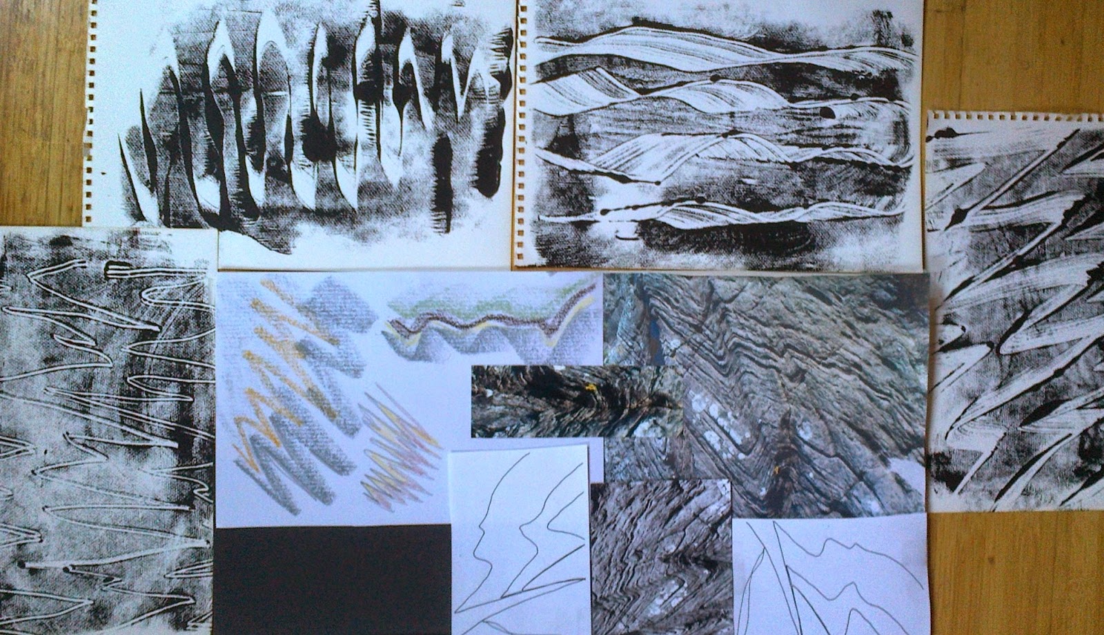
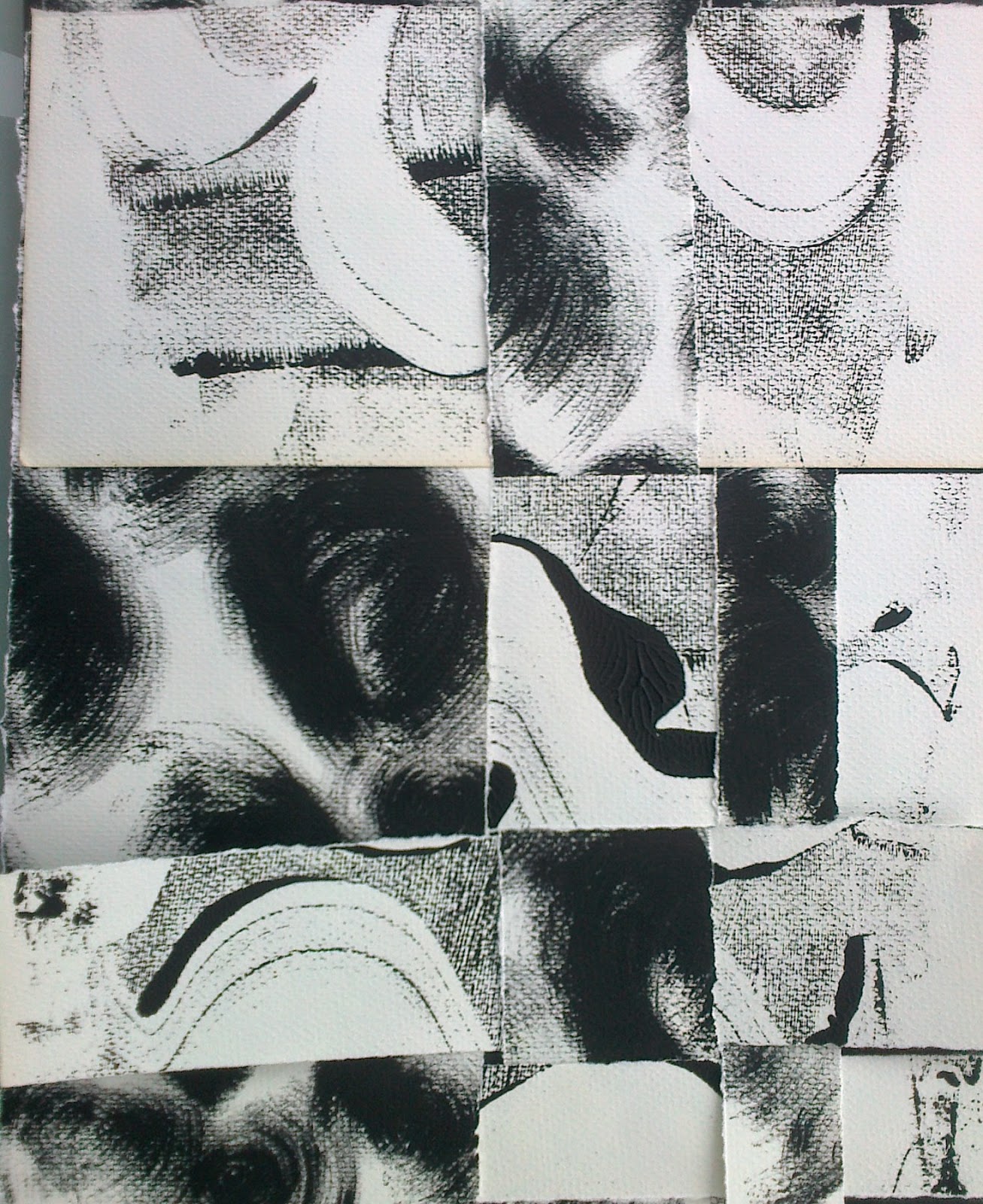
With sketch book in hand the follow results appeared. Selecting an earth tones palette with a touch of green. General warming up marks were made with pastels and pencils before tackling ones specific to images. The pastels were more user friendly and on the textured sketch pad paper shapes and textures appeared. Before making papers decided to look more closely at photos for shapes and colours and placed them on storyboards to focus on when making my marks.
 |
| Ref 5.11.1b |
 |
| Ref 5.11.1c |
While musing on the pictures I suddenly looked at my Module 5 sketch/sample book!It appeared to be a cross section of the Moine Thrust, which was the geological feature/area I was in when I took my header photo for this Module. I would bear this in mind as the chapter progressed.
 |
| Ref 5.11.2 |
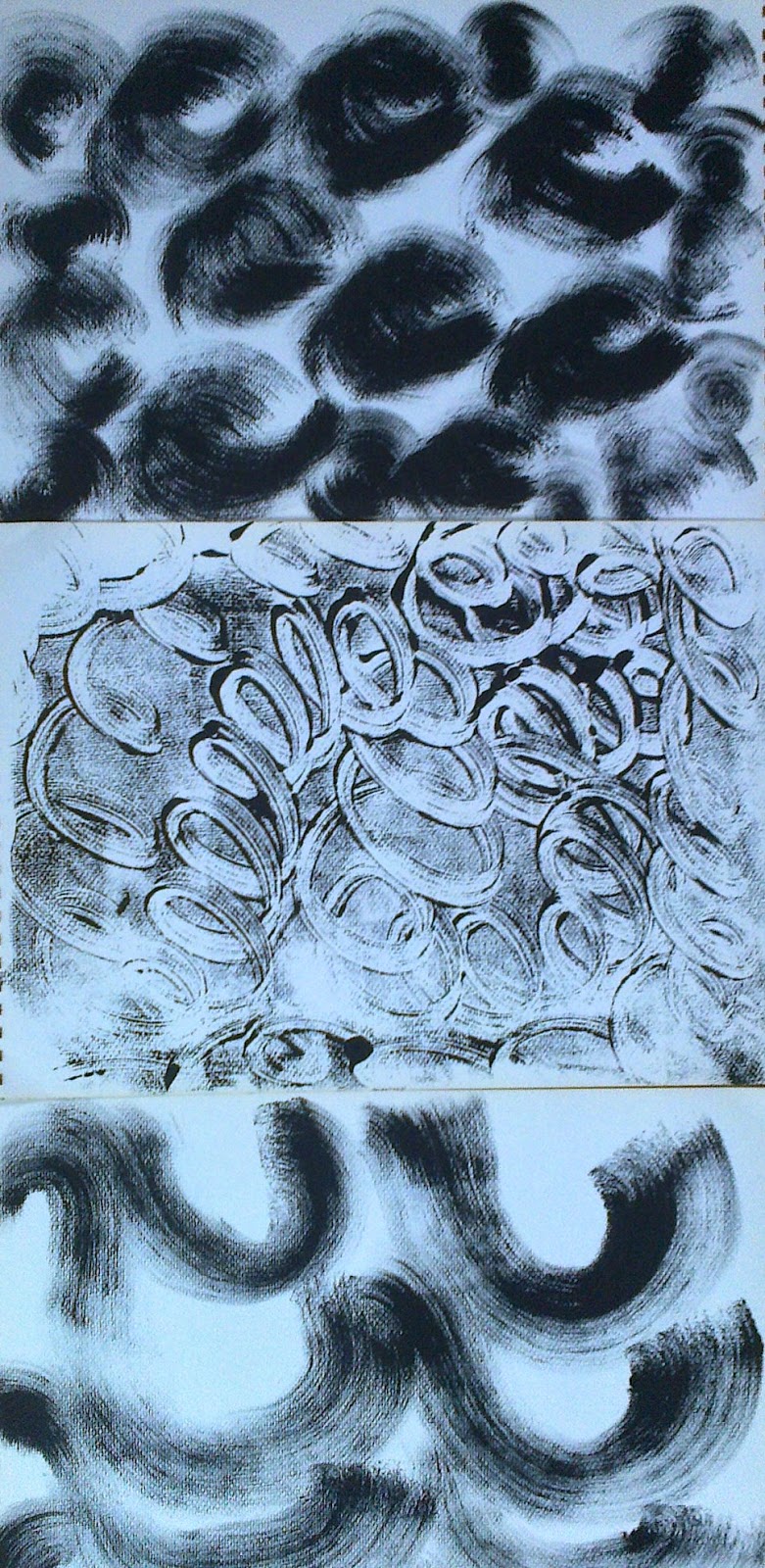
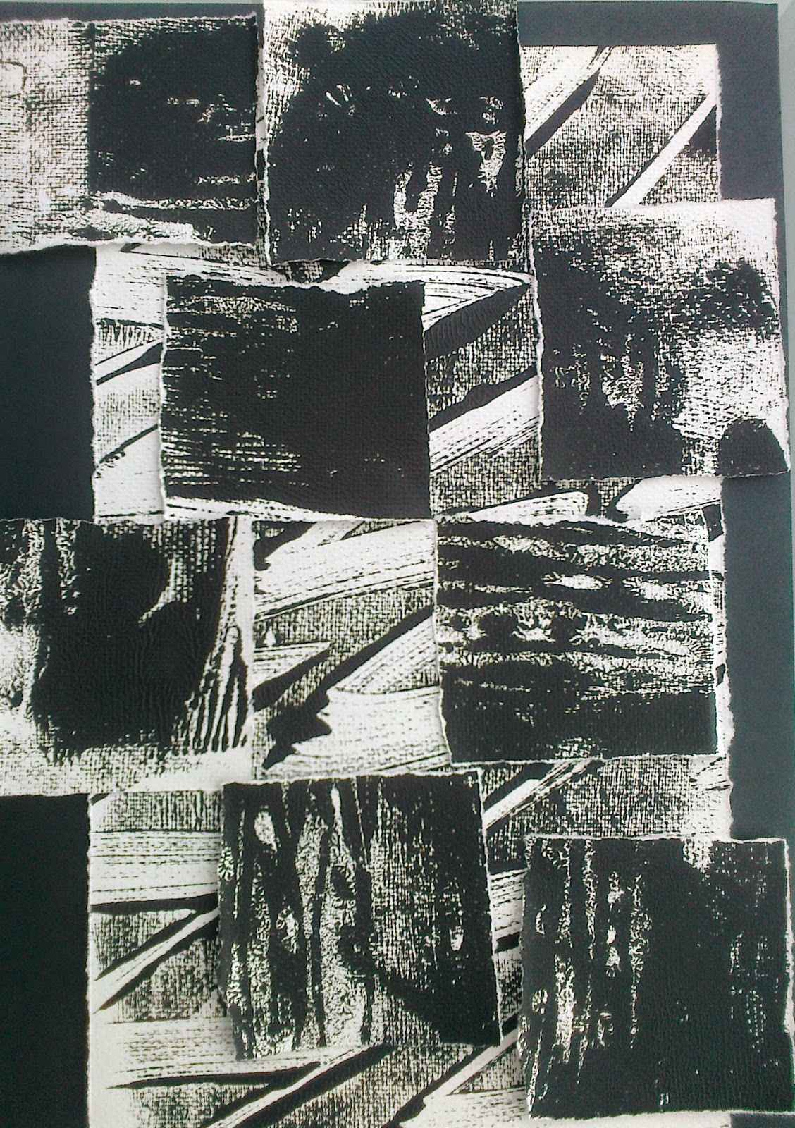
Flat Textures
Printing with black acrylic on perspex I made a series of papers
 |
| Ref 5.11.3a |
 |
| Ref 5.11.3b |
 |
| Ref 5.11.3c |
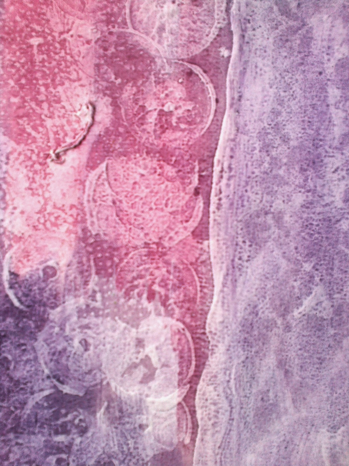
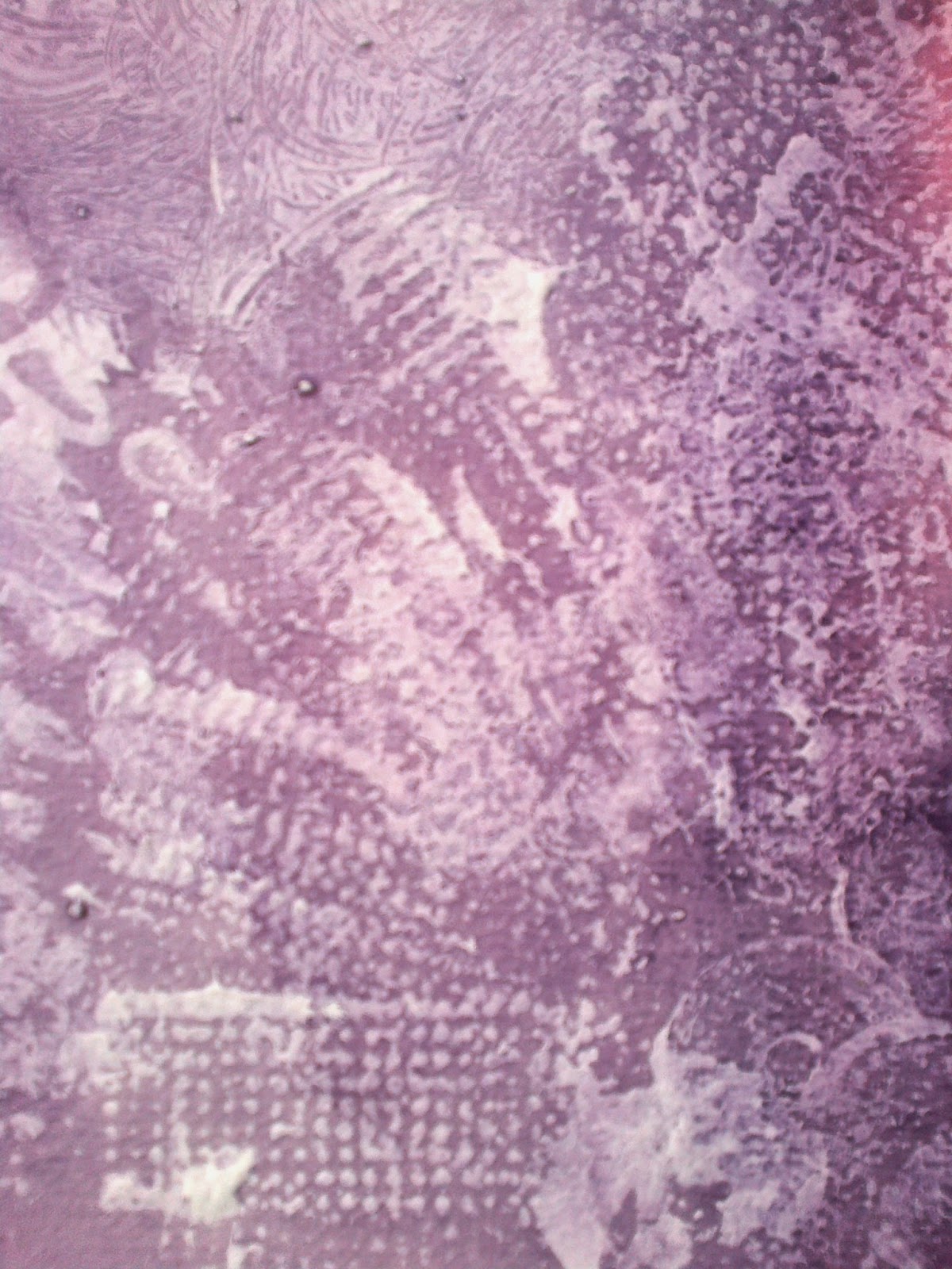
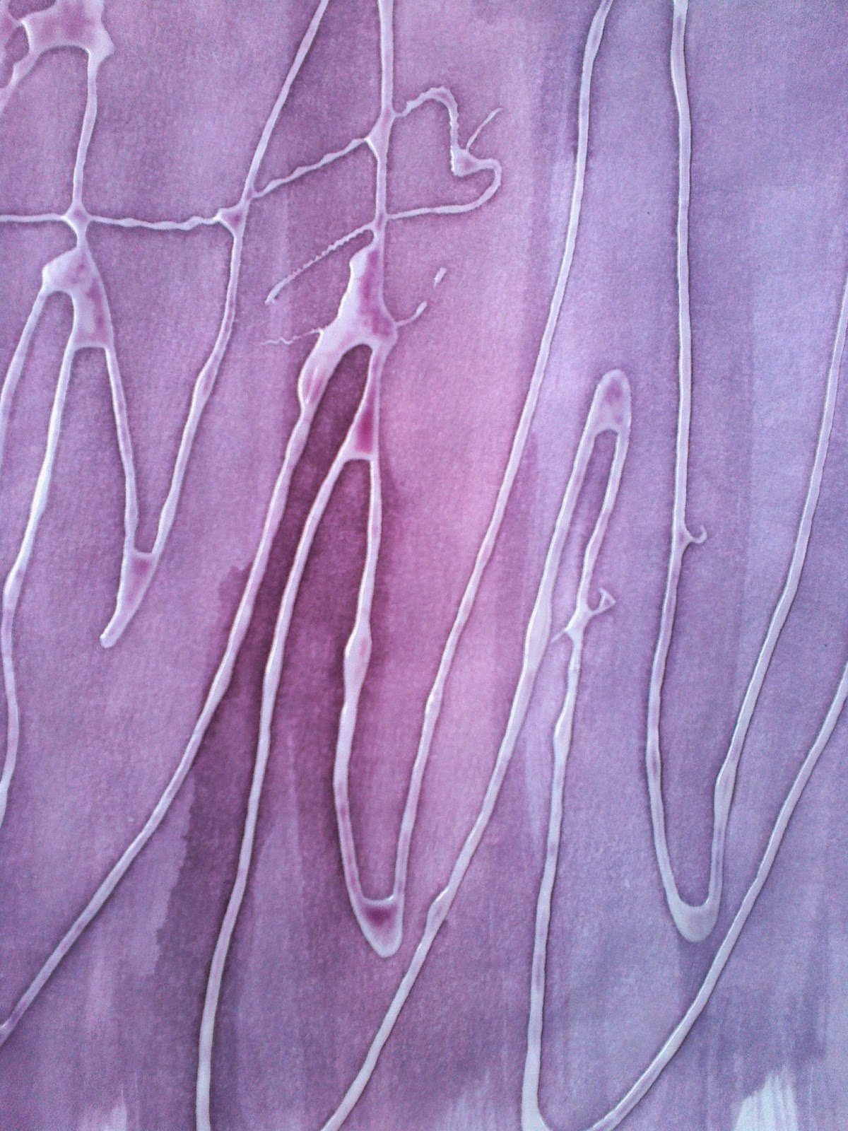
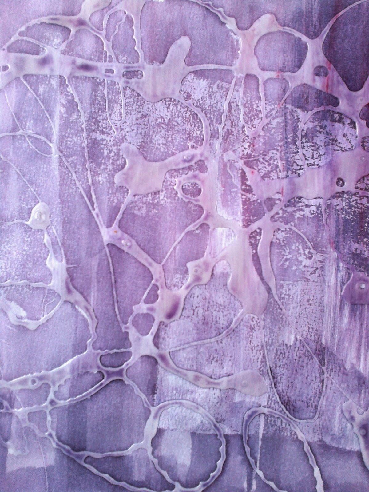
Textured papers
 |
| Ref 5.11.4b |
 |
| Ref 5.11.4a |
The first adventure for texture was with emulsion paint that was imprinted with stamps and card edges. The second adventure was with PVA glue that was 'drawn' and allowed to dry before painting.
 |
Ref 5.11.4c
|
 |
| Ref 5.11.4d |
The colour was an experiment for although I had earlier considered earth tones this adventure came about when I was thinking of doing underlaying 'igneous' rock colours...a step to far! When reviewing these papers considered that the method, but in the rights colours, could be used for a base layer for the resolved sample.
 |
| Ref 5.11.7a |
 |
| Ref 5.11.7b |
 |
| Ref 5.11.7c |
 |
| Ref 5.11.8a |
 |
| Ref 5.11.8b |
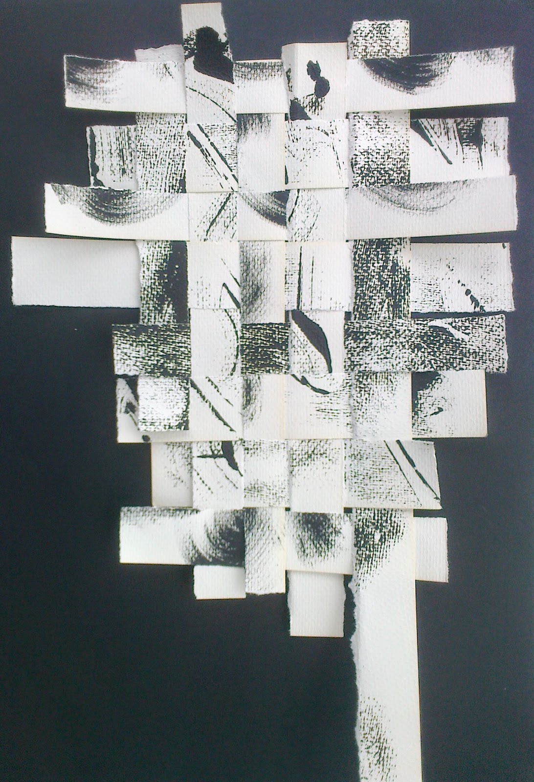
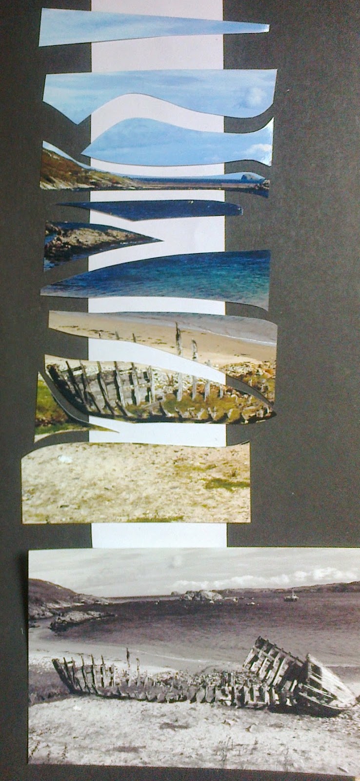
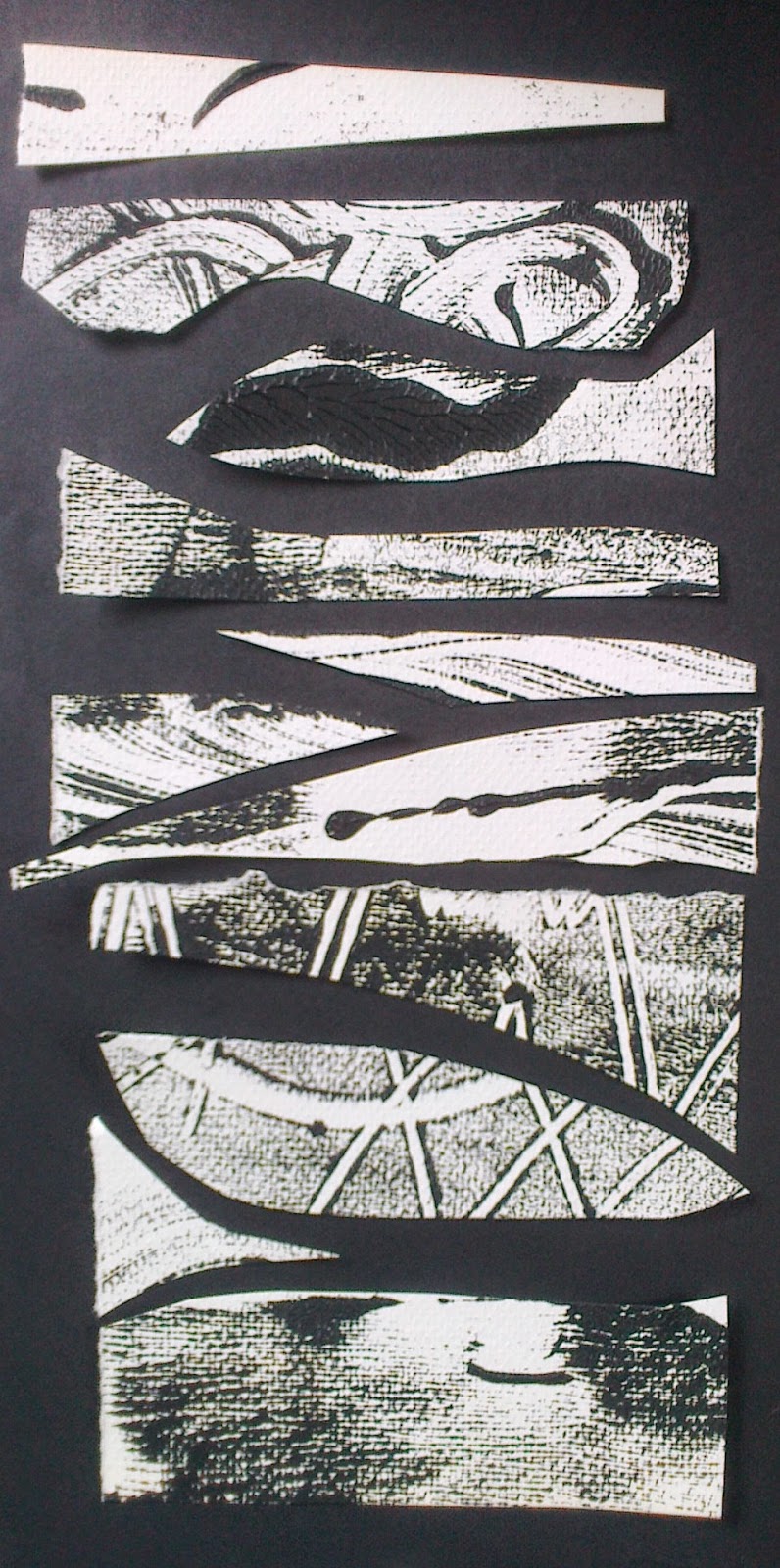
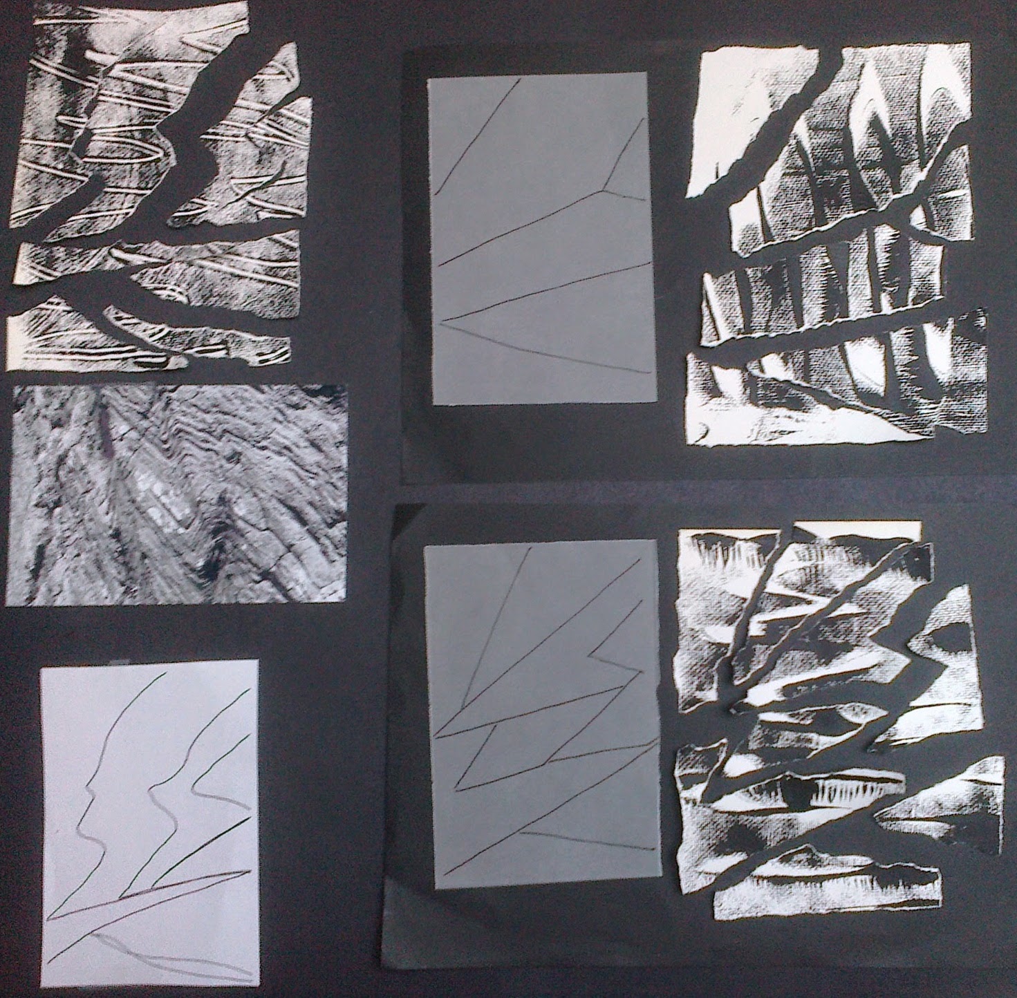
Then I decided to...explore! I suddenly wanted to hone in on the beach photo from my header for Module 5 , references 5d and 6 d above and take a close up narrower view. So I cut the shapes, defined by colour and texture blocks, and then had a play with some of the textured papers.
I liked the idea of perhaps flipping it on its side; just as the Moine thrust had done, and playing with the different textures or strata and forming a three dimensional shape but that leads me into Chapter 12 and some trial samples. Before all that have just reviewed all my chapters and collected thoughts on my priorities, helped by Sian's comments, will add this to the TEC list and focus on the task ahead... these words emerged.


What lovely work - I loved looking through it all. Looking forward to seeing it develop.
ReplyDeleteThanks Sheila. Now the difficult chapter begins, the resolved sample doesn't seem to get any easier, pruning ones ideas only seems to sprout more!
ReplyDeleteJudith, this looks so exciting. As you say it must be difficult to choose which design to use. I shall watch with interest to see which one you decide on.
ReplyDeleteHad a day off today as I was swithering and went for a lovely walk to clear my mind. When I tell you what I was thinking of doing I think you will say wise choice to go for a walk!!!!! Came back and set up my loom - diversion tactics abound! Also watched Nadal at Wimbledon... I will reveal what I was thinking of in my blog - later - watch this space.
ReplyDelete