Tuesday, 30 April 2013

Chapter 12 Composite Sheet for Fashion Accessory


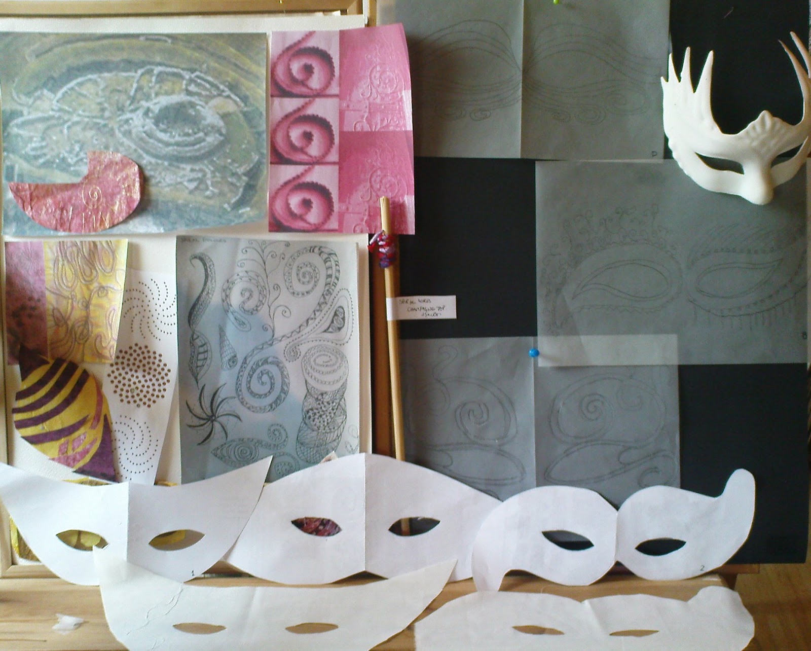
Organising items for a composite board helped to focus the mind on the next steps towards the final design choice.  
There would be lots of stops on the way as to whether I should go back to the starting blocks!  Sian's report back notes on 'Design thinking for an accessory' gave much food for thought  and decided to try and 'keep away from too many tricks  and to concentrate on marrying technique and design' think I may have failed already as the composite board already looks too busy now its posted!
Ref 3.11.1


Constantly swithering as to whether I should stick with working on the sample 3.10.10, see below or  play more with the idea of 3.10.7b, seen above in the central photo.  I decided to include more negative space elements into the 3.10.10.  Compromise is not always the best course and does not stop the nagging doubts.  Your will see my conclusions on this choice at the end!                                                                              

Looking at the basic shape and taking off the 'features' I decided to take advice and to play with the mask and draw other options around the mask on paper. 
Cutting the eyes so they were symmetrical  and 
playing with the antennae  - pulling them down so that it not only gave negative space but gave more balance when mask was worn. Ref 3.11.2
 See detail in 3.11.3a and 3b shows how a paper template helped decide to cut!

In order to give the mask a third dimension and shaping I concentrated on the area around the nose.  It was supported by wire mesh covered in perle herringbone while all other support was given by adding wire to strengthen the scroll cords.                         Ref 3.11.2

                                                                             Ref 3.11.3a                           Ref 3.11.3b

             
  Ref 3.11.4b                                                                                        Ref 3.11.4a                                                      Ref 3.11.4c
Scroll stitches were used to emphasis the scroll features around the eyes and antennae - a laborious task as the free machine embroidery base provided a tough surface to stitch through.  I probably over compensated with beading but enjoyed the touches of light they gave - it became a bit like eating peanuts - once you start its hard to stop!!
The mask is tied to the head using organza cords seen originally in 3.10.10 as potential scrolls. Ref 3.11.4d

And now 3.11.5!

There is still a feeling that I should have chosen the more open design using my thrums and bondaweb/chiffon! I liked the simplicity of the open design but felt it needed to stay unembellished and would not fit the brief of a resolved sample using aspects of module 3.  I did consider merging the two but that would have been a step too far!  It brings to mind another Robert Frost poem, The Road not Taken, ....' long I stood'......
'Oh, I kept the first for another day!'.
Background details


Monday, 11 March 2013

Three Artists

Zandra Rhodes was born in Chatham, Kent, UK in 1940.  Zandra remembered her   mother, who was a fitter for the Paris fashion House of Worth and later a lecturer at Medway College of Art in the following context ‘I loved painting, drawing and dressing up. I had some lovely dolls – May and Jacqueline – and I used to make clothes for them….I absolutely loved dressing up and our mother loved helping us with our outfits’.  Sadly her mother died in the 1950 and would not see her success as a designer. 
Studying at Medway College and then at The Royal College of Art in London her major area of study was printed textile design. Her early textile designs were considered too outrageous by the traditional British manufacturers so she decided to make dresses from her own fabrics and pioneered the very special use of printed textiles as an intrinsic part of the garments she created. This belief and energy would see a range of other ventures; owning shops – her first in 1967 in partnership with Sylvia Ayton, then solo in 1969 with a store just off Bond Street in 1975.
With her bright pink hair, theatrical make-up and art jewellery, she has stamped her identity on the international world of fashion. She was one of the new wave of British designers who put London at the forefront of the international fashion scene in the 1970's. Her unique use of bold prints, feminine patterns and theatrical use of colour has given her garments a timeless quality that makes them unmistakably a Rhodes creation.  Image on left 1969 caftan image on right from 2012 fashion show see link:
http://nowfashion.com/29-02-2012-zandra-rhodes-ready-to-wear-fall-winter-2012-paris-show-1810.html
She was recognised for her work as Designer of the Year in 1972 and 1974 and since then a continuing fashion collection alongside commissions in ceramic, electrical components, make up, book design and jeweller. http://ivanhoebooks.blogspot.co.uk/2009/04/zandra-rhodes.html
In 2001 theatrical costume design led to work for Opera designing both sets and costume. Zandra has also devoted much of her time to setting up the Fashion and Textile Museum in London, dedicated to showing the work of fashion and textile designers from the 1950's onwards.
Zandra Rhodes was made a Commander of the British Empire in 1997 in recognition of her contribution to fashion and textiles and has nine Honorary Doctorates and in May 2010 was installed as Chancellor of the University of the Creative Arts (UCA) in the Banqueting House, Whitehall UK.
She has also supported charities and these two designs show her distinctive look is also apparent in small objects.
Pushing the Envelope Initiative to raise literacy logo and Breast Cancer charity brooch


Deidre Hawken
What a wonderful invitation to take a  trip down memory lane. In a previous life I was fortunate to be involved in the millinery world when it had such celebrities as Philip Somerville and Frederick Fox in place with still a hint of the influence from the 50’s and 60’s of Mitzi Lorenz and Otto Lucas and was to get a jolt of new blood in Stephen Jones and Philip Treacy in the 80’s and 90’s and still current to the present day. 
I had not appreciated the impact of Deidre  Hawken so was delight to read of her progress from  training in Theatre Design at Central St Martins  to a change of direction, when she was 54, from costume props for the theatre and film to study millinery through winning a Queen Elizabeth Scholarship Trust. In 1998 she studied with Rose Cory and had a short internship with Stephen Jones and studied hats at the Metropolitan Museum in New York. Hawken was acclaimed for her costume design particularly in the film Angels and Insects in which she was head dress maker. 
Inspired by sources such as surrealism, historical forms and modern cuisine… she uses a limited range of materials, silk organza, silk taffeta, silk velvet, fine glove leather, strip straw and occasionally felt. These are manipulated using hat forms she designs herself.  Every component is hand dyed and hand sewn, and many hats are one-off pieces bought by collectors or museums. This mushroom hat made with gloving leather and the glorious swirl of silk 'cakes' shows how texture plays an integral part in getting the feel of the original item despite using completely different medium.


“I begin to make a hat by building it up as a maqette [i.e. as a model on the head] this means I get the balance right, everything has to work on the head, and the finished hat must look witty.”
Deirdre trained in Theatre Design at Central St Martins and has exhibited her work widely within the UK and internationally.  While known for her miniature food inspired shapes she also has a range of fashion hats which sadly I was unable to download pictures  but they can be found on her site: http://www.deirdrehawken.com/html/fashion.html
She has exhibited her work widely within  UK and internationally, including the Victoria and Albert Museum London, Crafts Council London, The Royal Festival Hall London, The Kelvingrove Museum Glasgow and at Julie Artisans' Gallery in New York. Her work is in various public collections including the Victoria and Albert Museum London, the Philadelphia Museum of Art USA, and the Hat Museum UK.  Deirdre is also a fellow of the Society of Designer Craftsmen and a fellow of the Royal Society of Arts. 

Moving from the miniature pieces of Deidre Hawken to the works of...
Janet Ecelman who works at the other extremity – taking spirals to a huge scale.   I first became aware of Ecelman when the Make Lace not War exhibition took place in Powerhouse Museum, Sydney, Australia. 
Since graduating from Harvard College in 1987, and later completed graduate degrees in painting and counselling psychology. Echelman lived in Bali, Indonesia, in 1988 -1992 where fishing and nets was to prove an inspiration that moved her from her previous artistic work: she attributes this to the loss of her painitng equipment-what a fortunate event for us to now be able to enjoy her 'new'career!  A Fulbright Award resulted in her first public sculpture, Bellbottoms, shown above, in Mahaballipuram, India. 
She combines  ancient craft practices, such as traditional Lithuanian lace designs in Trying To Hide With Your Tail In The Air- see right, with cutting-edge technology to create what she describes as ‘an oasis of sculpture’, delicate enough to be choreographed by the wind. This sculpture utilises regional patterns of Lithuanian lace in a 3-dimensional sculpture that is permanently suspended between trees at an outdoor sculpture museum. According to the museum director, during its first five years, the sculpture has required no maintenance and remains true to its original colour and structural integrity.Hand-knotted nylon lace, stainless steel, enamel paint, steel cable, and two oak trees; 30 ft. height x 12 ft. width x 12 ft. width.Location Museum of the Centre of Europe,Vilnius, Lithuania, 1998
She created her first permanent installation, She Changes, shown to the left in 2005 in Porto, Portugal. 
According to Sculpture Magazine, her work in Portugal charts "a bold new direction for sculpture" and is "one of the truly significant public artworks in recent years." 
2011 Guggenheim Fellowship her works, in mainly urban spaces, sees building-scale sculptures that join with forces of nature: wind, water, and light. Using unlikely materials—from fishing net to atomised water particles—to create dynamic, accessible art environments in cities worldwide.  When Idol Magazine asked Janet Echelman to describe her work in three words, she answered ‘voluptuous, ethereal, and monumental’. She also noted that she had, ‘sought inspiration from whatever was around me’ adding that she ‘saw her art work as a catalyst for a contemplative experience … to learn and to hear your own inner voice, and to develop a relationship with it- it is your greatest resource. Give everything you can to grow, develop and nurture it’


Perhaps my favourite title and detail is this piece made in 2009, Her Secret is Patience, installation, Phoenix, Arizona, using a combination of hand and machine knotted high tenacity coloured polyester. Video detail is available on her website: http://www.echelman.com/


Tsunami 1.26 Commissioned by Denver Office of Cultural Affairs Public Art Programme to link 35 countries in Western Hemisphere effected by 2010 earthquake shortened day by 1.26micro seconds 230 ft. long x 63 ft. x 30 ft.  This piece was shown in Syndney Australia in 2011.
On March 3, 2011, Echelman  during the Threads of Discovery session made a keynote speech, Taking Imagination Seriously.  Echelman had been recognised by TED, an organisation with an inspiring list of initiatives and individuals who  have 'ideas worth spreading' acknowledged.  This shows one of her 10 minute presentations. http://www.ted.com/talks/janet_echelman.html.

While all three artist use very different materials the essence of their individuality is to chose textiles which complement their designs and make a statement that goes beyond the piece being made.

Monday, 4 March 2013

Design an Accessory Part 2 and a bit more

To maintain the momentum of musing over various design elements  and not taking  any one of these in isolation I  set out three workboards.
SHAPE, SIZE, DESIGN
 SOURCE 
Selected three shapes and three designs to play with felt I would see what problems/ practical solutions would be faced in the final piece.  The first design to be tried on each shape was the paisley. 
COLOUR, DETAIL

The colour and detail board, also incorporated references  to Turner's Moonrise, http://www.tate.org.uk/art/artworks/turner-venice-moonrise-d32126 and a book on casalguidi embroidery, Embroidery Techniques, Via Laurie, Search Press. 

Doing the colour and detail board had a play with one of the mask images on gimp:
Ref 3.10.7
The details of the design actual go off the edges of this shape, but I didn't have a steady enough hand to draw those in on the computer! The aim of this image was to consider if the colour changing over the mask would work and whether the idea of using the threads either in soluble fabric or bond a web would be a background option for detail.
Ref 3.10.7a
While not actually completing the process put threads on the soluble fabric ( top) and on bondaweb bottom. Ref 3.10.7b

 By putting the tracing paper over these  pieces could see the colour effect that would be produced. Next stage saw these on the shape by layering in gimp programme                                              Ref 3.10.7c


At least this was a way of reviewing each shape and design before making a decision.  Felt  colours needed to be better graduated across the mask.  My notes of things to consider was getting ever longer! 
Ideas for some more design detail had been done in earlier chapters- particularly 4 and 5 but while going through samples found a small unfinished section, see below, which was started a few years ago after a workshop with Pauline Verrinder - it is for a necklace encrusted with bead wraps, in the Fibrefusion book Evolutions.  Adding to the original piece thought it could be used to provide a more textured cording detail - think it needs the beads and a bit more twist and fray.
Ref 3.10.8

Realising I needed to work on fabric rather than paper and as a full mask rather than small samples wanted to consider  
TEXTURE, DIMENSION, SURFACE Experiments 
  • first experiment I used machine stiching as design feature and possible support for wires.  OOPS initial idea was to put design on stitch and tear. First attempt rather wobbly. 
  • Next attempt put in twin needle the line wasn't wide enough, would need to get wider twin needle
  • and then forgetting that I was stitching on reverse had a zigzag stitch on the front. Maybe I was trying too many new techniques, where previous ones in Chapter 4 had provided succesful.  Back to drawing board...
The other aspect that had became apparent was that the fabric needed to take both the weight of details on the body of the mask and also, where the design went off the mask. Then overwhelmed by the number of shapes, designs  and texure options  I said to myself cut it out, calm down!!! 
 Ref 3.10.9
But that in itself started me thinking - could cutout work be a solution- using covered wire on the braids and coils to draw the design and make more openings to emphasis the line . I could  use the colour idea shown in 3.10.7 as a background 'wash' that would 'edge' the braids, coils and beading? Could there be merit in this idea as the design would appear to emerge and provide the shape focus, this would allow the mask to be flexible and mould round the face? Would a butterfly appear from the cocoon of wooly, gimpy thoughts? Would this be considered an easy option?  But perhaps time to stop and ask advice!
While considering the way forward decided to make a piece of free machine embroidery and play with some ideas and see if the fabric would hold the detail and also give space to add stitch and bead detail.  Although the density of the fabric does hold the wired scrolls it could perhaps do with an additional backing layer for just a bit more support if bead detail is added.  The sample below did however mould well round the face  


Thursday, 21 February 2013

Design an Accessory Part 1

Picture  from Elle France
When reviewing the concept of what makes an accessory I looked to Chapter 12 and selected artist Zandra Rhodes for inspiration.  In looking through her collections I realised that an integral part of her designs was how the models make-up complimented /contrasted with the clothes - could make-up be considered as an accessory?  
Ticking away in my brain over the dark winter months of January and February the Venice Carnival also caught my attention and a seed began to take root, could a mask be considered an accessory?   I had bought a mask, when in Venice in 2007, see left.  I had intended to paint it but just loved its shape and simplicity and did not want to spoil it!   
 In exploring the idea of a mask I needed to work through 3 key exercises in design elements to investigate the choices.
Some design ideas from earlier chapters, see right, were placed on a worksheet to try and maintain focus.


SIZE, SHAPE, SYMMETRY(or otherwise!), SOURCE
While exploring the mask shape I wanted to be able to have some sense of what was underneath and off the extremities of the mask therefore the mask did not cover the whole face.  The following shapes were cut out:
Ref 3.10.1a                          Ref 3.10.1b
Taking each mask in turn, numbering samples from top left to bottom right, I then took a piece of tracing paper and did some initial design ideas, which had been influenced by shapes that had been used in earlier chapters, and the original inspiration of Zandra Rhodes and Venice.
 Ref 3.10.2a Ref 3.10.2b
 While each design had merits on the original shape the design was made for it then became apparent I could play, moving the tracing paper onto different shapes, this gave a permutation of 36 designs and that was without turning the masks upside down!! While I did not want to make a decision at this time, I felt the need to consider more design elements before making my final design choice, my preference was narrowing down to shapes 1, 2, 4 and 6 and designs B,D,E and  F,  with thoughts that design A was a bit messy and could be improved as an asymmetric option.
TEXTURE, DIMENSION, SURFACE                                                                                        
While textured surfaces of cords, braid, beading would be a part of the finished design it was a key part in the process to establish whether this would be a 2 or 3 dimensional piece.  If it was to be 3 dimensional how would this be made? I was not going to be able to simply put a mould over my venetian mask, I need to consider how to add dimension.

Ref 3.10.3.Let the play session begin, a brief flirt with seeing how a mould would work and how this could be replicated by hand. Using smocking stitches to give contour, shown on the left, on the right fine layers of tissue with a muslin surface that was brushed with PVA and then place on cling film and placed on mask. 

Looking through The Art of Manipulating fabric, by Colette Wolff  stimulated me to consider using tucks, Ref 3.10.4,  or darting, Ref 3.10.5, to bring additional dimensions to a flat surface, or to possibly use a technique shown in Janet Edmonds' Three Dimensional Embroidery - vilene and paper machine stitched shapes
                                                        Ref 3.10.4 reverse                       Ref 3.10.4 front
    Ref 3.10.5   

Should the shaping happen before or after the design work had been done?  
  • The smocking, ref 3.10.3 and tucking ref 3.10.4 were easy enough to pull up. Needed to consider whether design should be worked before or after pulling up the shape. Dart seams could be covered by a designed or a space could be left in design to incorporate dart with base fabric, but after initial experiments making darts were the least favoured option, perhaps pleats could be an alternative option! The tucks seemed to offer a good element for shaping and giving a surface That could be embellished through inserting/emphasising cords.
  • The paper and fabric sample, ref 3.10.3 was stiff when dried but a needle could be pulled through.  A thought, could you prick pattern onto surface with a needle to aid process? This was thin tissue and muslin would it work on heavier paper/fabric?
Time to reflect on what fabric could be used; while my fabric stash included silks and cottons that could be dyed and used wanted to consider surfaces that had texture. Previous work on Modules 1 and 2 had left me samples.
Ref 3.10.6                                                         
  Left: threads sewn onto plastic sheet
  Middle: threads trapped in bondaweb sandwich
  Right: threads in chiffon and muslin sandwich with     bondaweb


Ref 3.10.7 For a previous project on bowls I had used soluble fabric to encase threads and connect with machine stitching.  For the mask perhaps it should be worked worked more lightly?                                                                              A more open use of this soluble fabric method using  just machine stitches with no captured items could be a useful feature or perhaps a combination of the two!
                                                              Ref 3.10.8a                                                Ref 3.10.8b
While considering surfaces I had a play with marbling on paper and fabric and also revisited the idea of bleach to make lace pattern on tissue paper and cotton. The marbling was more subtle on the reverse of the paper and fabric . If this was a look I wanted to have as a background for stitching  there would be a need to use a lighter touch with the quantity of colour!
Ref 3.10.9a                                                    Ref 3.10.9b

COLOUR, DETAIL
Ref 3.10.10a                                                                                                                                       Ref .3.10.10b
As a preliminary sketch for Sian I had identified the colours that I was considering, violet/pink to yellow/green moving across the mask. I felt this would give greater dramatic effect than if I worked it horizontally. 
The colour board on right was made when I found this rather Rococo image and while I mused on the bright sheen of papers at the top my thoughts were more for a pastel theme from the colour charts at the bottom with areas of  intensity of colour.
And now to consider each of these design elements and to come up with a short list! Details to be included in the final piece will be decided when the final shape is selected.  It will be important to ensure there are  areas where there is not too much detail to detract from the shapes and to consider what happens at the edges of the mask and how to bring a touch of drama to the piece.  The next act of play is about to begin!