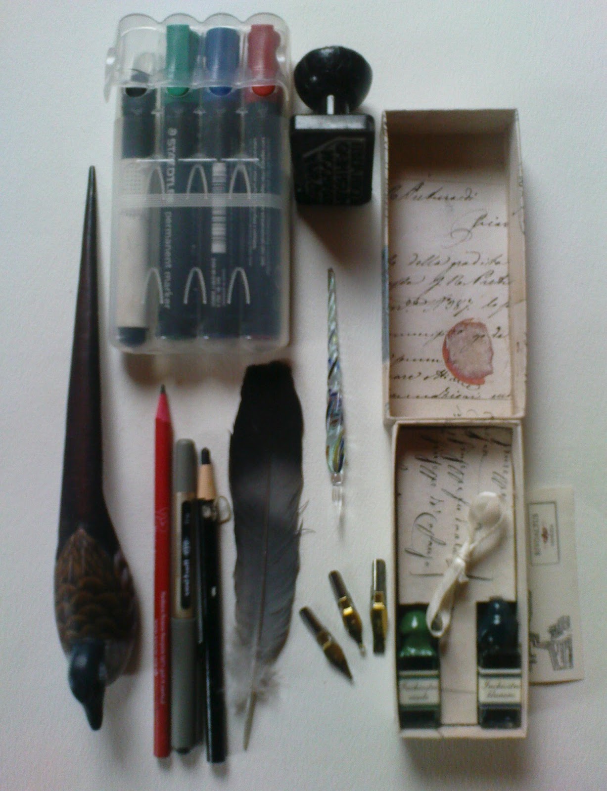
My Storage and Health and Safety notice is revised as I progress through the course:
STORAGE AND HEALTH AND SAFETY ISSUES DISTANT STITCH
Module 1, 2 and 3 ( new additions in red for
Module 3)
As the course is taking place in my home the following
three criteria have influenced the following decisions regarding storage and
health and safety issues:
- My own convenience and safety
- The convenience and safety of my family, and friends who may visit
- The well being of the environment in which I live – a remote rural
location where we have a private water supply and septic tank. I endeavour to recycle paper,
fabrics and am know for collecting
‘thrums’- waste threads in Scotland - from not only my own work but our
monthly sewing groupies inevitable come armed with bags of their thrums
for me. In trying to maintain a low carbon footprint car use is considered
carefully and as craft suppliers are a sixty mile drive away I do use the
internet! But again I try to look to my collection first before pressing
the order button!
STORAGE
I maintain two work areas:
- a wet area within the garage, where there is easy access to water
- a dry area in an upstairs study where there is access to a computer/printer
and sewing machine, threads, fabric, books and sketch pads/pencils. My
ironing area is in another part of the house
As an excuse for my hoarding tendencies I need to have
a variety of storage options.
Wet Area
With grateful thanks to Mike who not only allowed me a
space within ‘his domain’ the garage, but also built the bench and shelves and
cut various boards and acrylic panes I have:
- a bench, 150 x 70 x 70cms
- stool
- two shelves
A series of three plastic containers for paints/printing
inks, fabric medium and stamp/mould making and adhesive materials allows easy,
visible access.
Rollers are hung on wall, brushes are kept in
containers and cutting tools are kept in original boxes.
A plastic sheet is used to cover work surface-
particularly useful when Mike is having a wood working day or when I have a
printing/painting day
Apron and shirt are hung for easy access
Dry Area
With great appreciation again to Mike for making me
three mobile tables and a bookshelf I am able to expand and contract the area I
take up relatively easily.
Storage is in colour blocks as we use the area for
living and like to keep it ‘attractive’:
- A series of glass cookie jars hold my threads, for sewing; separate
Kilner jars hold more varied weight threads; old glass sweetie jars hold
fabrics.
- A 4 ring binder sketch book to log my progress for upload onto blog
with A5 rough note pads at my side for thoughts and ideas
- A4 plastic display folders
hold Distant Stitch module chapter notes and templates made and not
included in sketch/log book
- A3 plastic display folders hold papers and fabrics that have been
printed for project
Ease of access on working samples
To
ensure that materials for the project I am working on are easily accessible I
have made and covered two cardboard trays:
·
one for threads being used
on project
·
one for fabric that could
be useful in the project
and specifically for Module 2
were lots of pieces of paper were used a plastic envelope for papers
·
a story board, serves as a
billboard for each chapter. Key pieces are kept on it for reference and
inspiration
As I have progressed through Module 3 I have identified a need for flat storage of A3/2 pinboards on which I lay ideas flat and incorporate fabrics, threads and other items to 'play on' working through ideas as I go along....this is now work in progress for Mike!
HEALTH
AND SAFETY
The
key concerns that have arisen when undertaking Module One include:
Ensuring
that I work in a space that is:
·
light, well aired
·
cables for any equipment
are well concealed reducing any hazard when moving around the work area
·
all items to be used on the
specific part of the project are close to hand
·
and, take regular breaks to
help stop fatigue.
Dyes
and colourings:
My
main colouring agents have been:
·
acrylic and water colour
paints, pencils and
·
inks. Concerns on using an old set of inkjet
printer refills made me research the product and Appendix A gives the advice
that I followed. As the containers had
sharp ‘injection needles’ empty refills were disposed of at the local Doctors
Surgery where they have a ‘sharps disposal’ facility. Any other waste was disposed of away from the
water system.
·
Dylon fabric dye has been
used. The warning that it is an irritant
are heeded and gloves are warn when working with the dye. The fact that it can be an irritant to eyes,
might cause an allergic reaction and one should not breathe in the dust makes one vigilant while and after using the
dye. As the hints include the fact that
the dye may run after several washes I only use this dye on items that will not
be washed thereby ensuring no contaminated water gets into the water system. When mixing this dye I only make sufficient
quantity for immediate thereby reducing storage issues or waste disposal. In
instances where too much has been made and I have insufficient material to dye
contacted Dylon who have informed me that it can be disposed of in our land
drains.
·
Bleach is toxic and should
be used with great care. It can not only
damage clothes but make an impact on the environment. When used to lift colour from dyed fabric I
placed a small amount on a china plate to ensure no waste remained. It is advised that your wear gloves when
using bleach and work in a well ventilated space. While I do have a face mask I was able to
open doors so did not use it in this instance. As I need to replace my stocks I have looked into more user friendly
items.
Adhesives:
·
Glue sticks, sellotape,
double sided tapes and PVA is easy to
use and apart from ensuring it does not stick on work surfaces. However, I have found that is best not to use
PVA on typed paper and place in sketch book as it diffuses and turns some
images green!!!
·
When working with papers I
have used a spray temporary adhesive.
This is a highly flammable substance in a pressurised container and
should be kept away from heat/flames or electrical equipment that are in
operation. It should be used in a well
ventilated space and in short bursts without extended spraying.
Cutting
implements:
·
Scissors – the work has
alerted me to the fact that my scissors are not particularly sharp!! I have found a person who will sharpen them
so hopefully not only will my cutting be easier but also more accurate.
·
Knives - The main concern
centred on my craft knife which was used on flat, stable surfaces with a
cutting board underneath the item. The
protective cover was replace as soon as any cutting had been completed
·
Olfa Rotary cutter should
be kept with black click cover on when not in uses to ensure that it does not
have sharp edge protruding. When using
to cut into fabrics or papers it should be only used on stable surface and one
should push away from the body.
·
Seam ripper – While seemingly
innocuous this little implement is sharp and when used for cutting channels one
is exerting pressure and the cutting edge can slip off line so one should be
sure that they are treated with respect.
Sewing implements:
·
Sewing implements and
accessories, again simple things like pins and needles are stock and trade in
sewing but in the wrong position they can cause discomfort and wounds. To minimise risk of needles and pins dropping
into carpets or chairs I always have a pin/needle cushion to hand and tend to
‘count them out and count them back’ i.e. I use glass topped pins and only have
the needles I need to hand.
·
When working with
beads maintain them in a lipped container with velvet to help position them and
avoided spillage on the floor.
·
Selected the
relevant sewing needle for the task to ensure that you do not strain fabric or
your hand to pull it through the fabric
·
Sewing machine – to ensure
smooth running of machine, particularly when using frequently or running thick
thread, it is important to ensure that spool area is cleared of dust. When sewing various layers or thickness of
fabric loosing tension and using a slow speed seems to be good practice. Ensure that needles are not blunt.
·
When different
thickness of threads/cords are being used it is important to consider the use
of different machine feet, e.g. cord or braid foot to ensure easier and safer sewing takes place. The use
of drinking straws on the thread, placed either side of the machine foot, also
maintains more accurate positioning of the thread through to the needle.
Hot Tools:
·
Domestic irons, this is in
a separate area and as well as using non stick baking parchment I have invested
in an ironing sheet to protect my ironing board.
·
Test iron a small
sample of fabric if you are not sure of its fibre content
·
Soldering irons, this is
kept and worked with in the garage where a work surface and stand are available
and I am close to a source of water.
As
I progress through the course I will add notes to this report that identify
concerns and actions taken.
COSTS
| Module
3 | Supplier |
Cost |
Amount used |
Total module 3 |
| Item |
|
|
|
|
| A4 Sketchbook |
W H Smith |
5.99 |
|
5.99 |
| Beads |
various |
13.45 |
half |
6.77 |
| Embroidery Techniques |
Search Press |
|
|
12.99 |
| Sub total stock for module |
|
19.44 |
|
25.75 |
| From previous purchases |
|
|
|
|
| Glue sticks |
|
|
third |
1.00 |
| Double sided tape |
|
|
third |
1.83 |
| Cartridge paper |
|
|
half |
2.00 |
| Printing paper |
|
|
quarter |
1.25 |
| Silky threads |
|
|
half |
5.80 |
Total Module 3 £ 37.63
TIME
26 weeks
average time per week 7.46
78 days
average time per day 2.49
Authentication
REFERENCES AND WEBSITES
References
Books and websites
Machine Embroidery stitch techniques - Valerie Campbell-Harding, Pamela
Watts. Batsford
Celtic Art – the methods of Construction, George Bain, Constable London
three –dimensional Embroidery, Janet Edmonds, Batsford
Evolutions – a stitcher’s evolutionary workbook, Fibrefusion
Colorworks, Debbie Menz, Interweave
Celtic and Chinese Knots for Beaded Jewellery, Suzie Millodot, Search
Press
Decorative Patterns of the Ancient World, Flinders Petrie, Studio
Editions
Embroidery Techniques Using Space Dyed threads, Via Laurie, Search Press
Mary Corbet’s website Needle ‘n thread.com
Artist websites as indicated on blog
At the end of each module I change the blog header here is the one used for Module 3
|
|
|
|
|
 Thank you Sian for your close up from my image in Chapter 1 and allowing it in as my first design for this chapter.
 An evening walk in the hills of Glenbuchat inspired the word I would use for my lettering designs, calligraphy. Ref 4.2.2


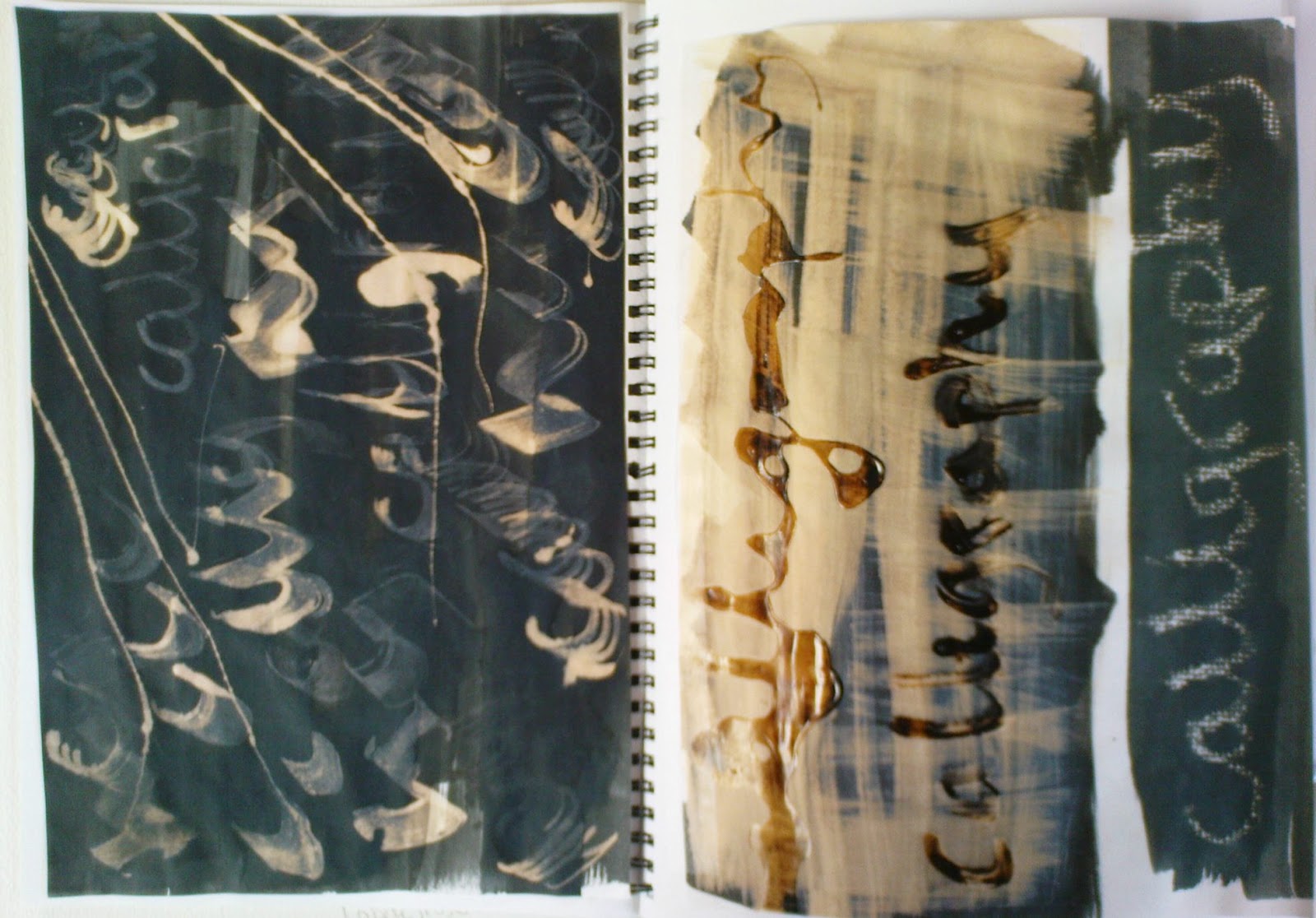
 For image 4.2.6a the card E method was used on an inked surface with bleach used as the dipping agent . In 4.2.6b PVA was used as the writing agent with ink and bleached then dragged across, the PVA was hard to control but I rather liked the pools that formed - later in the chapter I tried again with this method. Image 4.2.6c was made by writing with a candle on paper that was placed on top of a tapestry canvas. Black ink was then dragged across the writing.
 The idea of 'mail' as an easier word came to mind. Choosing a sheet of watercolour board 3 SWB, I had previously used A4 printing paper, and a foam brush it was nice to have a larger scale. It did take a moment to get a rounded feel but the 'm' in 4.2.8b was a very pleasing result. The straight black lines caused by a bleach dribble I had not seen!


 While this piece had been made during the bleach and ink stage I had been very cautious after completing the first phase of marking the paper with ink card marks. Encouraged to drag with ink and then bleach I had let the original marks to dry before diffusing with more ink and bleach and the hesitance was rather obvious. As it eventually dried I liked the lettering but feel the background leaves something to be desired. However in changing direction I seem to have chinese writing!


 Ref 4.2.16c


 For a final rub I used tracing paper with oil pastels and pencil on the string and PVA writing. The staggered effect shows up well when held by window but seems to have become flat in this scan. Ref 4.2.20