Monday, 19 January 2015

Chapter 9 Decorative papers


Ref 6.9.1
Ref 6.9.2
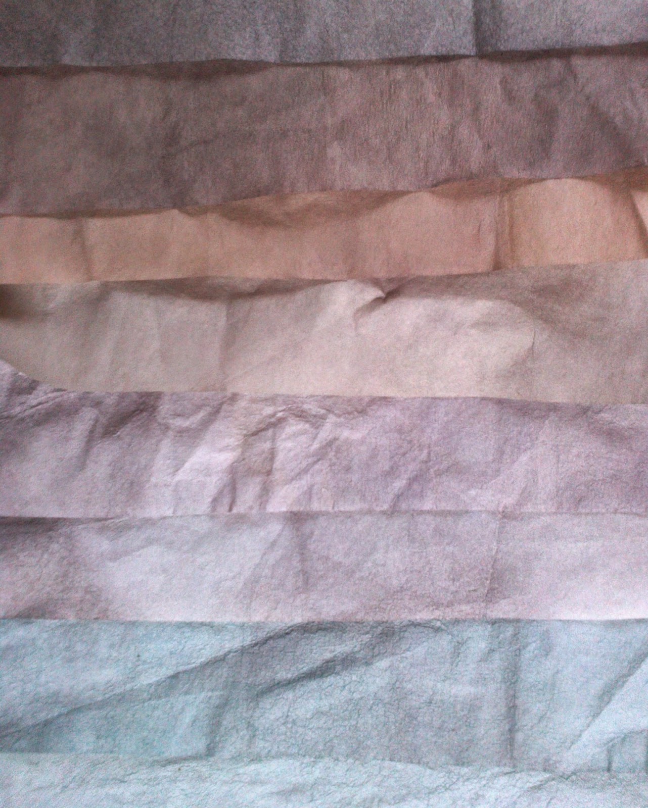
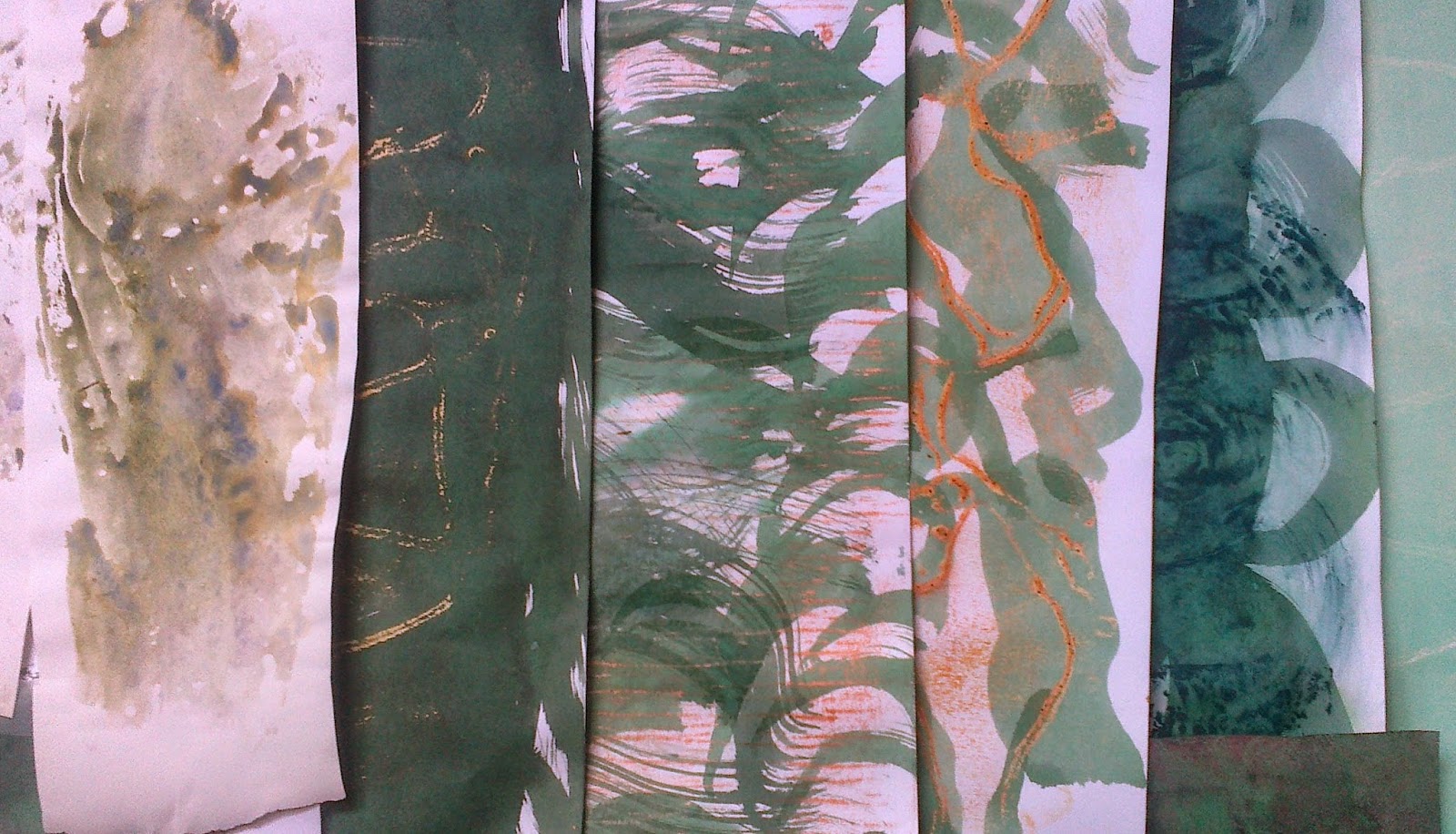
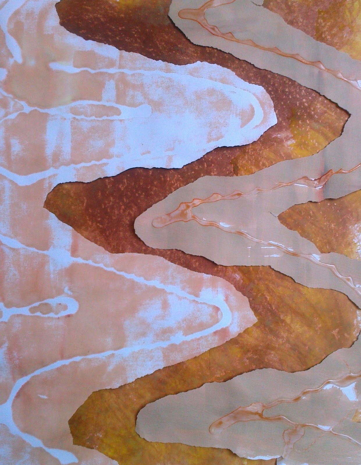
Working through Chapter 8 the following key colours in 6.9.1 were selected to make into A3 papers.  While the colours on right, 6.9.2 were perhaps more reflective of the landscape in December felt I should try to introduce a bit more colour. Perhaps the balance between bright and muted will vary as I move along but wanted to give myself the option of bright tones. Using brusho inks I set out four themes of colours, purple through crimson to scarlet, blue through to turquoise, lemon through yellow to brown and greens. Not all papers were included as I seem to have made rather a lot!!! At the same time I collected various papers from previous modules that could give spots of interest.


Ref 6.9.3 a,b,c,d
I selected three images to inspire my cutting, tearing and layering:
Ref 6.9.4a
Ref 6.9.4b
Ref.6.9.4d
Ref 6.9.4c
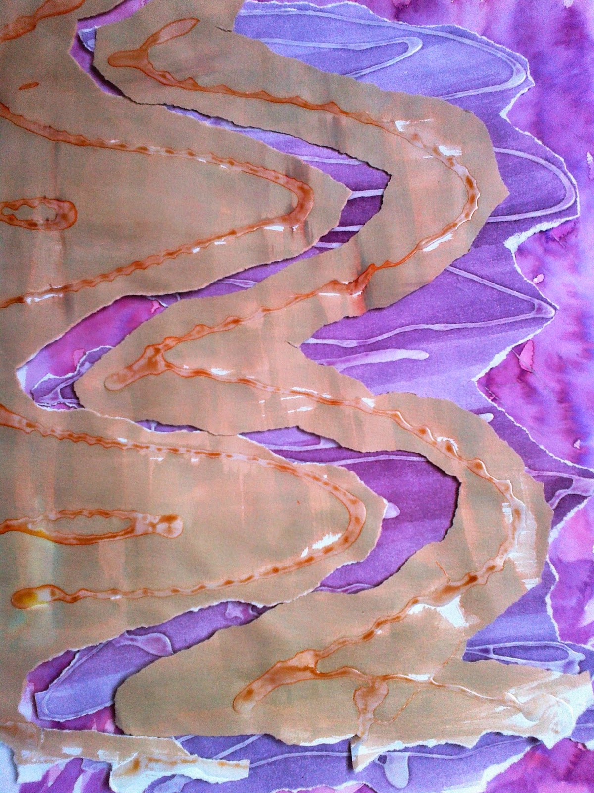
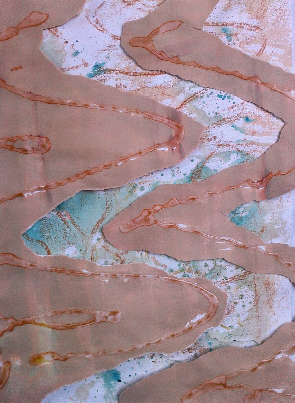
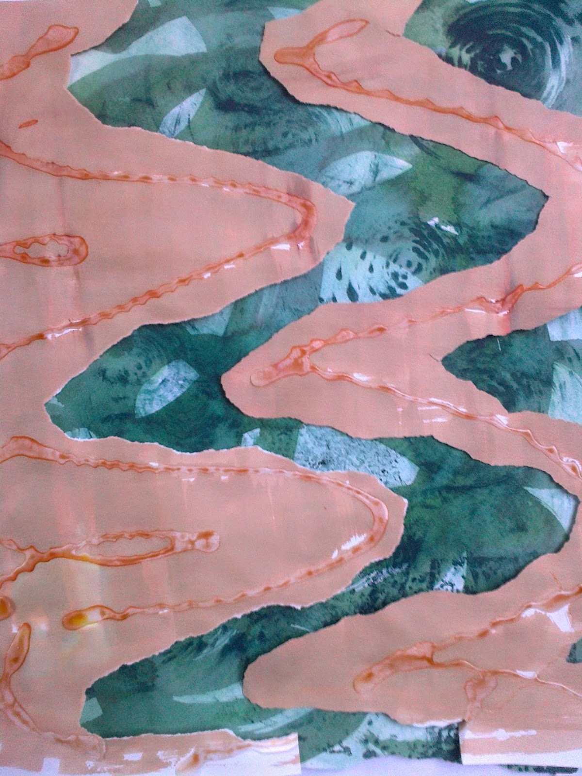
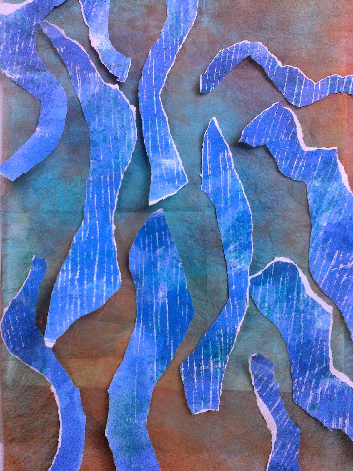
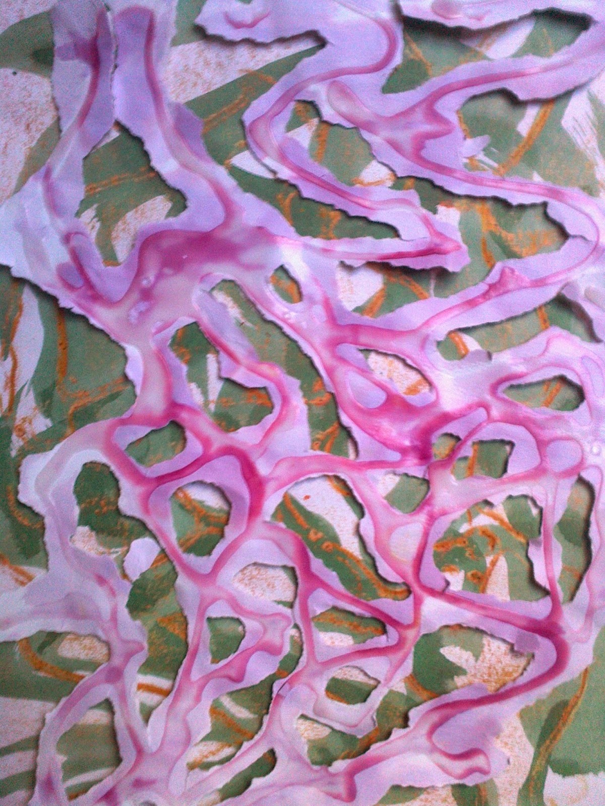
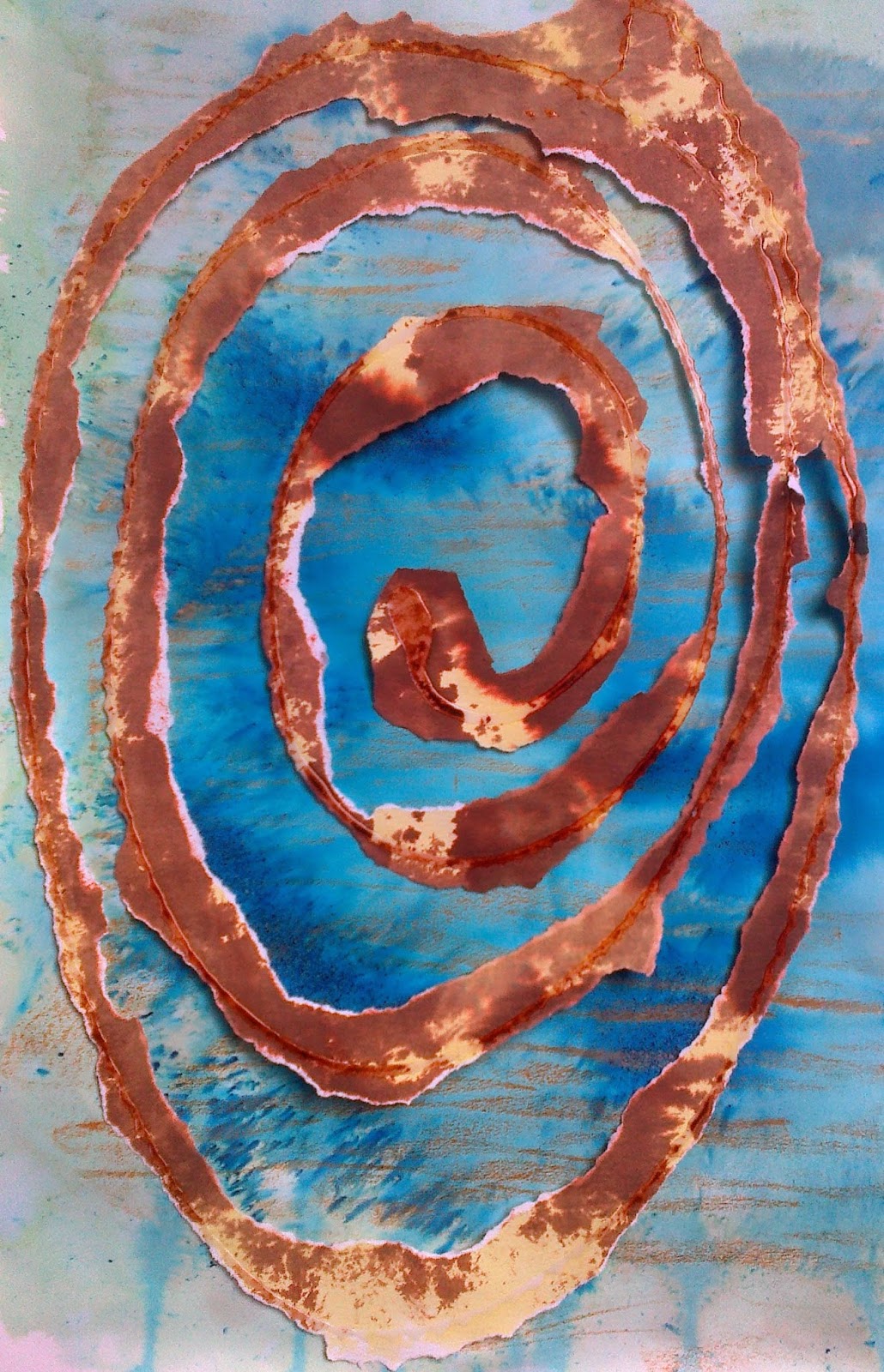
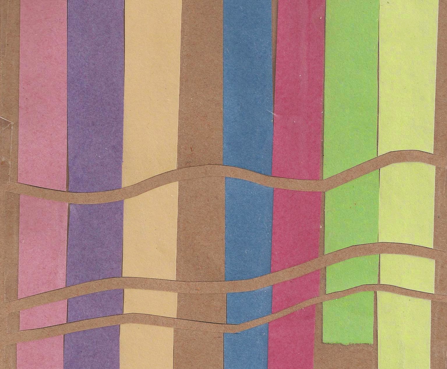
Meander was the first: Tried to look at the range of colours and combinations but to also make the meanders a little bit more meandering! In image 4 a have reversed the papers to give more tone to the colour  -the top paper had use PVA glue to give a resist before using a brusho wash. Note to self when using brusho: a)don't overwork the brusho colour as it has the capacity to fill in and expand! b) wonderful bleed effect if you mix two colours together before placing on paper.
The lower paper had used a candle resist before brusho colouring.  Image 4b uses 3 papers the top two using acrylic resist - with brusho and acrylic paints on layer 1 and 2. The bottom paper a silver crayon was rubbed over a texture wallpaper and then brusho painted Image 4c shows sponge effect with brusho. Image 4 c shows gold rubbed over an acrylic pattern where the paper was a second print from c.
Ref 6.9.5a
Ref 6.9.5b
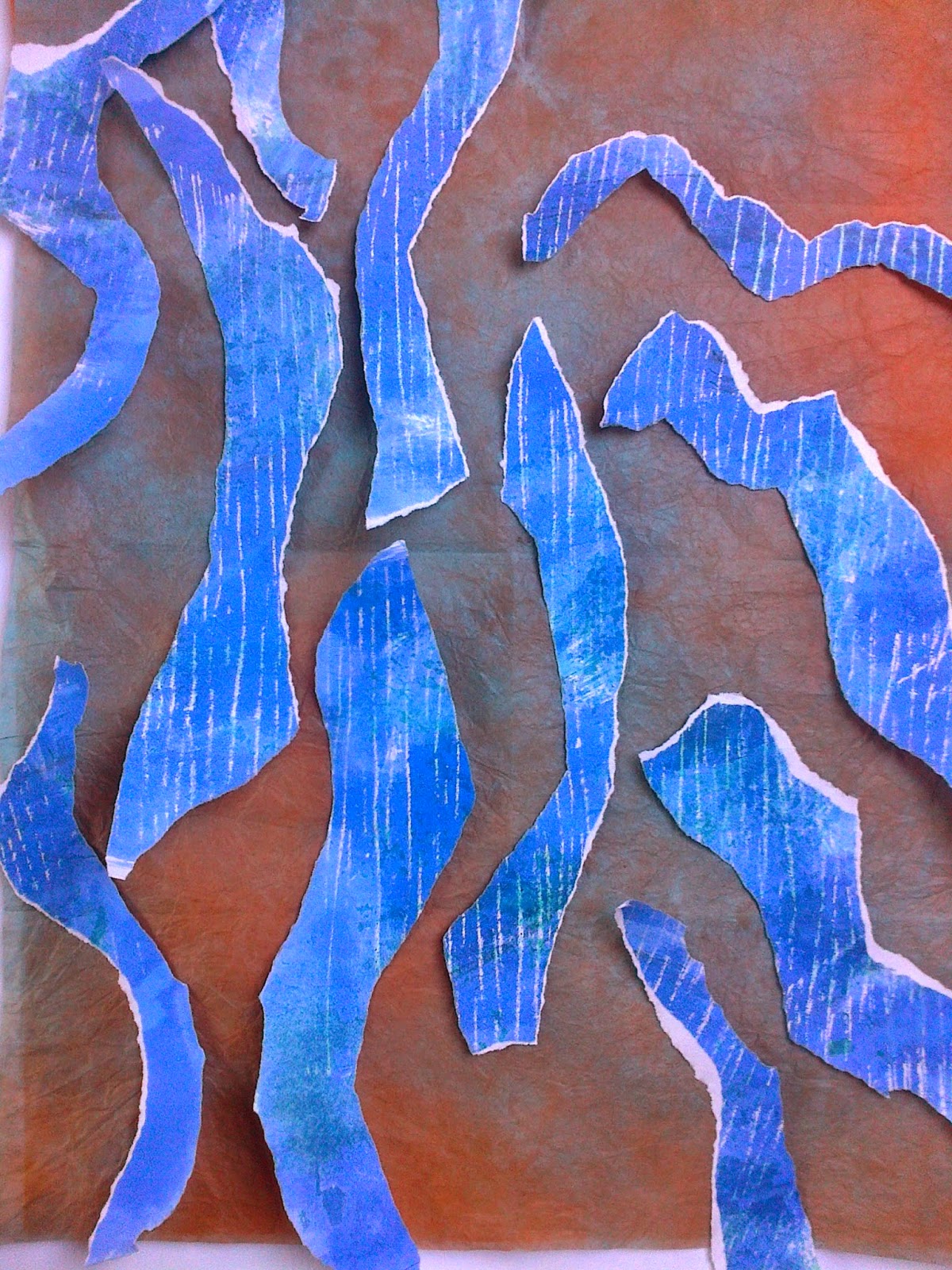
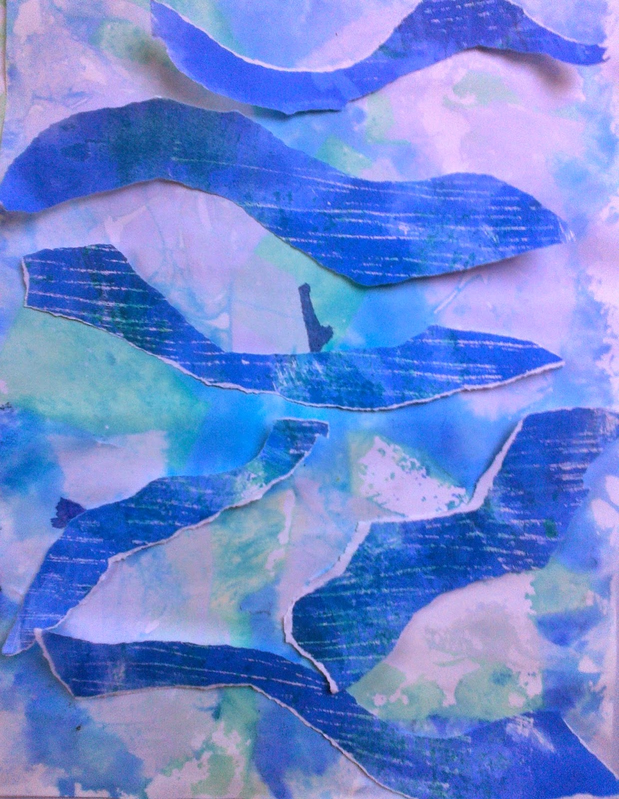
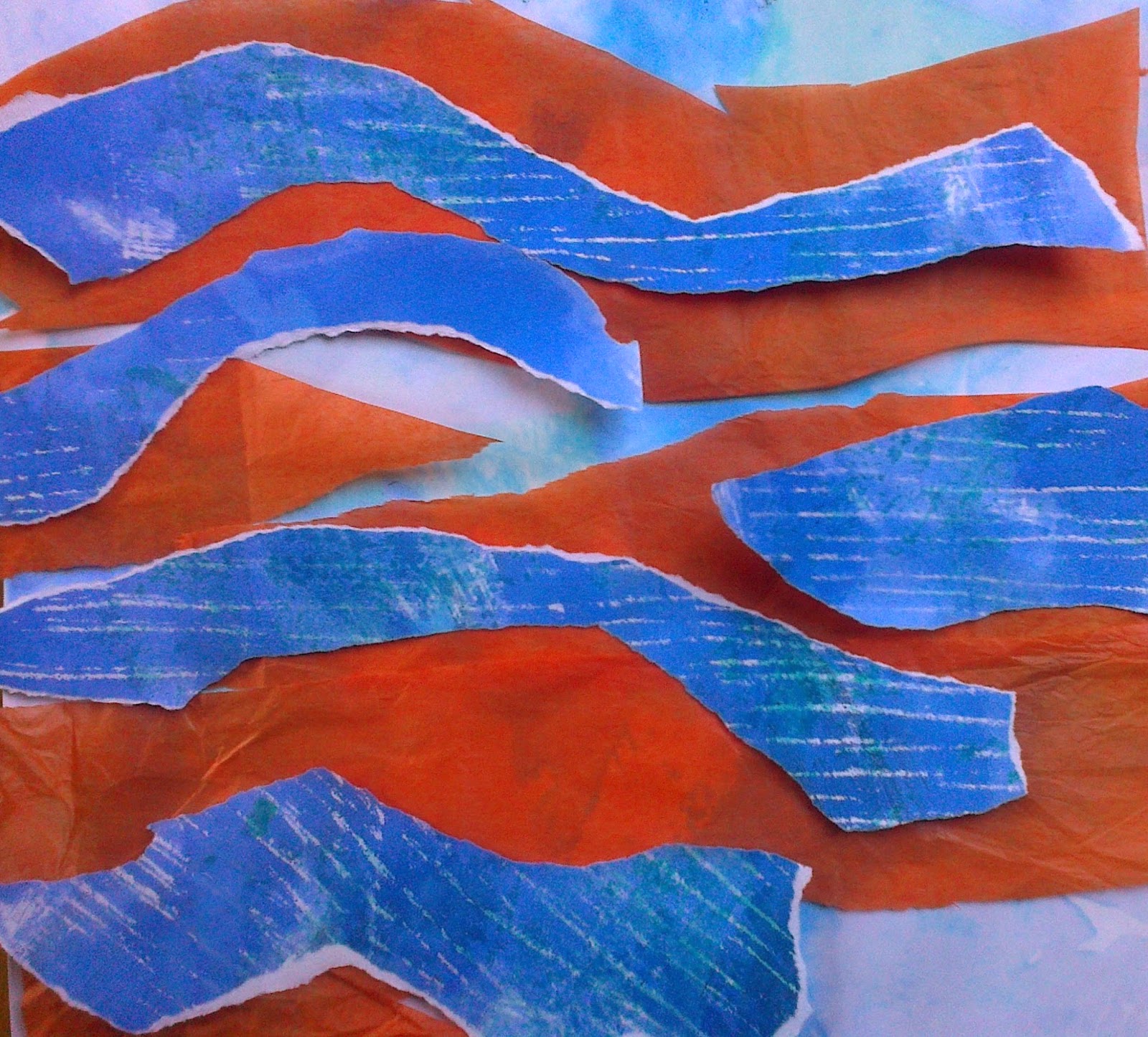
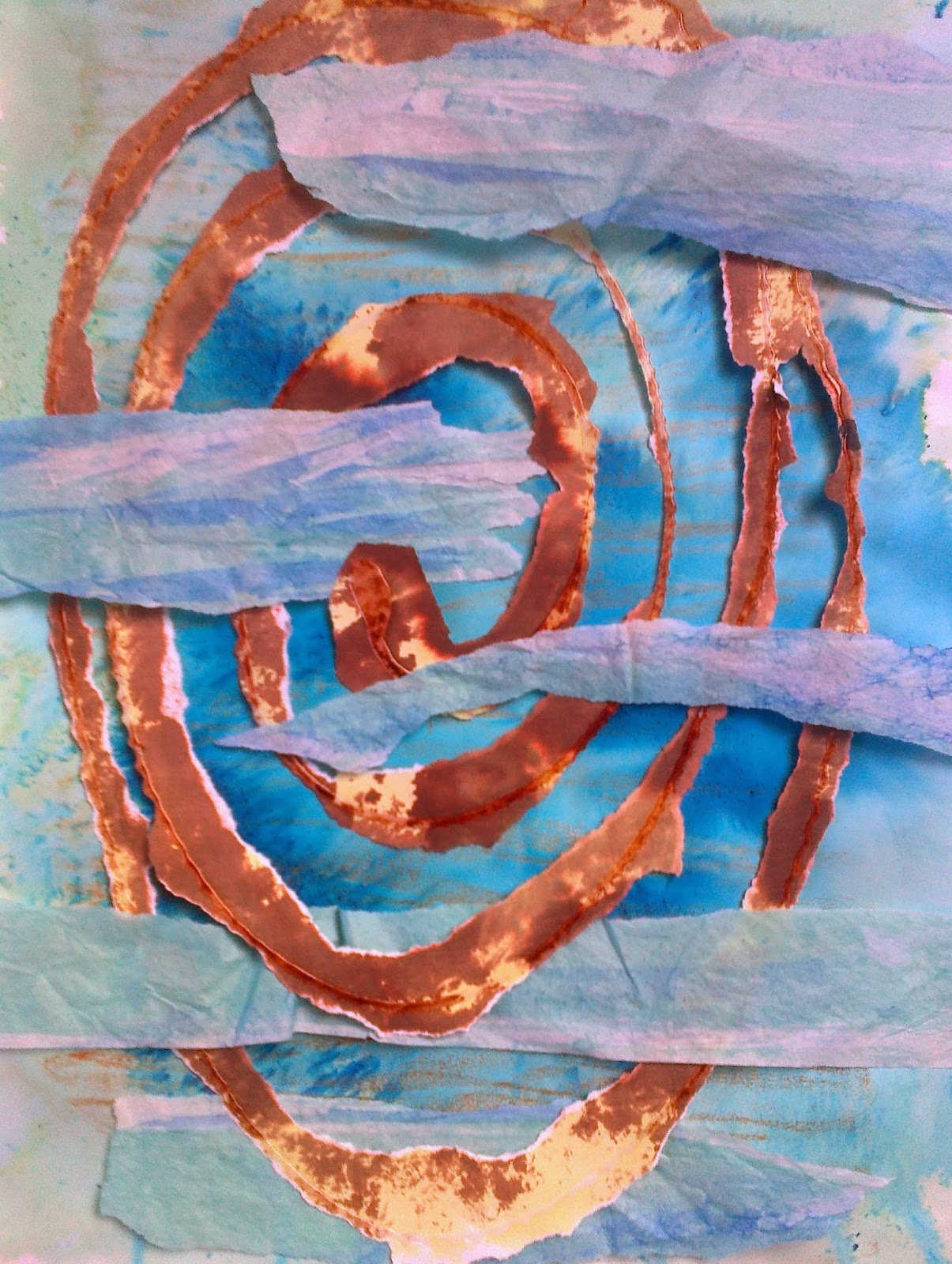
The next series meanders over three layers of changing backgrounds.  Image 6.9.5a is an orange layer over tissue under a layer of blue and orange abaca paper topped with strips of blue brusho paint over silver rubbed paper, image 6.9.5b the bottom layer is blue under the same abaca paper.  Image 6.9.5c are the same strips but placed over a brusho washed paper that was saturated and then 'dyed' with pieces of tissue paper that was peeled off when dry. For image 6.9.5d orange tissue was placed under waves.
Ref 6.9.5c
Ref 6.9.5d


For sample 2 cross currents had taken on a new life:
Ref 6.9.6a

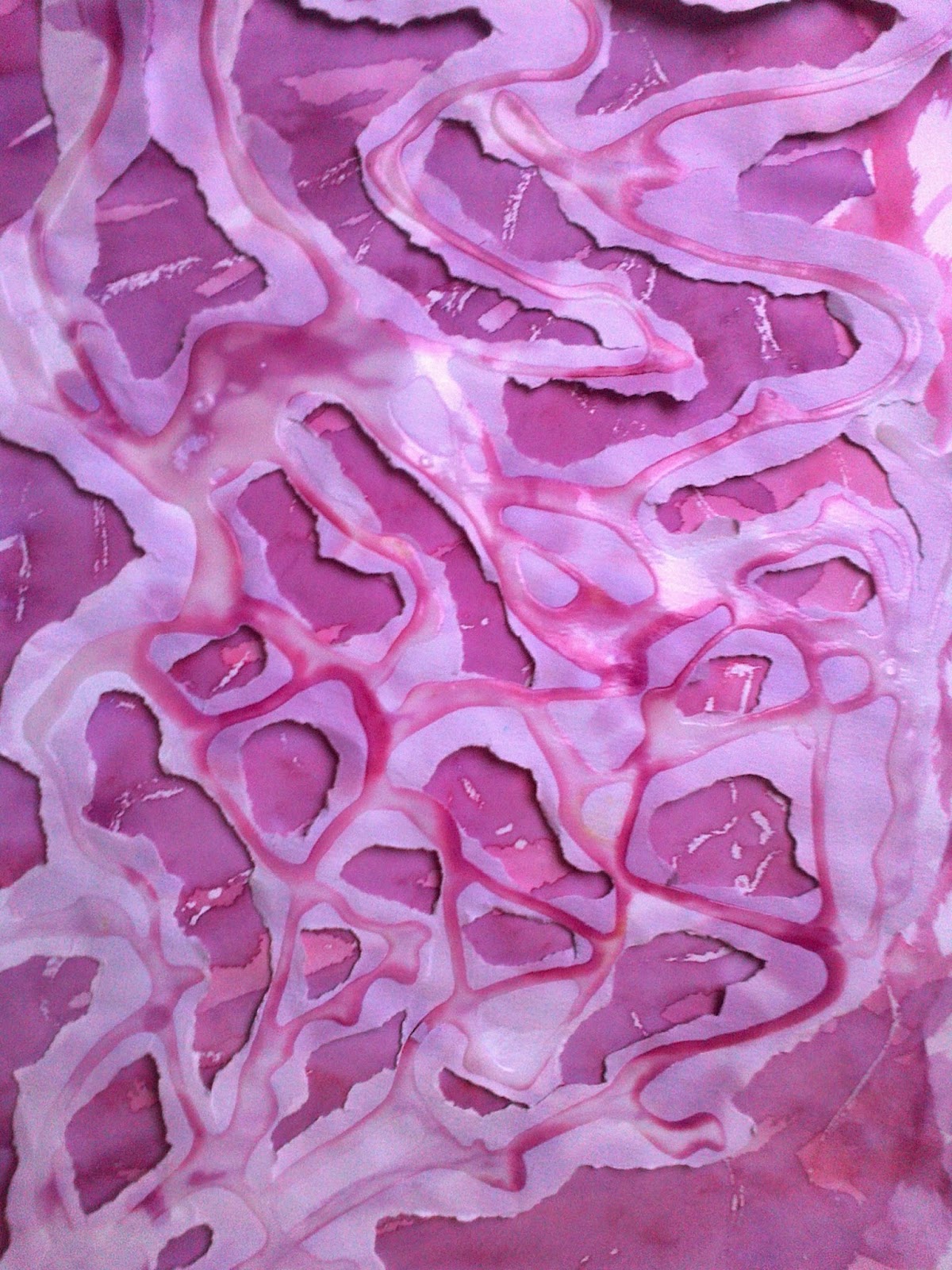
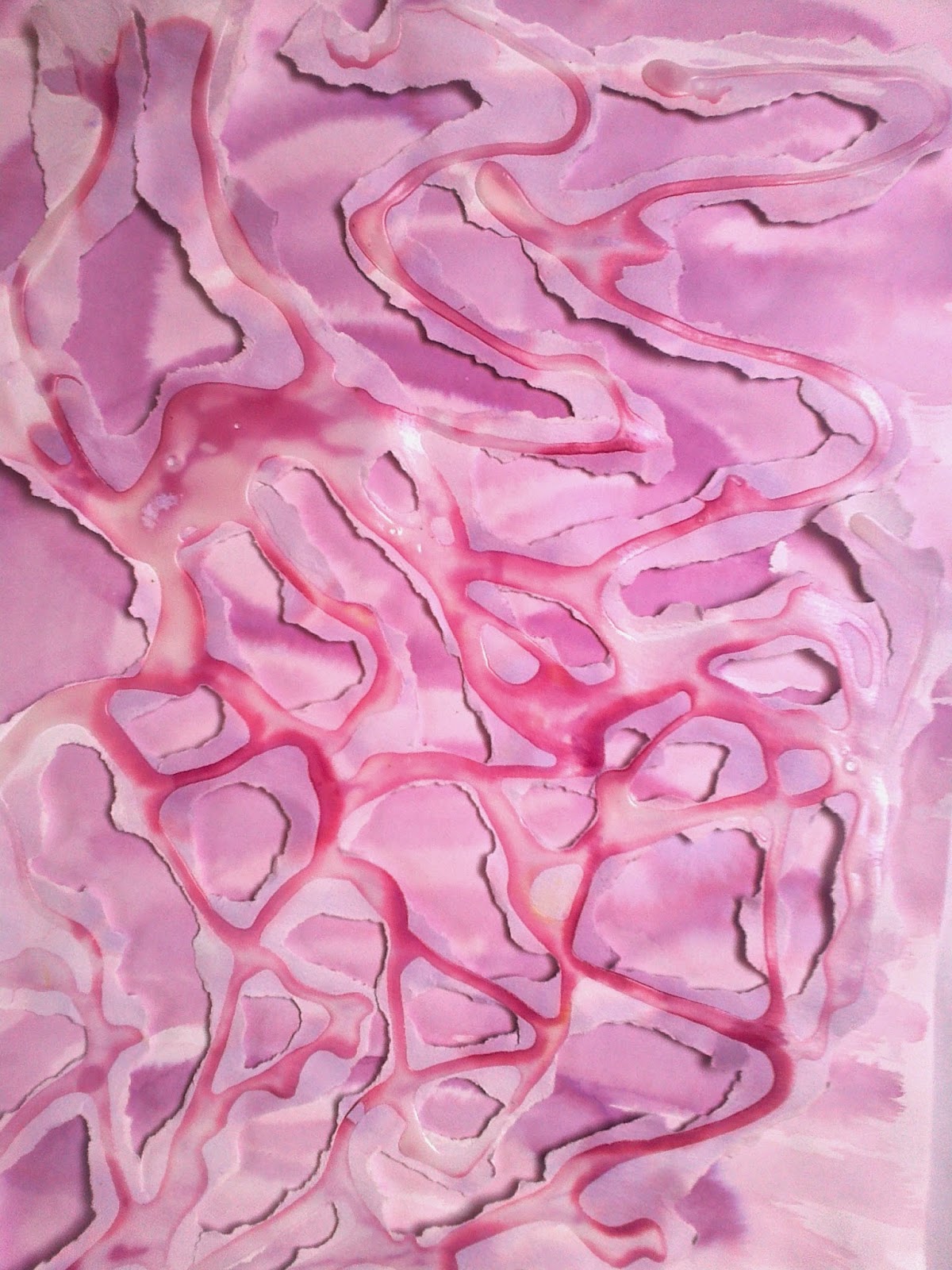
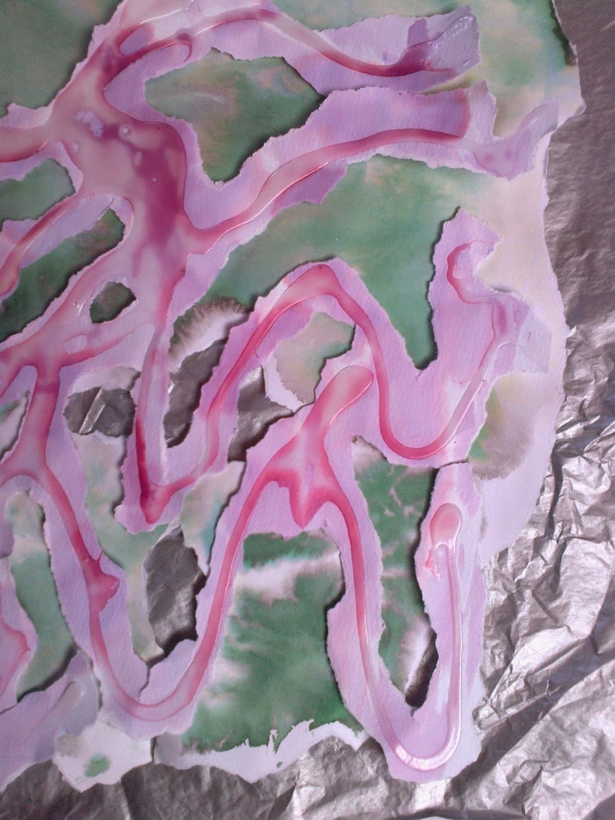
 As the original sketch could be conceived as too close to meandering chose  a more random design where I concentrated on the 'holes'. For sample 6.9.6a the top layer of PVA resist was cut and torn and placed over the lower layer of brusho painted over a silver wax resist.
 For sample 6.9.6b the bottom layer was rubbed over the original top layer paper of PVA resist with a gold wax crayon. When tearing the top PVA layer resist it was apparent that another note to self was consider how this would translate into fabric and stitch? Layering was going to be an important in the finished piece and was beginning to see that three separate but sometimes touching or alternating layers would need  floating threads would play an important part in maintaining some sense of fluidity but also support.  It was also important that texture as well as colour would be seen on the bottom, revealed layer. samples 6c and 6d were about showing the contrast and tone.
Ref 6.9.6b
Ref 6.9.6c


Ref 6.9.6d
Ref 6.9.6 d(i)
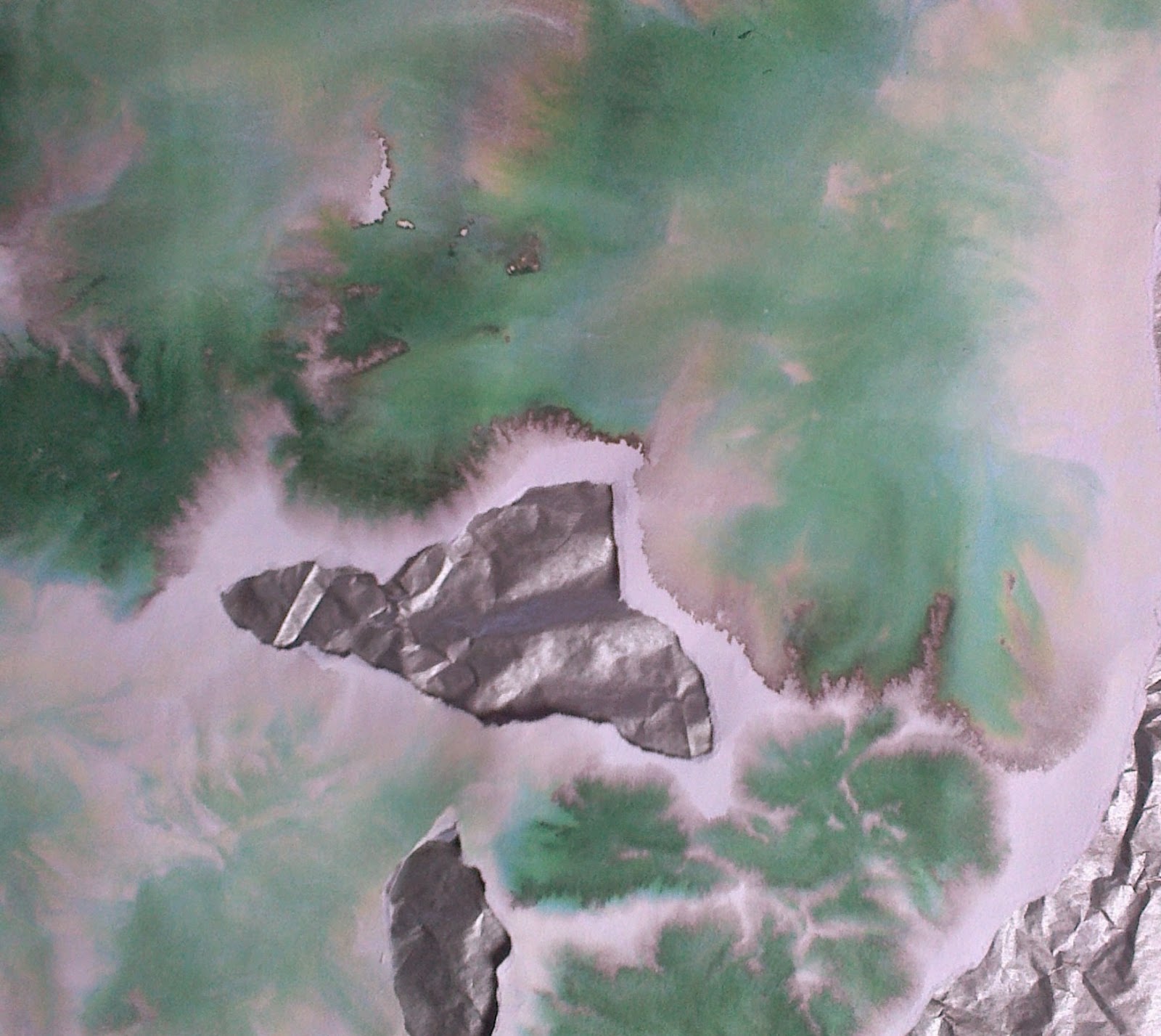
For d I have shown the 'bleed' that I like so much when using brusho and wondered on how this could relate in fray or stitch?


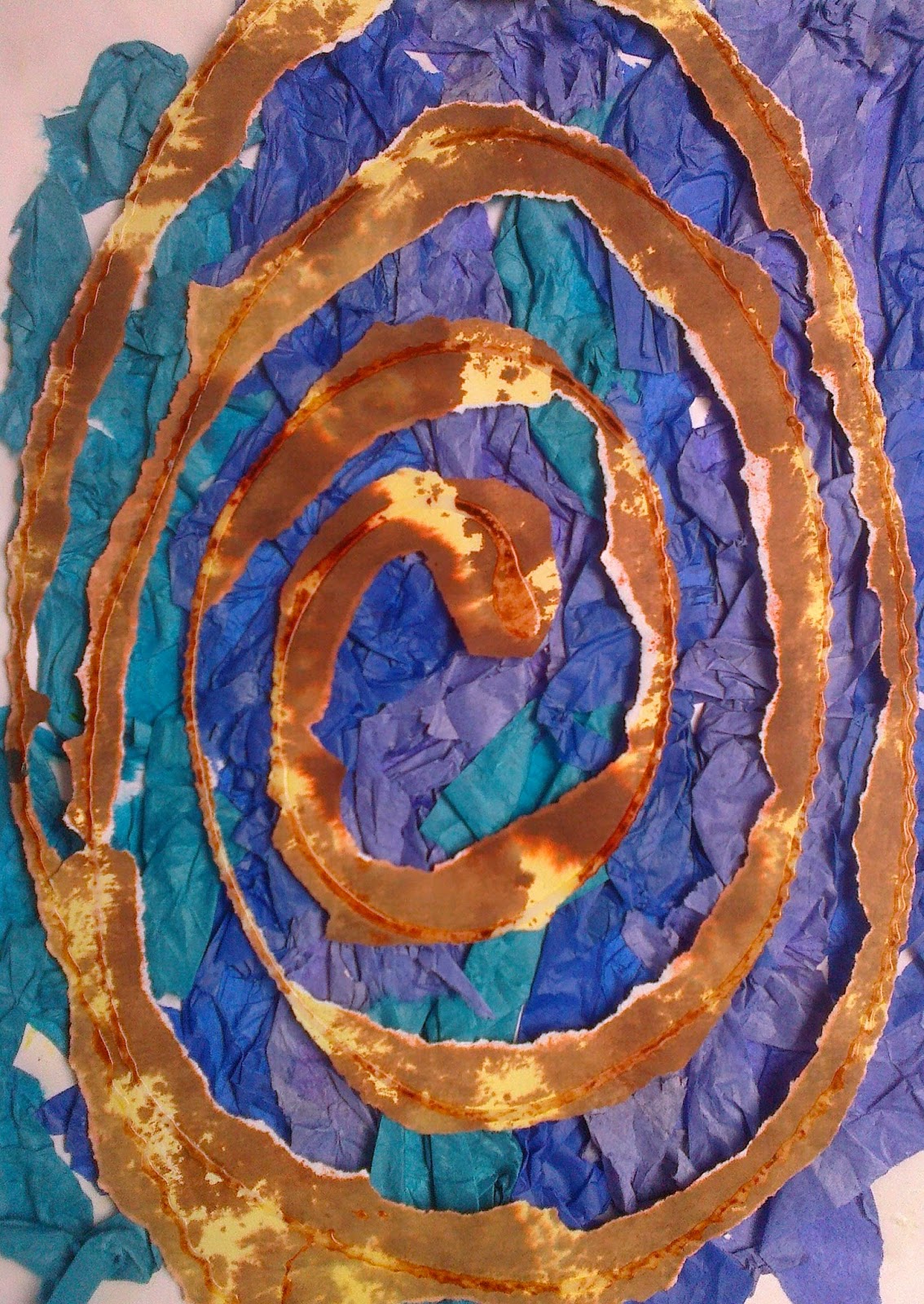
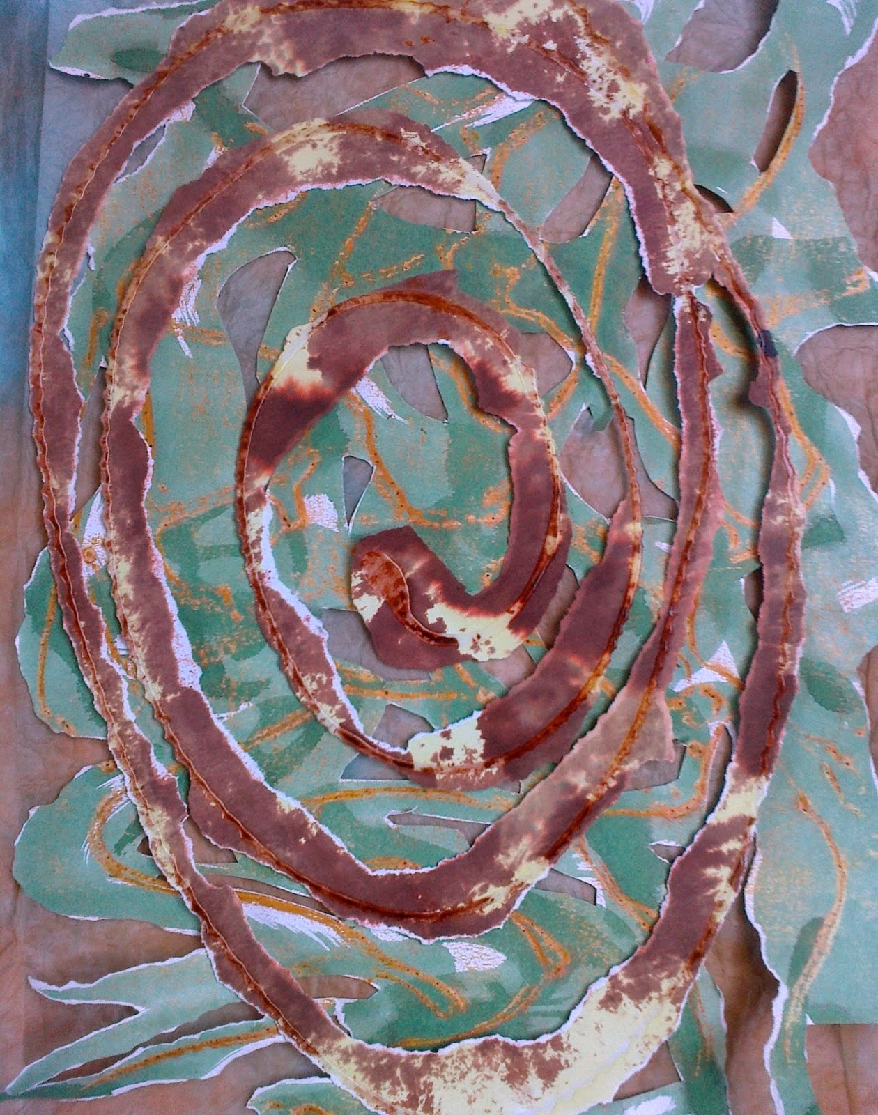
For the third image, reflection and rhythmic were in my mind...is this cheating! I wanted it as much for holding in mind as a sense of place as much as an image.  So my answer to combining was to elongate or distort the perfect circle.  The issue of light in the finished piece would need much thought not least because it would effect the palette across the piece but in the meantime on with the tearing...

Ref 6.9.7a

Ref 6.9.7b
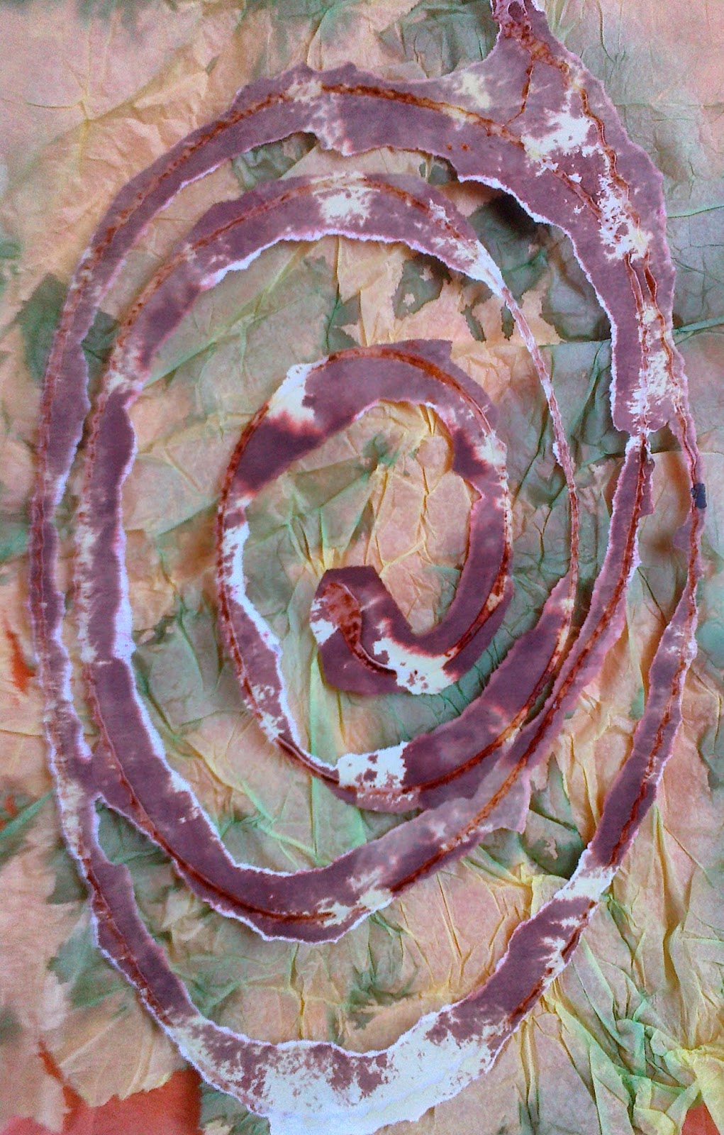
Image 7 shows the same paper using PVA on the top image and wax rub on the bottom as in earlier samples.  In 7b the inclusion of tissue that was pleated dyed and opened was included.
Ref 6.9.7c

Ref 6.9.7e
Ref 6.9.7d
For the remaining three images I feel that the swirl  should be more diffused, as in b, and was beginning to see that the swirl would be best used as a raised shape or texture rather than a predominant colour feature.


As this was happening tried to put some thought of the practicalities of making the final piece so took a pause to look back over the chapters to get a feeling for how to proceed to Chapter 10.  It was difficult not to be too prescriptive but as I had so many ideas realised I need to simplify design ideas and concentrate on the essential nature I was trying to portray. The five words to the module after Conservation were shape, colour  and now I needed to concentrate on texture, line and form as well as my conservation theme diversity.  My thoughts on the final sample had drawn me to an idea of using three panels on a 1:2:3 ratio and while the image below doesn't show that it is something for my work board that says, 'keep it simple but moving across the piece'.

Ref 6.9.8


Monday, 29 December 2014

Chapter 8b compositions to take forward

Before moving onto Chapter 9 I needed to select at least 3 small colour compositions.  
So a pause to review preceding chapters and also take photos and sketches of  Glen Nochty.  Being winter the bright colours of my earlier chapters were not evident and a pastel hue seemed to be more relevant! But will play with the colours in Chapter 9 In the meantime have used coloured sugar paper which reflects this gentler tone. By a strange coincidence I looked at the geological map of the area- its one of my quirks- and guess what!  
Ref 6.8b 1
Ref 6.8b 2
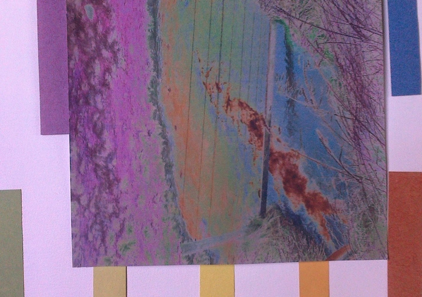
Just love the fact that there's a flash of pink in the middle at bottom line of picture! It indicates the presence of Grampian Granitic bedrock! Following a walk in Glen Nochty a simple picture of one of the small burns that runs into the Nochty revealed the following image when I colour embossed it!
Ref 6.8b 3
Ref 6.8b 4 i and ii
But no decisions on colour until I decorate papers in chapter 9 and experiment with colour tones .  For now an experiment with the sugar paper and images from previous chapters. For sample 3 inserted a slither of colour, which on seeing as I write the blog would be nice to see in the reflected image...
For the samples in 4 used colour to play with the shapes 5 and 2 in the first part of Chapter 8 which  appeared as 3 and 5 in Chapter 6. Should have kept my sample numbers in some sequence to have made cross referencing easier.
Ref 6.8b 5 i and ii
Ref 6.8b 6

The samples in 5 left revisited images from Loch Courusk and the wave patterns (bottom image 5 ii) in the sand as in 8.5.  Neither were not successful and had written all over them, 'need to revisit' but it did reminded me of a more interesting image I had used for my notebook cover on my wanderings around the coastline of Scotland.  The fact that a footprint causes sand to dry out as you walk always intrigued me as do contour lines hence the drawing in 6.

But before go into Chapter 9 just wanted to put in a line from a poem that we used for our Walking To Health group Christmas card, WH Davies 's poem What is this life.  We were on a walk in October this year when the title came to mind and no one could get the author,  although we all knew the first lines.  Googling it I was delighted to read it and these lines about water and sky leapt out:
No time to see, in broad daylight, 
Streams full of stars, like skies at night.


Friday, 19 December 2014

Chapter 12 Three Artists

Jae Maries
Having recently attended a workshop with Jae Maries it was a delight to  see her name as one of the selected artists for this module. Apart from taking away key sketches and ideas from Jae's workshop it was a luxury to be encouraged to take time to consider what the finished piece would reflect about my thoughts and the journey of setting off and finding new solutions that added to the finished piece.  
With this in mind  for my resolved piece I explored images of Jae's work.  The key ones included Jae's influence of  exploring the relation of people and their environment, an aspect I am wanting to include in my resolved sample. Using  a daily notebook Jae  records her life through symbolic and abstracted marks and forms. Jae has been careful,' not to be directly influenced by other artists and that is an issue to bare in mind with one's own work' ... 
It is important that rather than copying or trying to be in the style of an artist we do not lose our own voice as Jae points out, ' for the artist to produce truly original work and find his or her distinctive voice, it is essential to develop a personal method of expressing their own feelings and responses to the world'.. 
Words to concentrate the mind in this final chapter of the course.
Nude in the landscape, seen right, had a resonance with the theme of the landscape that has been occupying the last few months of work on the Module.  The shapes and colours reflect how an atmosphere is set by a simplicity of execution rather than too much detail.
Site Development  1 shows in a different mood, a design which invites the eye to be drawn across the image to explore smaller areas of detail. The simplicity of the colour palette and the fact that the composition doesn't sit in a specific boundary of a rectangle encourages you to move  across the panel and to consider if an original piece has been torn and then rejoined...
While I cannot seem to enlarge these photos from the internet they look as though they are very textural. The last picture, Tracts, appears to have a simple tonal palette with a slice of complimentary colour that brings it to life with subtle movement


Barbara Lee Smith

An artist who was unknown to me until I read  Carol Shinn's inspiring book on Freestyle Machine embroidery in 2010.  Barbara's background in embroidery has led to her interpretation of landscapes with  subtle layers of paint, a variety of backgrounds of fabric, paper and other nonwoven fabrics  and thread.  Her  exploration of nature brings the essence of the landscape and her experience of it to the viewer. In a fascinating interview of how she moved from embroidery to fabric printing and painting she quotes Constance Howard for inspiring her to work on a large scale 'Work big, you see your mistakes faster! '  Much of her work certainly lives up to her taking this advice to heart. The interview appears in  http://www.textileartist.org/barbara-lee-smith-rhythms-nature-part-1/ and is a great insight into her method of work and inspiration.
detail Red Right Returning
The images that have stayed with me from her gallery include,  Red Right Returning.  Working with maps is something I have long enjoyed, so for me this image was dramatic.


The subject matter Wind, right, is shown besides Westerlies and show how the energy of these elements are reproduced in Barbara's work.
A host of multiple images are also reproduced to show the impact Barbara Lee Smith's work has even when not individually large.
http://www.textileartist.org/barbara-lee-smith-rhythms-nature-part-1/salt-sand-stone/ 
Leila Thomson 
http://www.hoxatapestrygallery.co.uk/tapestry-art-prints/cat_2.html
Orkney artist Leila is for me a 'must see' when in Orkney. To anyone visiting, particularly if you are landing at St Margaret's Hope the short journey to her studio's takes you past one of the loveliest bays in the UK. Her tapestries are inspired by Orkney's ever changing landscape and scenery, as well as Orkney folklore and heritage. Leila Thomson graduated from Edinburgh College of Art with BA Hons.1st class in 1980.  Her large tapestries are most frequently made to a commission...but you may need to contact her well in advance. However her prints do get across the atmosphere of her subjects.
Tapestry Art Print: 'Echoes'Leila's ability do encapsulate the spirit of the place in her tapestries stayed with me from my first visits to her small studio, which has recently been expanded to included the work of her children. One of the key aspects that appeals to me about Leila's work is the inclusions of the human form in her work and it is those images  that I have focused on. 
The image to the right, Echoes
Tapestry Art Print: 'A lifetime together'

A Lifetime Together, is a print that a couple of my friends gave me on the death of my parents.  For me it gives that wonderful sense of wonder that you can find when sharing the gift of discovery of a special stone or shell in the company of another. The colourful elements and shafts of light and images of birds adds to a very personal reflection.


Tapestry Art Print: 'Symbols of hope and humanity'Symbols of Hope and Humanity, gives an imaginative image that allows the viewer to take their own journey amongst the elements with a glimpse of our place amongst the wider world.
Milestone Community Church Tapestry shown below on 
https://www.facebook.com/HoxaTapestryGallery
 gives more details of the textures that Leila achieves in her work. 
Photo: Milestone community church tapestry is now well underwayAll three artist give a very different relevance to the work that we are tasked to achieve in our Resolved Sample.  But the key aspect that comes across from them is that they know the landscape intimately that they represent in their work.

Three very different artist who have given me much food for thought in setting about completing my resolved sample.

Sunday, 7 December 2014

Chapter 8 Conservation theme

The concept of conservation seems to have evolved from its definition in the 1950's of preserving, restoring and protecting. It now includes supervision, educating and involving the population in the 'duty of care' for the planet and their own individual communities and at the same time improvement in their own health from being outdoors.  How these themes are evolving into policy can be seen,October 2014,  Act for Nature.
http://www.rspb.org.uk/joinandhelp/campaignwithus/act-for-nature/index.aspx

Reading and research some background to thoughts that would help me decide on a theme for my resolved sample led me to recall two inspiring people who originally  gave me tangible evidence of what had/could be done to appreciate the environment ...Theodore Roosevelt, the 36th President of the United States of America has these words carved in the magnificent lobby of the Natural History Museum in New York;
Nature
There is a delight in the hardy life of the open.
There are no words that can tell the hidden spirit of the wilderness, that can reveal its mystery, its melancholy and its charm.
The nation behaves well if it treats the natural resources which it must turn over to the next generation increased, and not impaired in value
Conservation means development as much as it does protection.
and a Scotsman John Muir who would influence Roosevelt in the establishment of the National Parks of America.  While Muir notes 'Not blind opposition to progress, but opposition to blind progress ' his part in establishing the Sierra Club would sow the seeds of the green movement.http://www.sierraclub.org/

Living in the Cairngorms National Park I am aware of The John Muir Trusts key objectives to discover, explore, conserve and share with the addition objectives of the Outdoor Access Trust for showing care, respect and responsibility for the land we live in.  While these key words may not have the high profile and headline concerns of what is endangering our planet the attraction of these objectives is in the fact that you can play an active and positive part in understanding the issues of a particular area. The John Muir Trust Award asks you to Discover a wild place and actively explore and research that place.  This research should then inform you as to what needs attention and  how you can share that with others with a maxim of; ' take only photos leave only footprints'.

So those key words have been added to my workboard. Musing on environmental songs on the 60's and  70's also stimulated thoughts for the exercise in visualising words: bend, calm, choppy, combined, crushed, currents, evolve, enclosed, fast, gentle, meander, quiet, slow, straight, swirling, tumbling, restful, ripple, rhythmical, undulating, violent, vortex.  The italics indicate words from Sian's collection the rest I have added from aspects of previous samples and the words selected for Chapter 3.
Ref 6.8.1a
Ref 6.8.1b
 The first exercise, to cut shapes inspired by the words, the first simple shape developed into four samples as I suddenly realised I wanted to consider the possibility of dimension as well as positive negative images.

 Ref 6.8.1.ci
Ref 6.8.1.cii
The spiral fall out in 1c.ii obviously inspired the next design!


Ref 6.8.2a
Ref 6.8.2b


 Meanders started to appear and also began to realise that shapes in water are often replicated in cloud patterns.  The shading that one sees in a mackerel sky has a certain wave like quality to it... the sample 2b not only helps to consider a side view but helps to consider how shading could also deepen the effect
For sample 3 I tried to convey,'choppy' and the side angle and the 3D  'model' hopefully show how fabric could be manipulated to show that!
Ref 6.8.3c
Ref 6.8.3b


Ref 6.8.3a


Ref 6.8.4a
Ref 6.8.4b
Sample 4 looks at the idea of choppy surface quieter undertow! and came from a sample done in an earlier chapter
Sample 5 takes the idea a step further and looks at cross currents, on river banks and sea shores these currents and the flow of the water are responsible for erosion and deposits
   
Ref 6.8.5
Sample 6 looks at the 'prints' that water leaves on sand and soil after it has flowed over it. A host of other prints of what is left beside water could be explored...

Ref 6.8.6


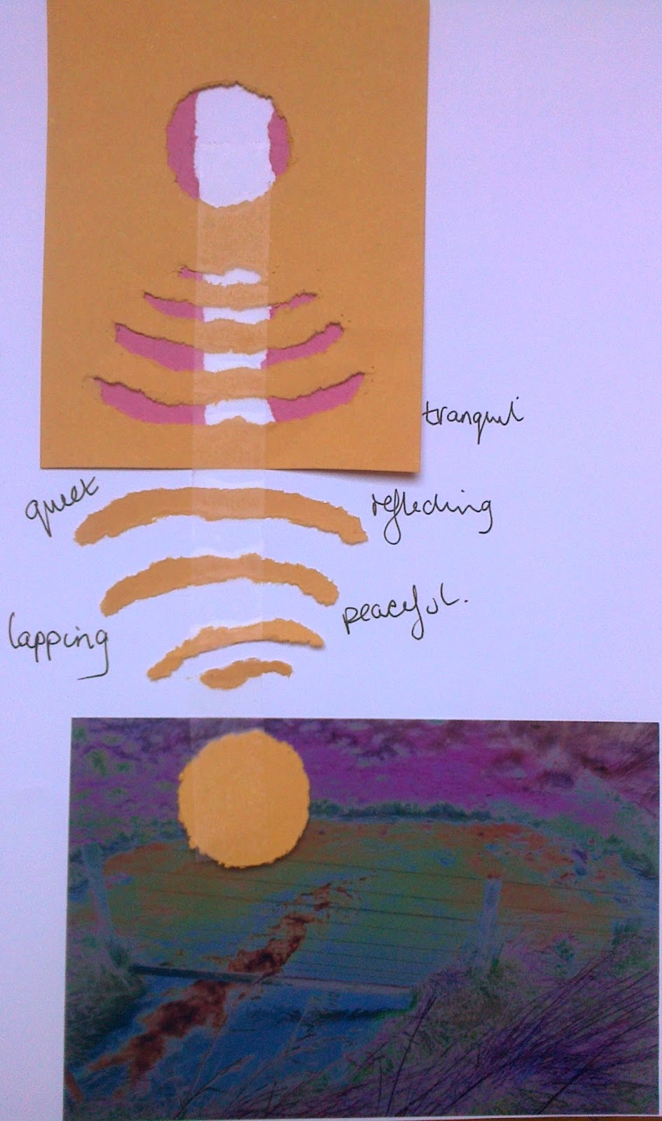
Sample 7 gives a more reflective glimpse that brings sea and sky together. 
Ref 6.8.7

As I move through visualising these words with black paper my mind can't help but review ideas for the resolved sample.  While my mind is still swithering on a final theme I have been collection objects and looking at details in photos to help inspire me and focus what papers I produce for Chapter 9. I have also been collecting ideas related to literature and folk lore regarding sky and water e.g. Selkie, the legend of a seal turning to a man.

While our sample is not to be a pictorial record of the place we chose it seems important that the design reflects in some sense the soul or sense of place.  As well as the importance of sight and the images all other senses play a part, touch- rough, smooth, spiky, rounded; sound - peaceful, windy, birdsong, animal sounds; smell - freshness, vegetation.
A glimpse at my dilemma?...In earlier Chapters my consideration veered towards the Caledonian Canal and the environmental sensitive sites along it and the fact that much emphasis has gone into encouraging people to use it for a host of activities. However I felt that I wanted to visit the chosen site more frequently to get a more complete understanding and as the Caledonian Canal is a three hour drive away a specific site within Glen Nochty, which is 2 miles from my house, seemed more appropriate. In addition my carbon footprint would be much healthier!! 
In the introduction to the Module we are asked to consider 'where else you might display this resolved sample' ?   My thoughts were that it could be a centre piece for a local exhibit which again would be easier to achieve and relevant to the area.  I am currently producing work looking at  'pathways'  and this could sit well beside the resolved sample.  I am considering undertaking the John Muir Trust Award Challenge so this could also provide a series of relevant locations outwith the local area and further afield in the John Muir local offices.