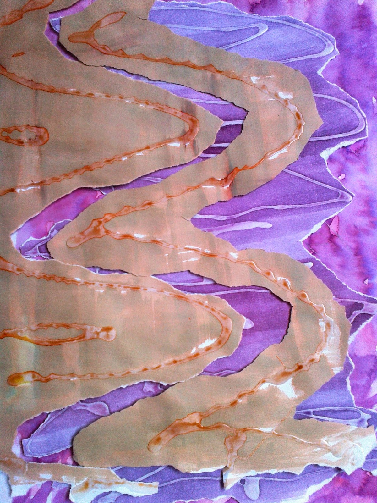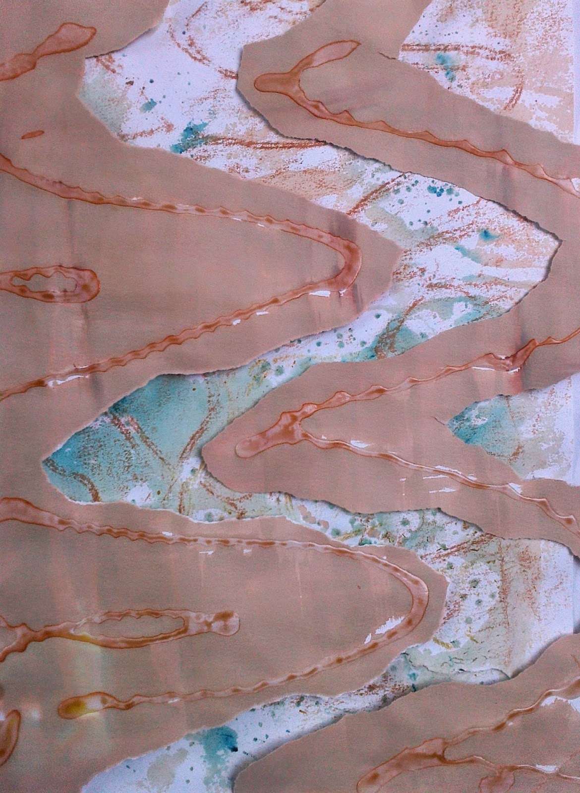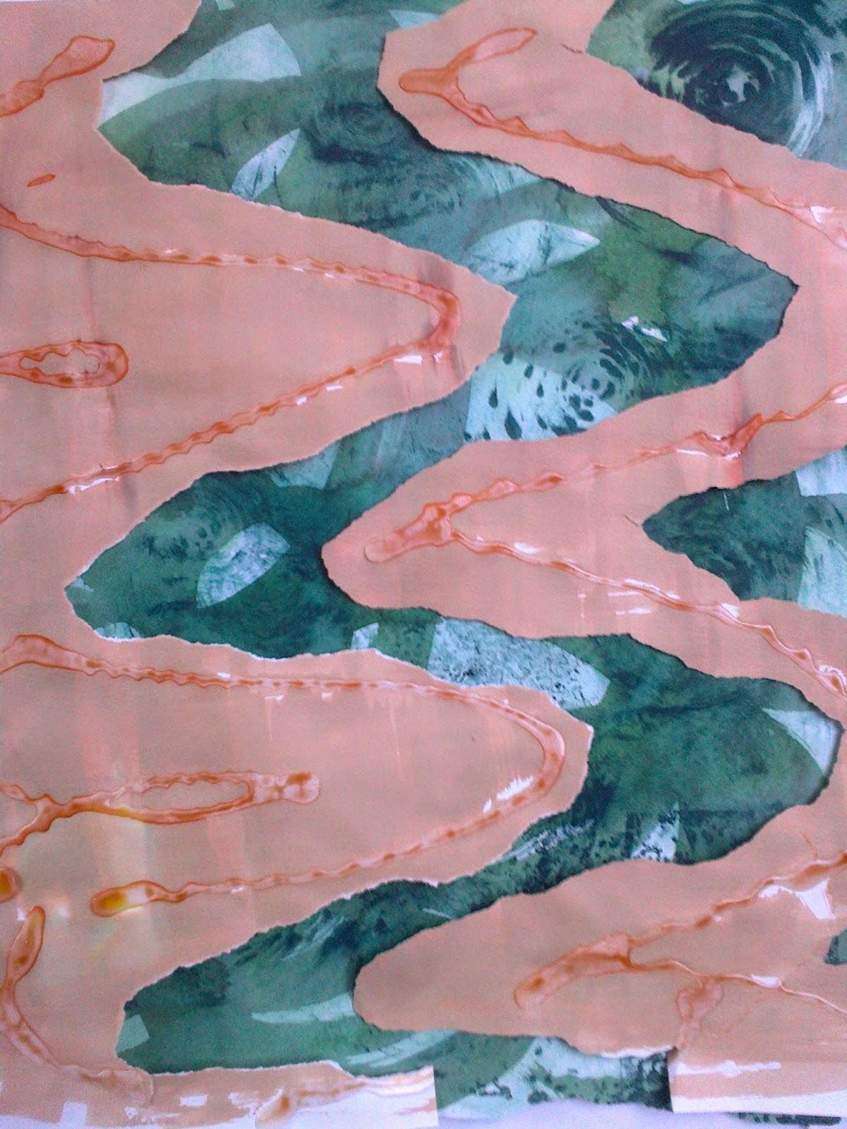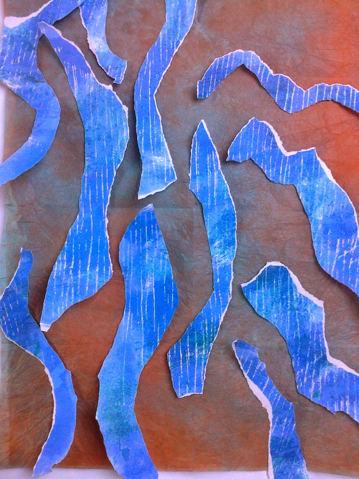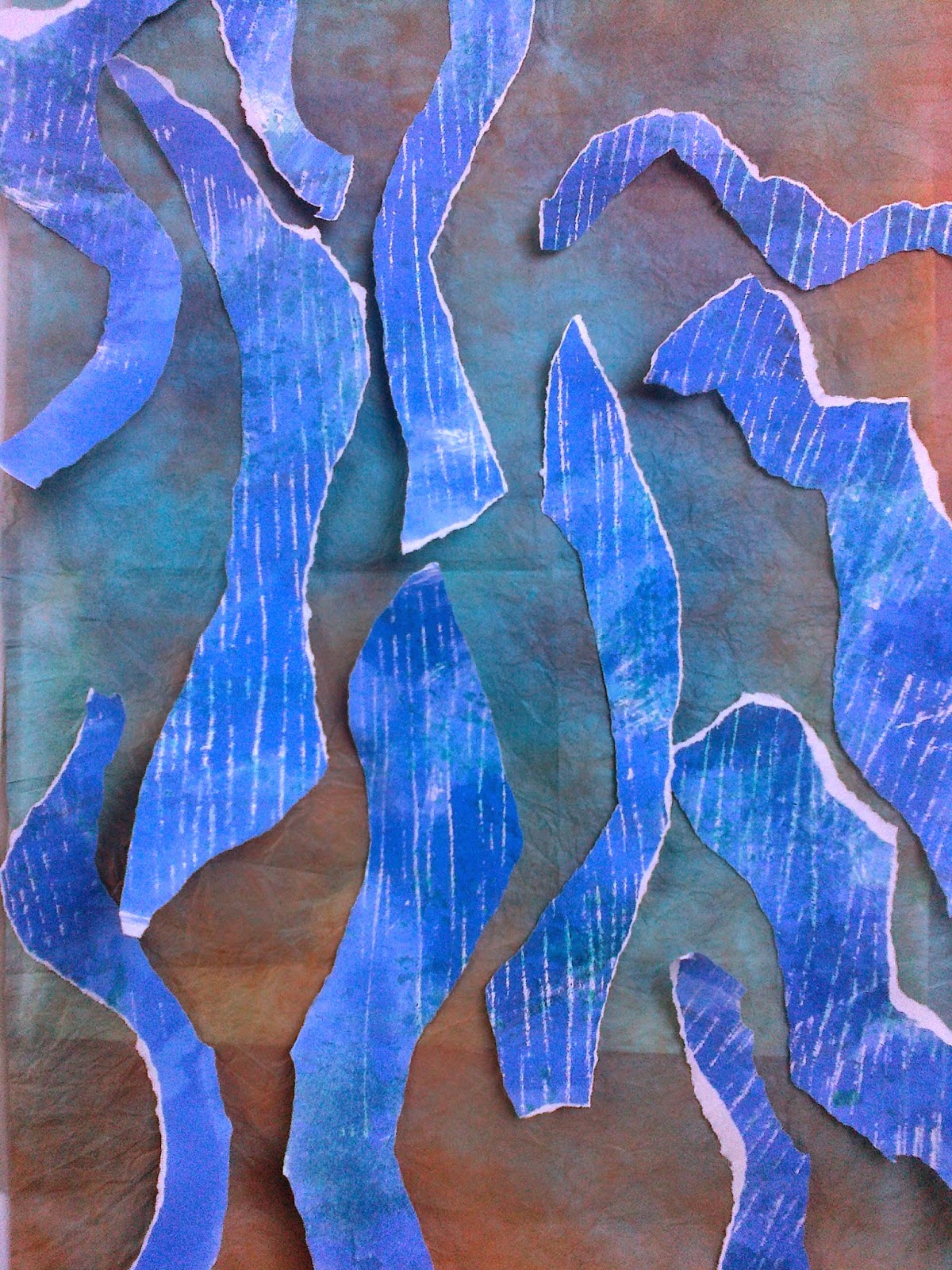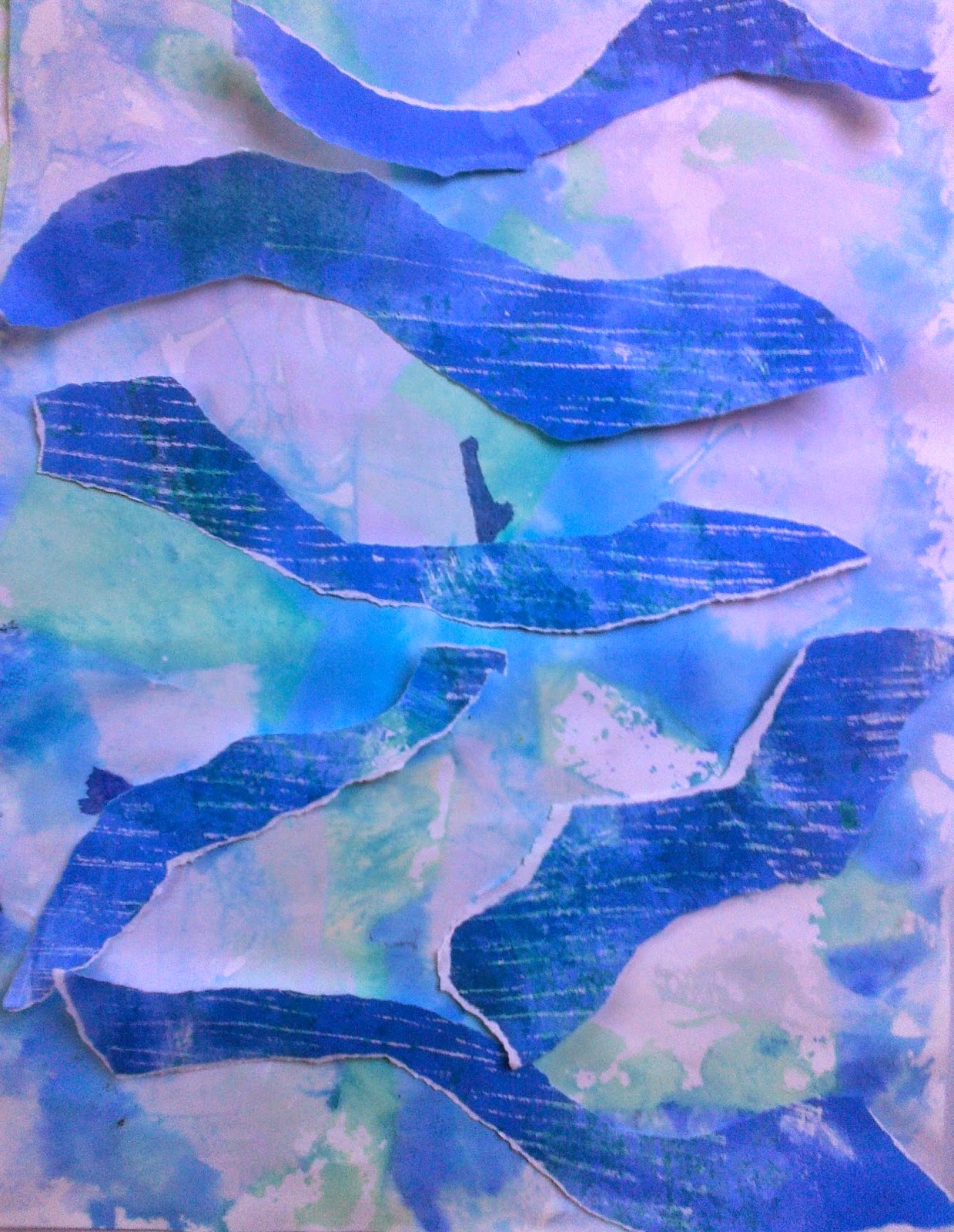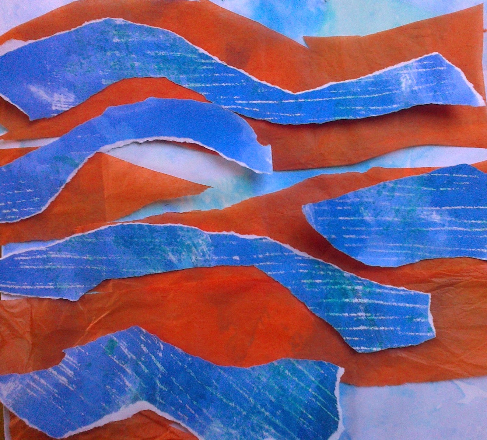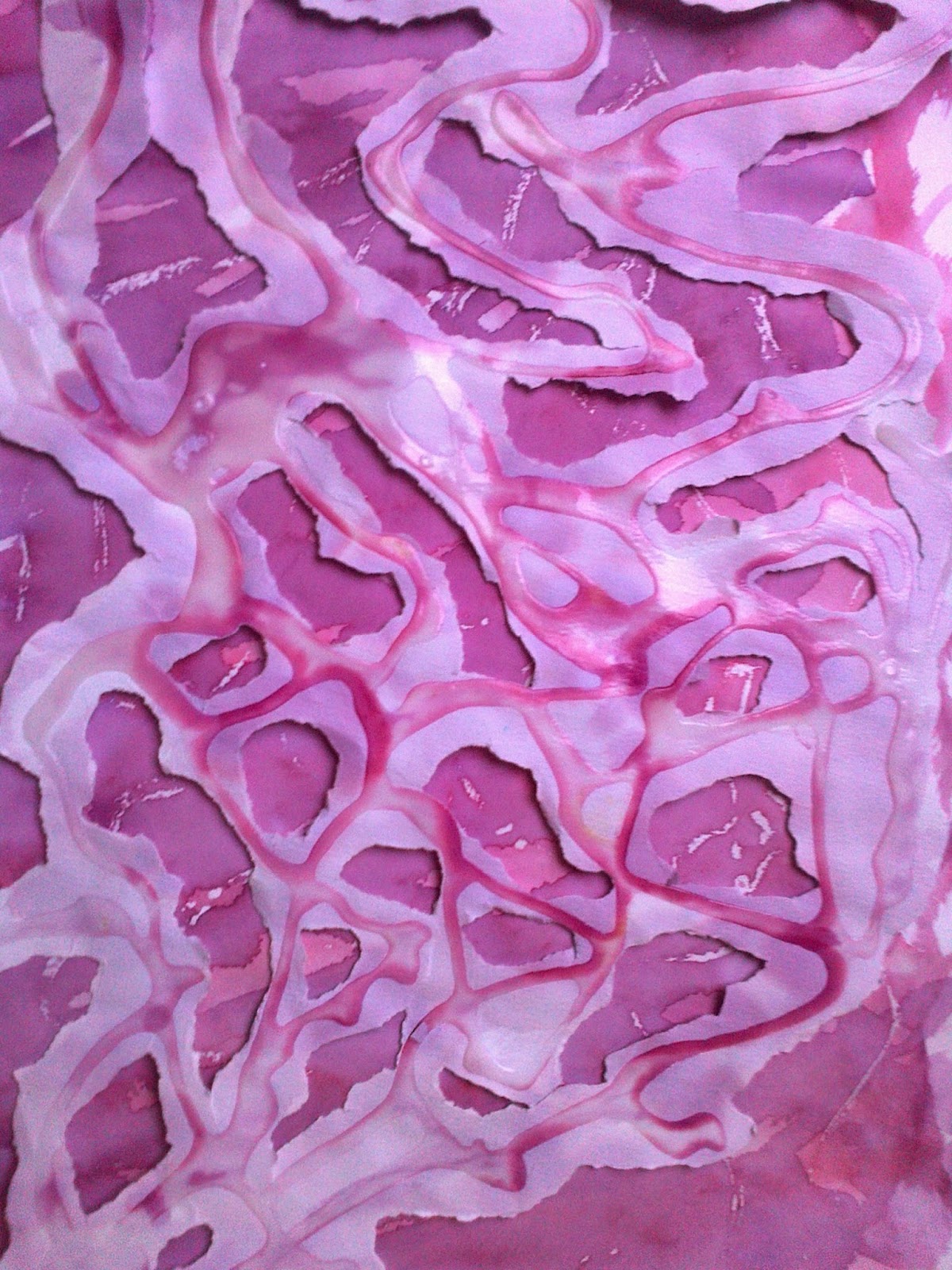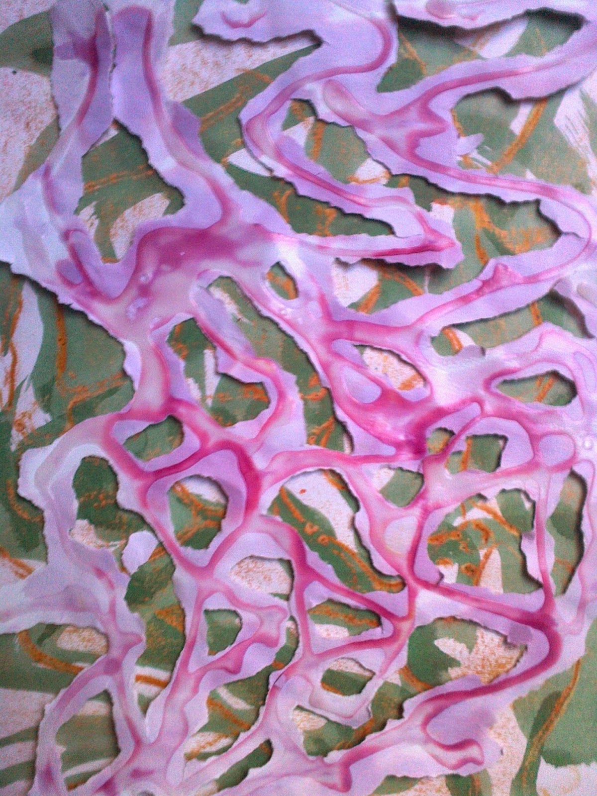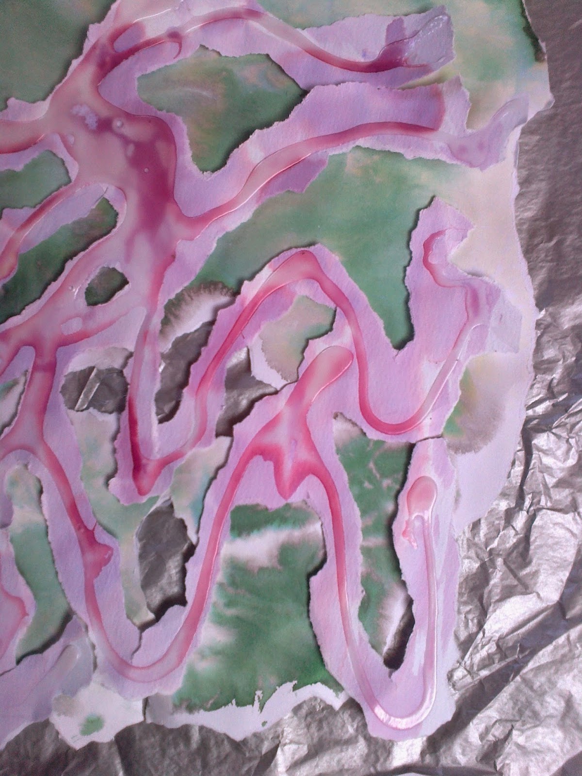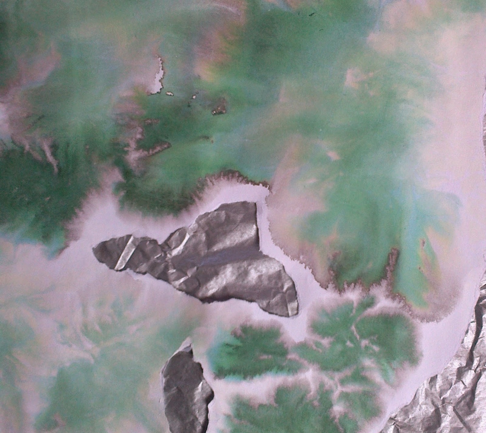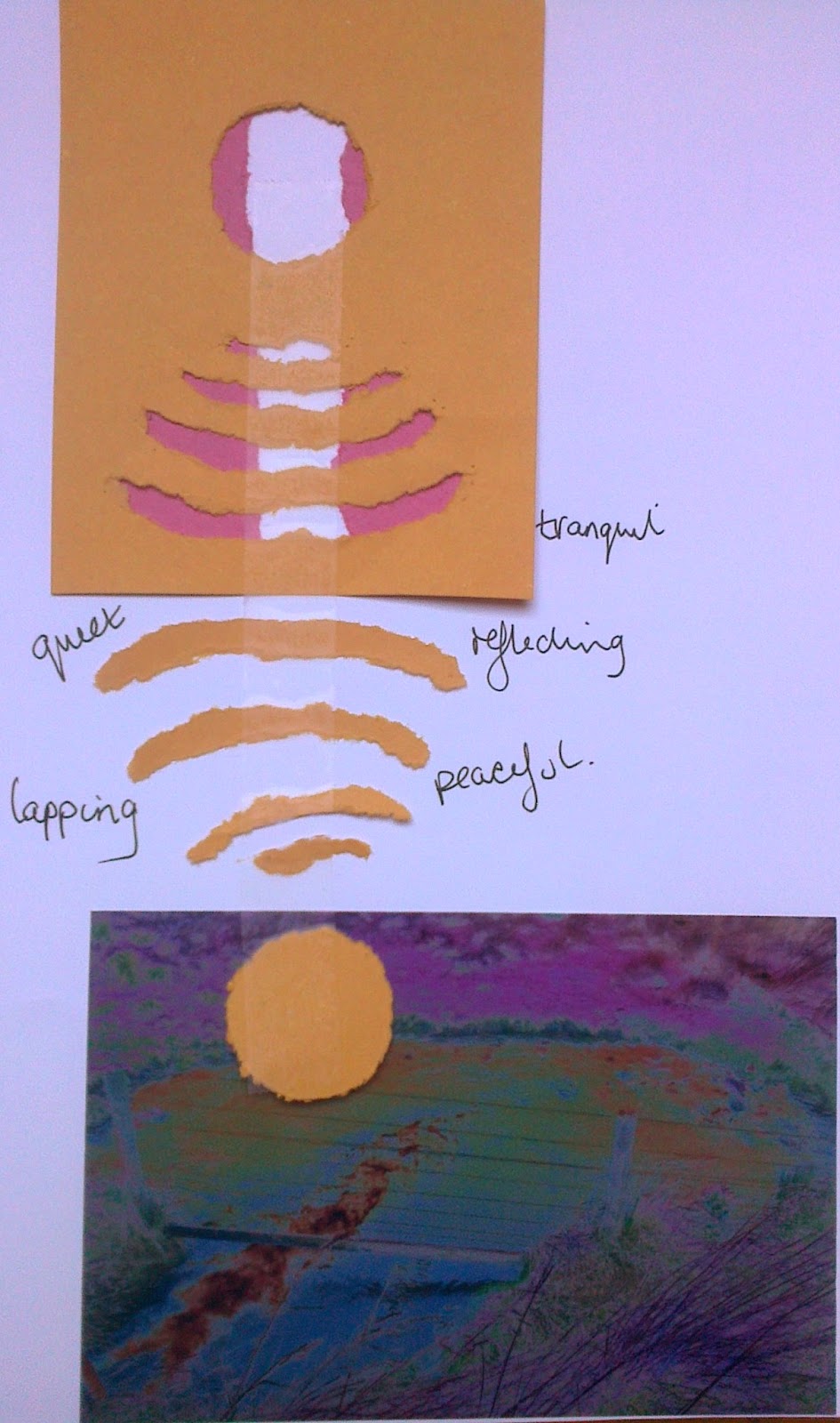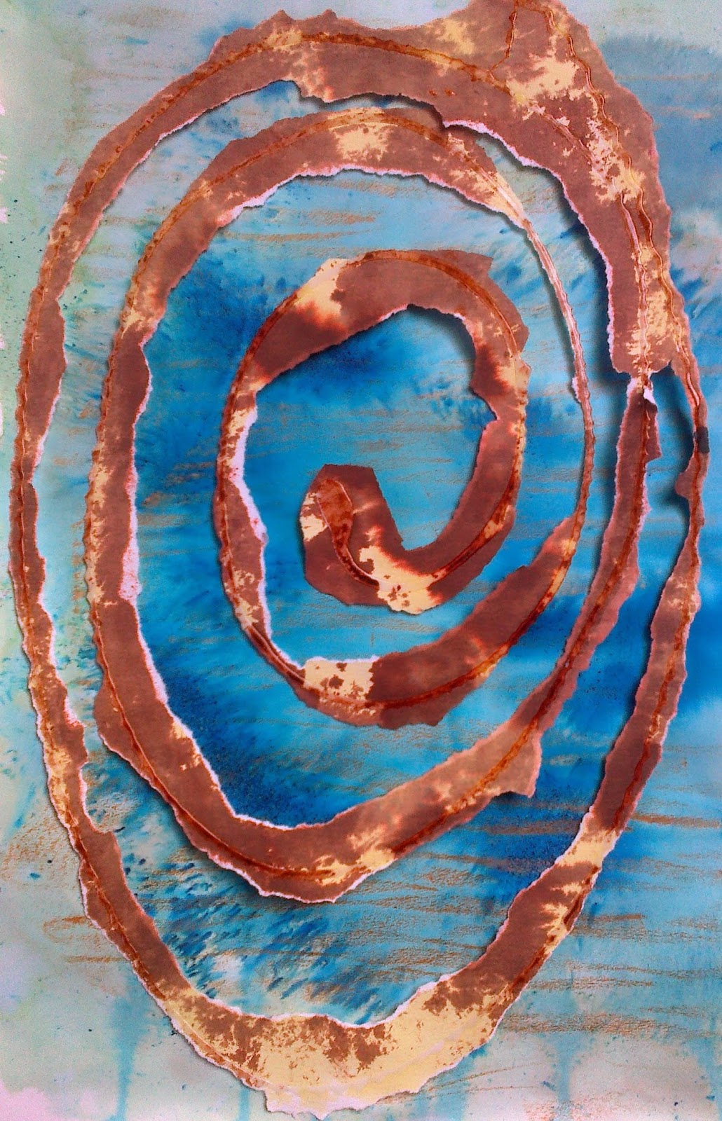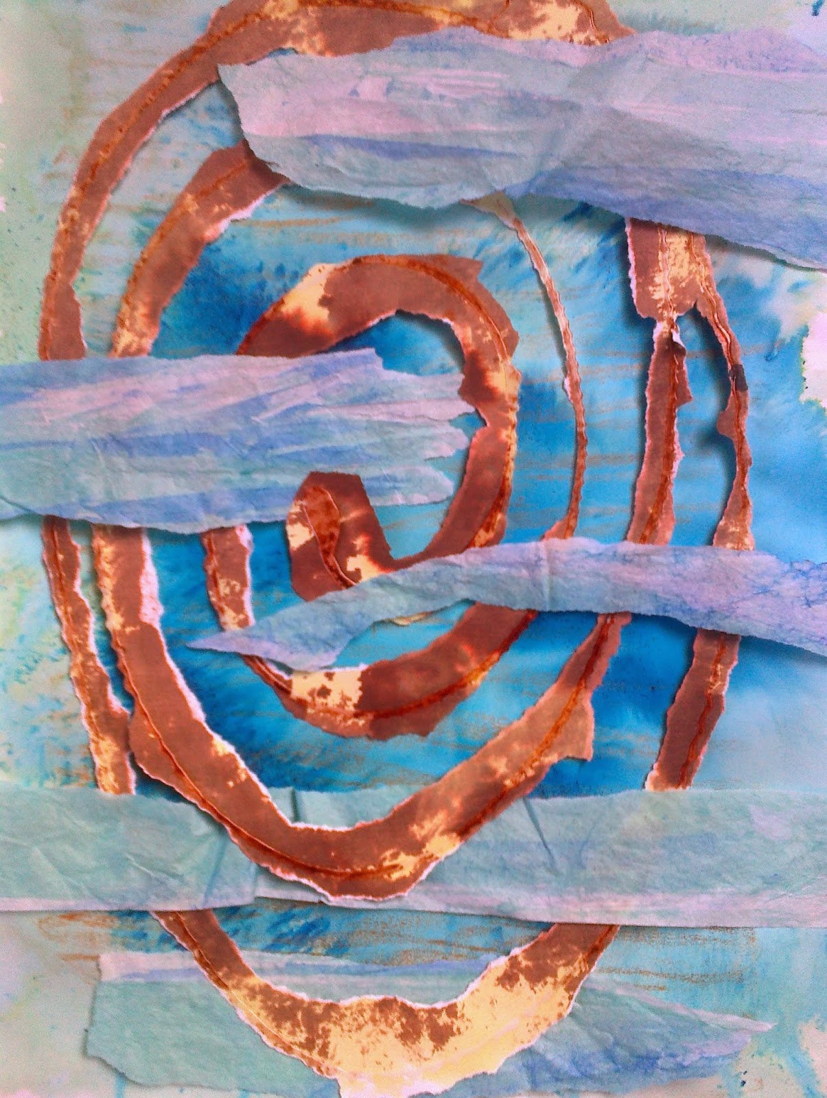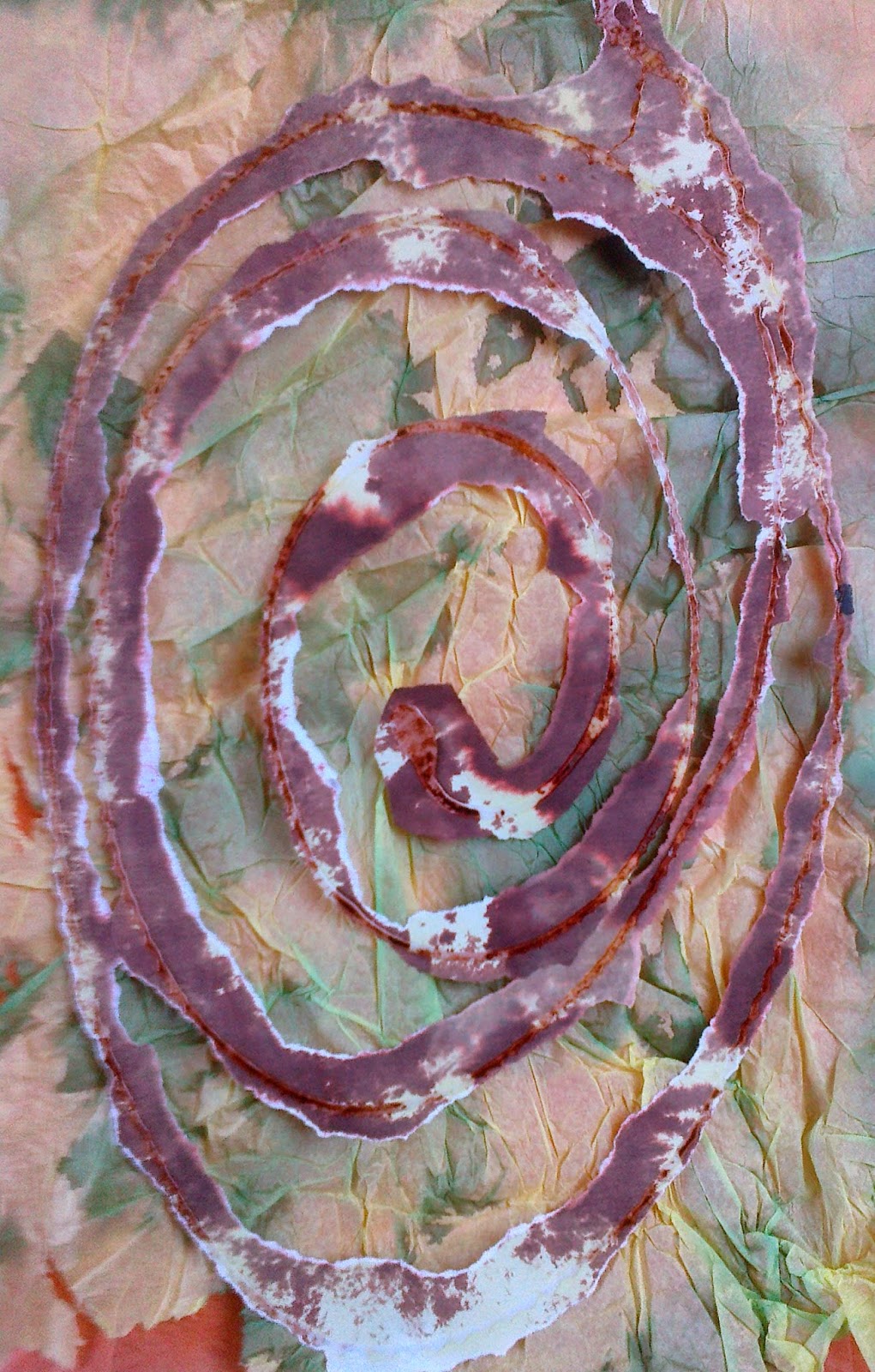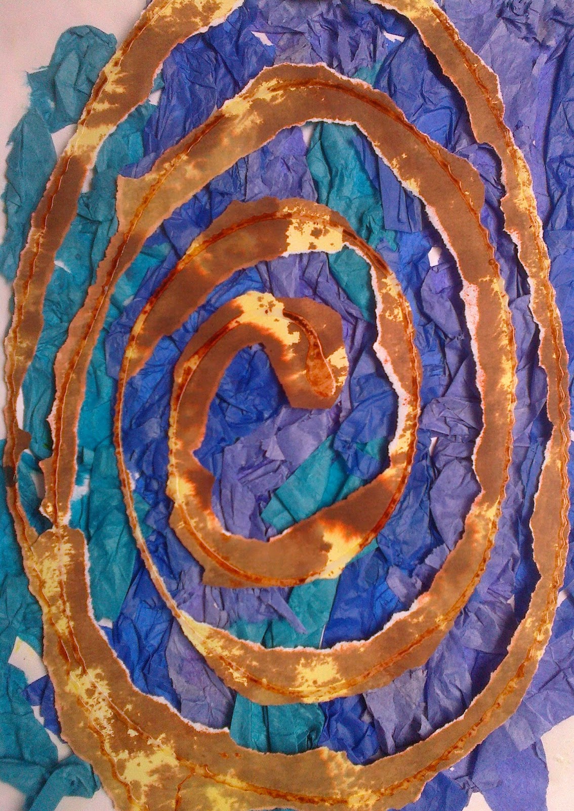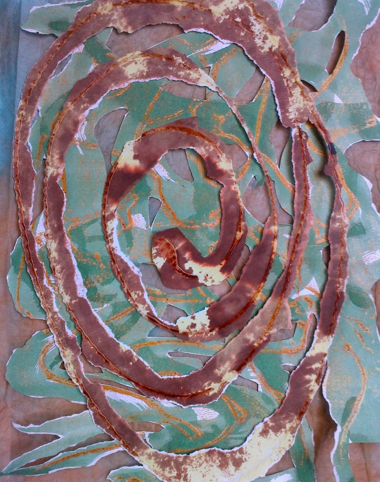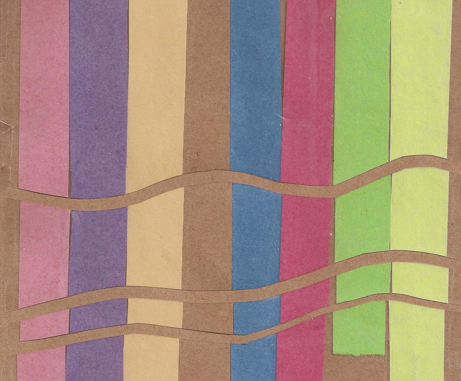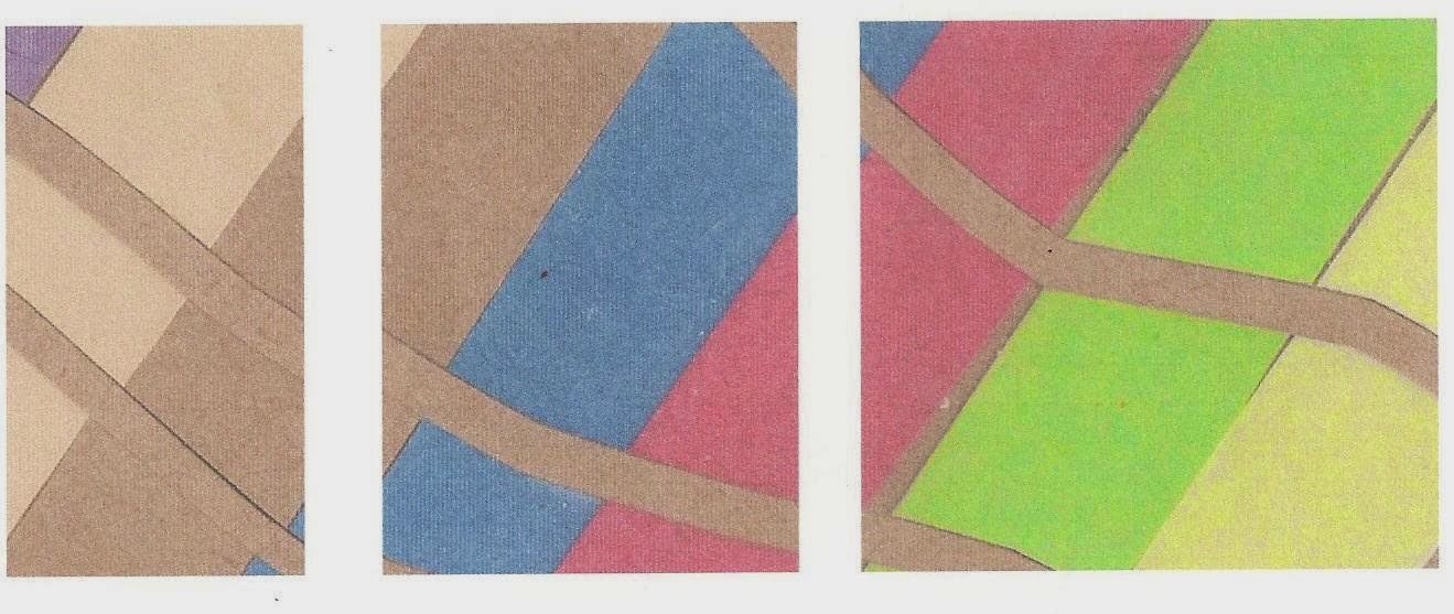
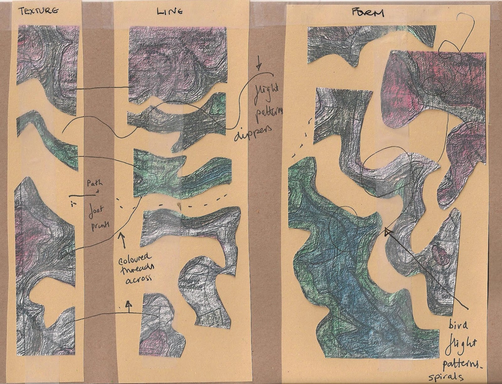
 Before converting some key paper designs into embroideries there was a need to consider how to enlarge the small sequences into a much larger piece. The thought of a piece being A1 was somewhat intimidating, as was the idea of how this could be housed at home or in an exhibition. The idea of doing three panels had evolved from the last sequence in Chapter 9, shown above left. Sian's input on developing the idea, see top right, seemed to help solve the problem. First thoughts considered layout 6.10.1 as It seemed to offer the idea of distance.... but perhaps it would be better to be sized up and allow the design tell the story! It could always be cut back! I played with shapes and a sequence 10.2.
 |
| Ref 6.10.1 |
 |
| Ref 6.10.2 |
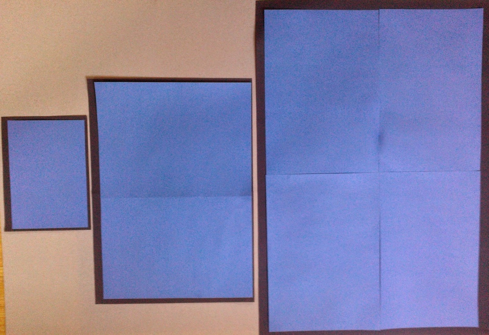
Establishing the dimensions the panels would need to be I made full size cardboard story boards: 6" x 25", 12" x 25" and 18" x 25". Had thoughts of building up the layers over the three section starting with just one layer for the left panel.
 |
| Ref 6.10.3 |
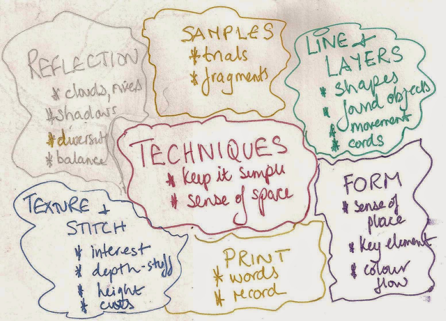
A mind map was made to help keep me on track, 10.3 but when you read keep it simple in the middle and then see all the writing in the bubbles this would be a key task.
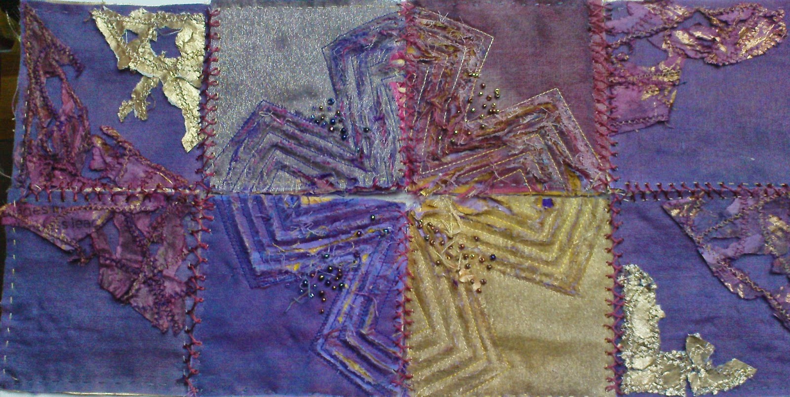
As a result decided to just take stock of previous modules and suddenly the image from Module 1 Resolved Sample shouted out at me along side the work of Herta Puls.
 |
| Ref 6.10.4a |
 |
| Ref 6.10.4b |
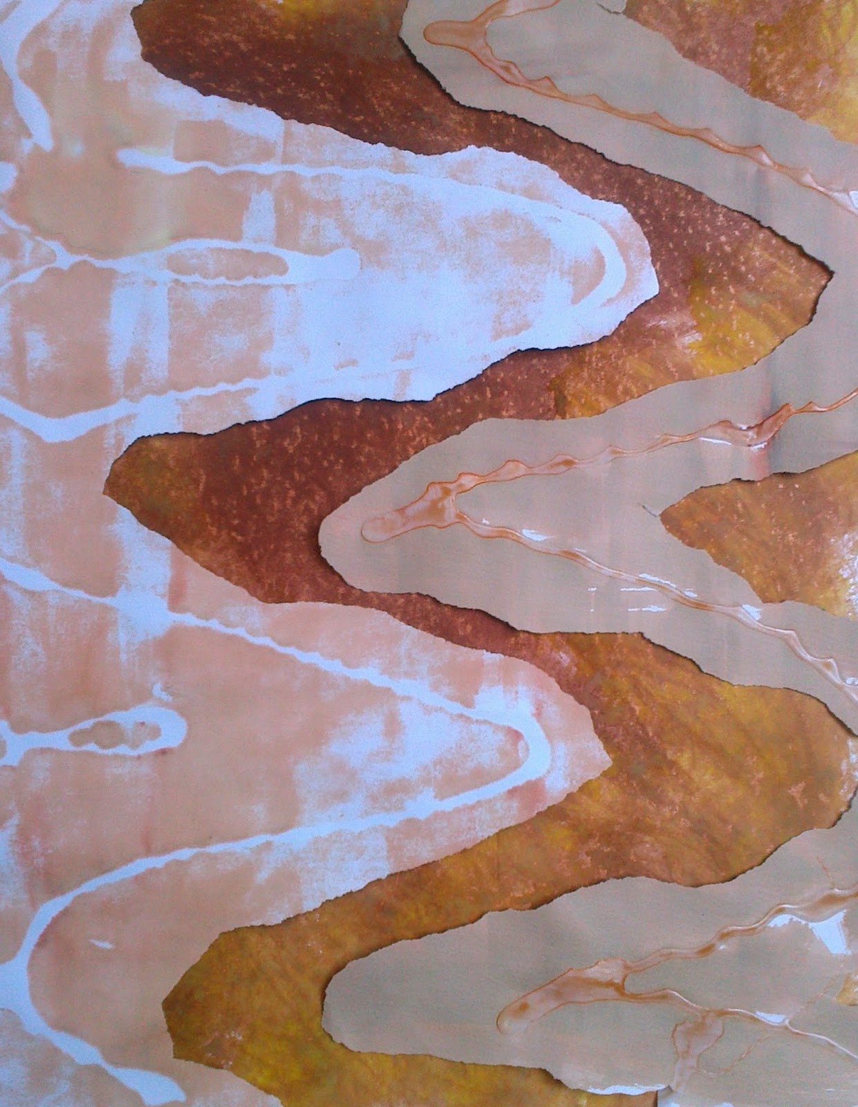
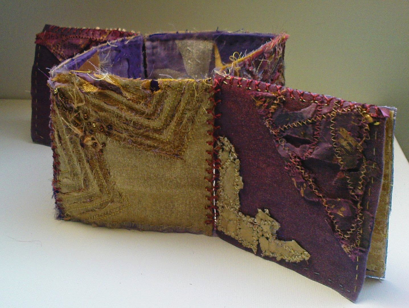
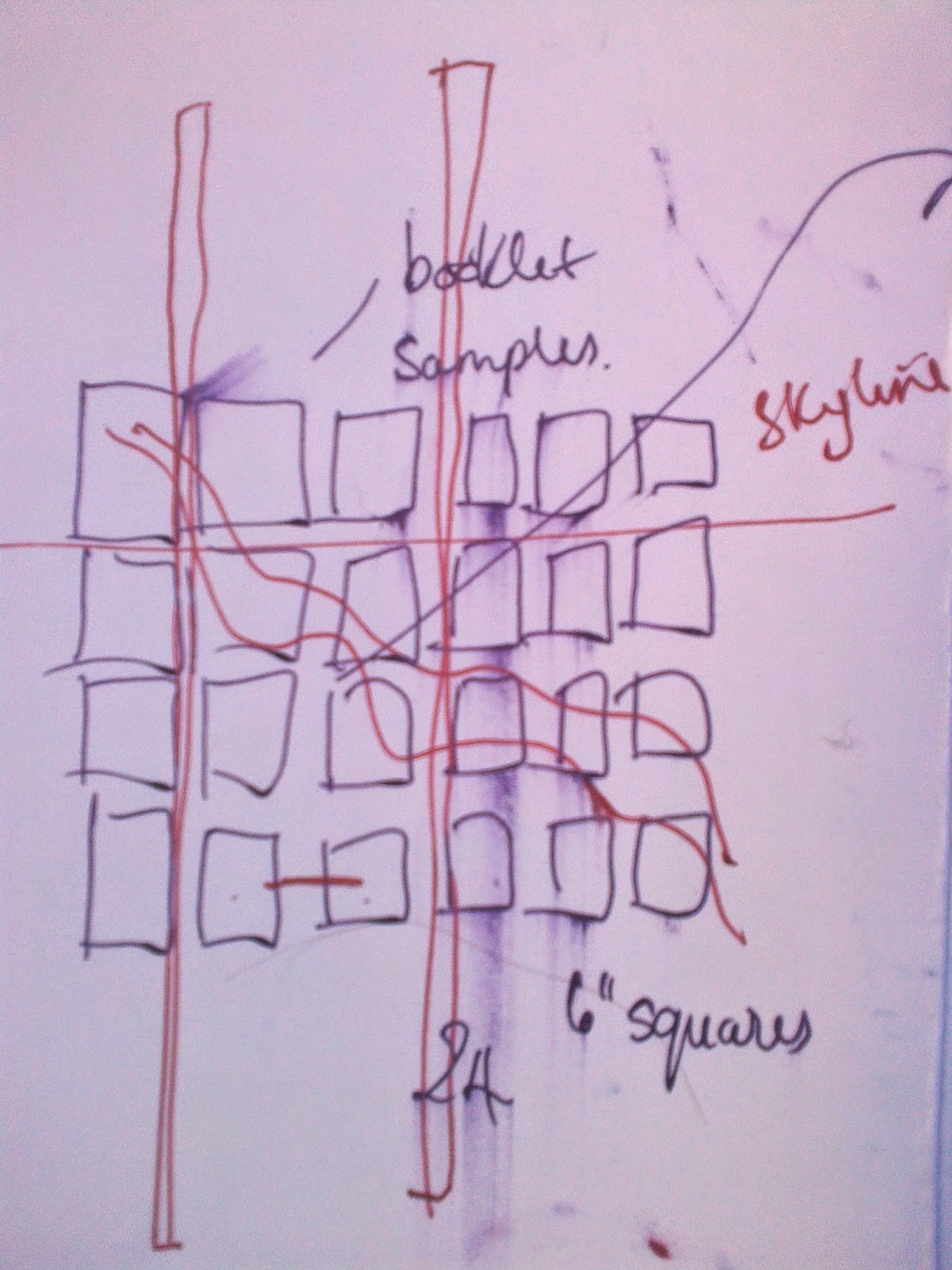
Could this be both an effective way of building up sequences across the three story boards -6 inch squares would translate into the scale I wanted to use? It seemed to offer a fluid but stable background to link layers, shapes and colours across the three sections as shown in 10.2. Other aspects gave it merit, flexible,
 |
Ref 6.10.4c
|
 |
| Ref 6.10.5 |
interchangeable - could the back be worked in a different tones and turned to provide areas of contrast or allow the piece be shown as a three dimensional piece as in 10.4c... the list went on! Before getting to carried away with structure lets get back on course...but here's the first signs of smudged excitement in 10.5!
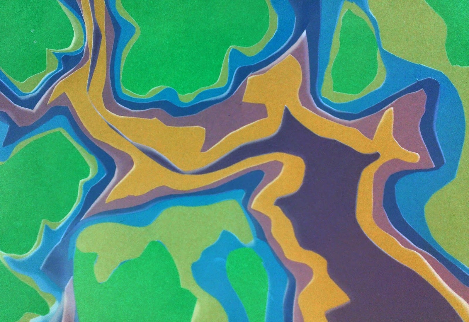
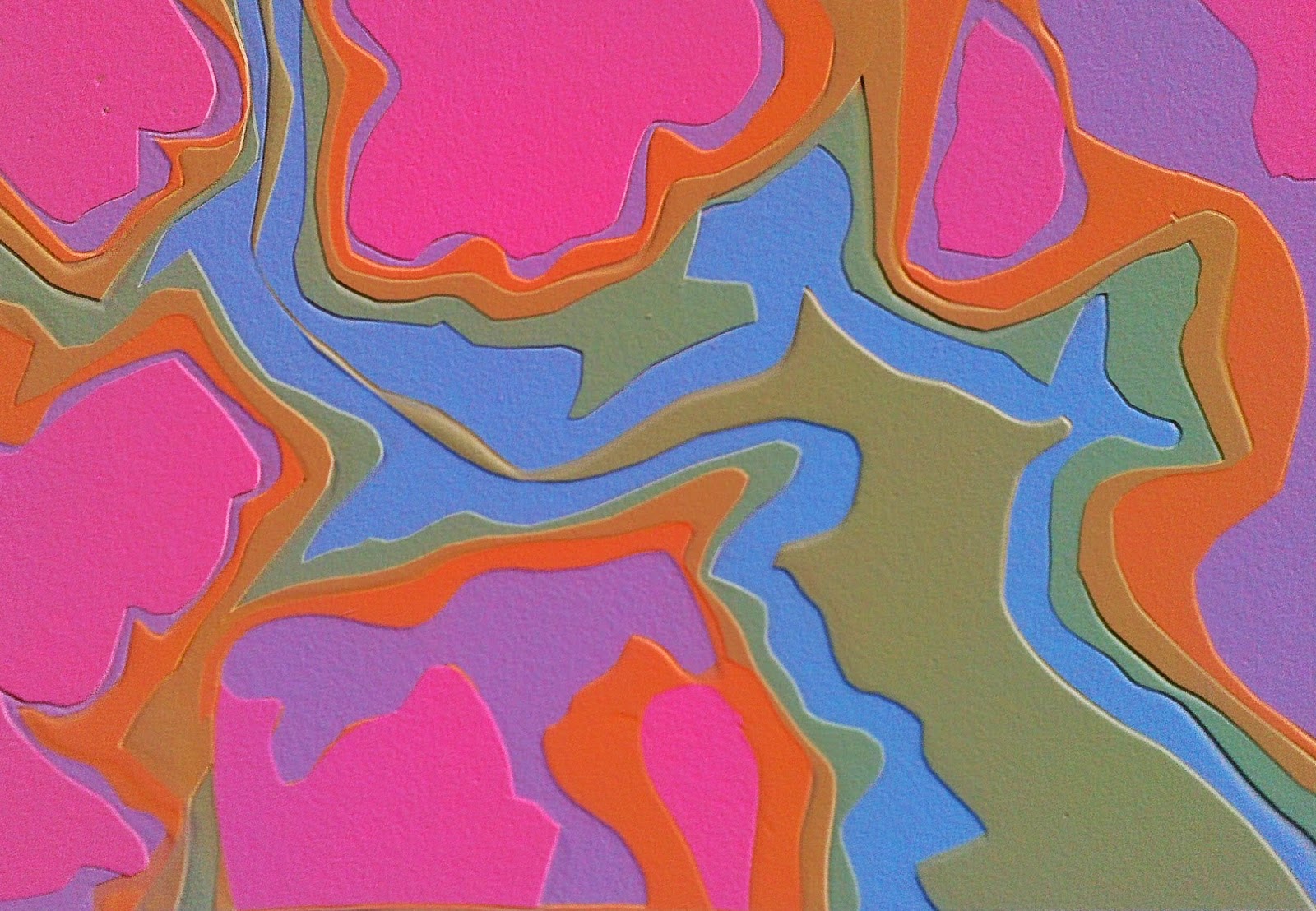
Playing with shapes from my trips in the Glen and the lie of the foothills of the Cairngorms my camera allowed me to consider embossing and solarising images.
 |
| Ref 6.10.6a |
 |
| Ref 6.10.6b |
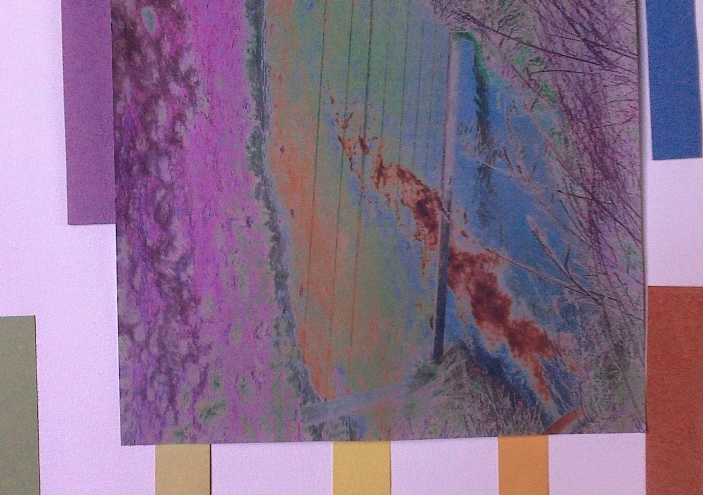
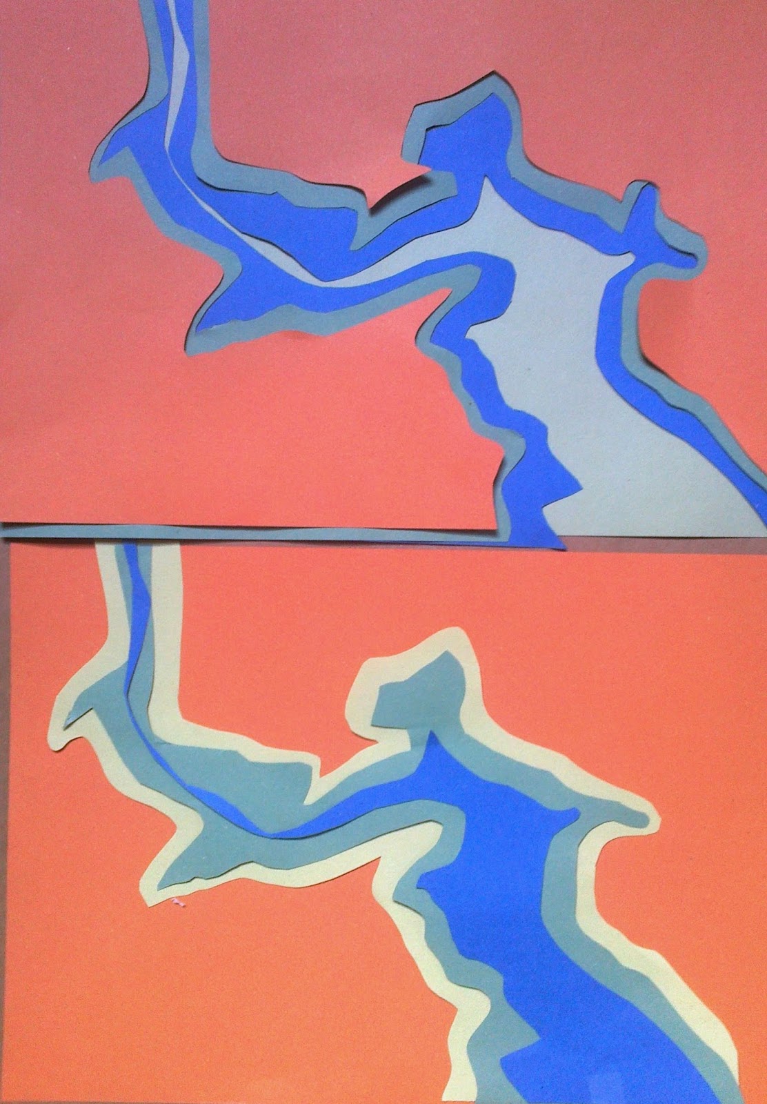
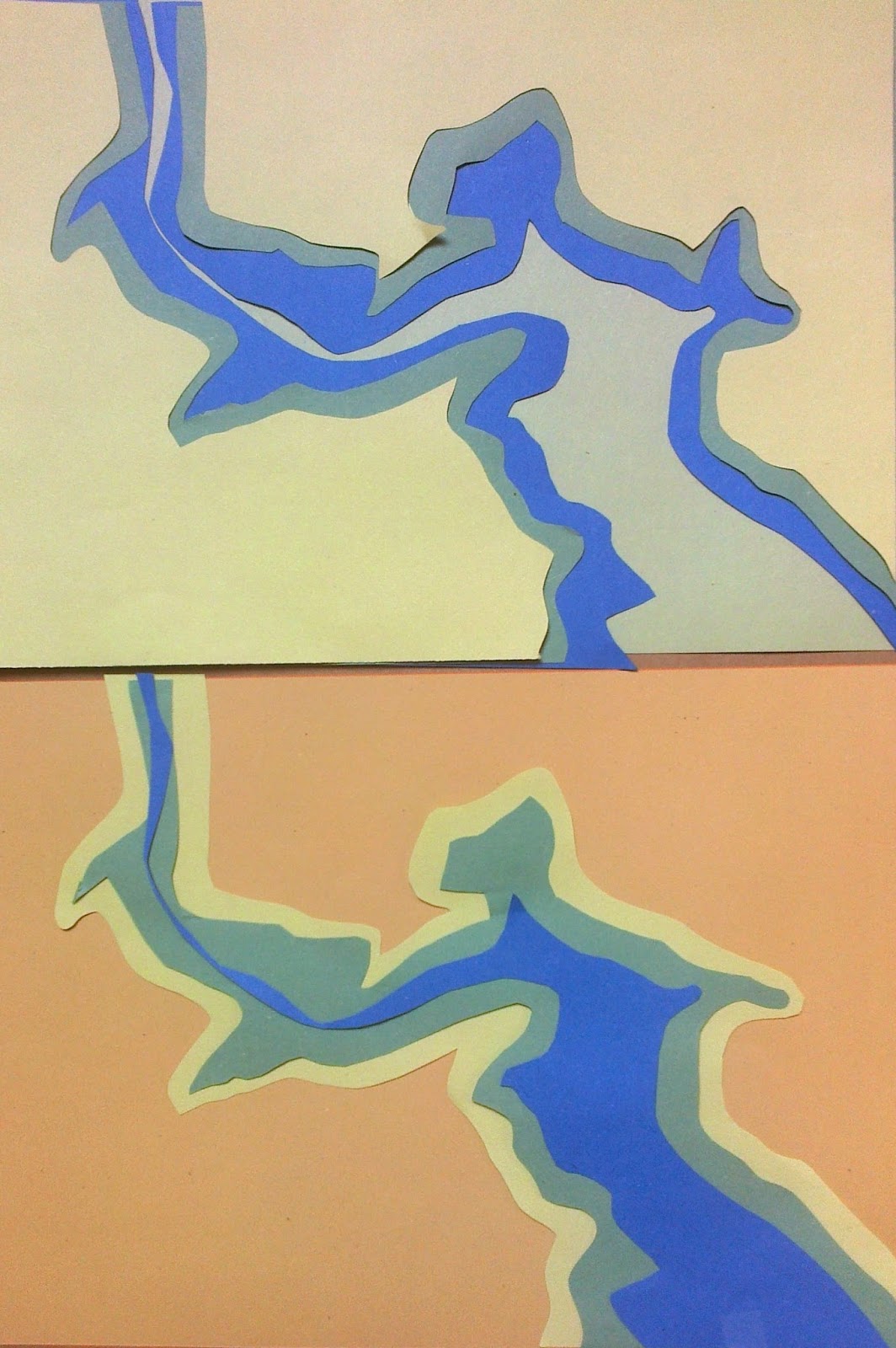
The decision on shapes would help me focus on how to translate samples of fabric manipulation and stitch into my Chapter 11 sample border and then my larger final piece. These initial samples seemed too busy and distracting so pruned back to a more simple outline. These pictures made me think of thermo imaging and looked at a website were animals have been recorded and the fact that a colour code is also used for how endangered various species are in our area. http://www.veterinary-thermal-imaging.com.
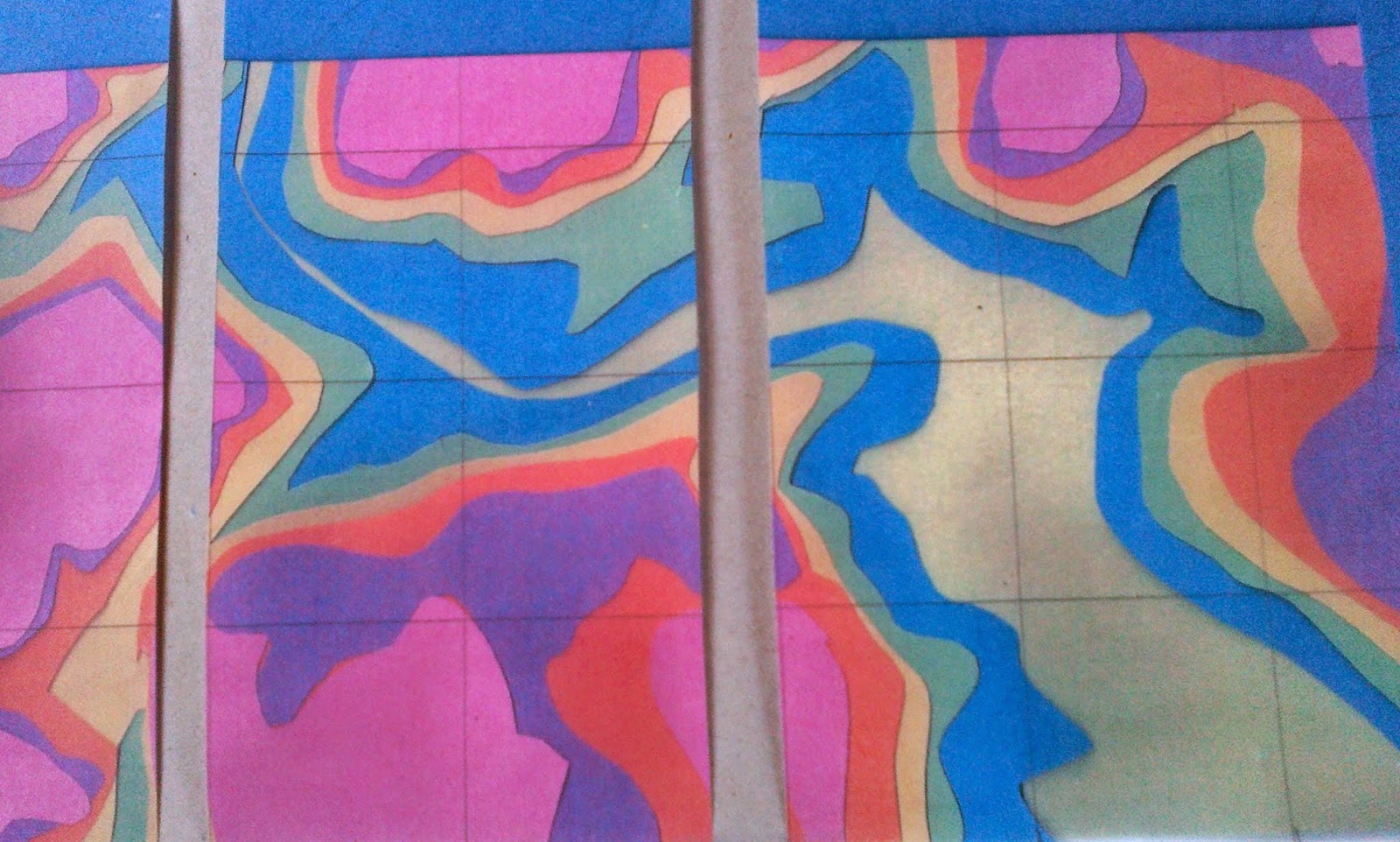
Played around and came up with this image which is perhaps a step too far!
 |
| Ref 6.10.6c |
 |
| Ref 6.10.6d |
 |
| Ref 6.10.6e |
I became intrigued by the image which seemed to place a 'human' figure in the centre of the picture. It had started when a friend I met on a walk into the glen mused that the Water of Nochty
could have once been a loch in 'earlier' days! Now there's a challenging thought.
 |
| Ref 6.10.7a |
 |
Ref 6.10.7
|
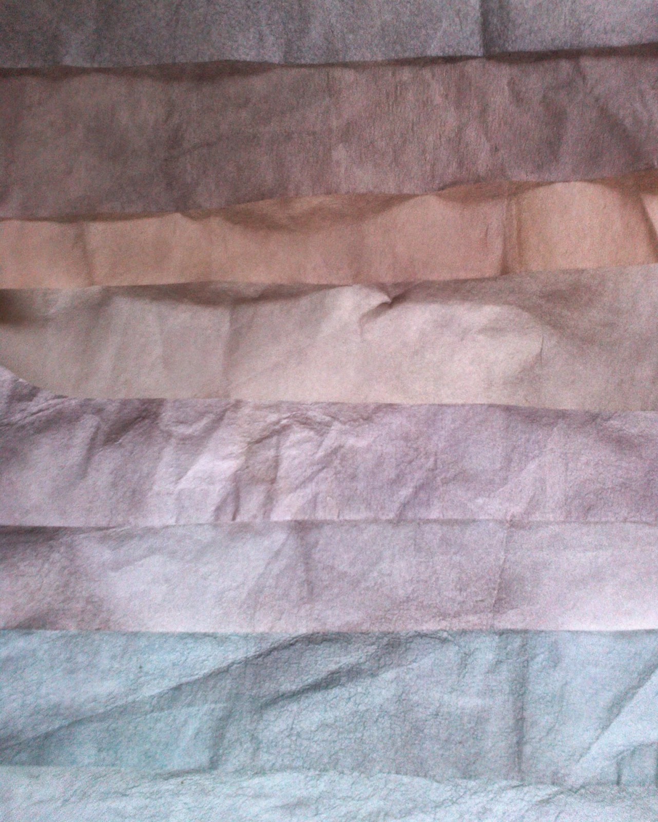
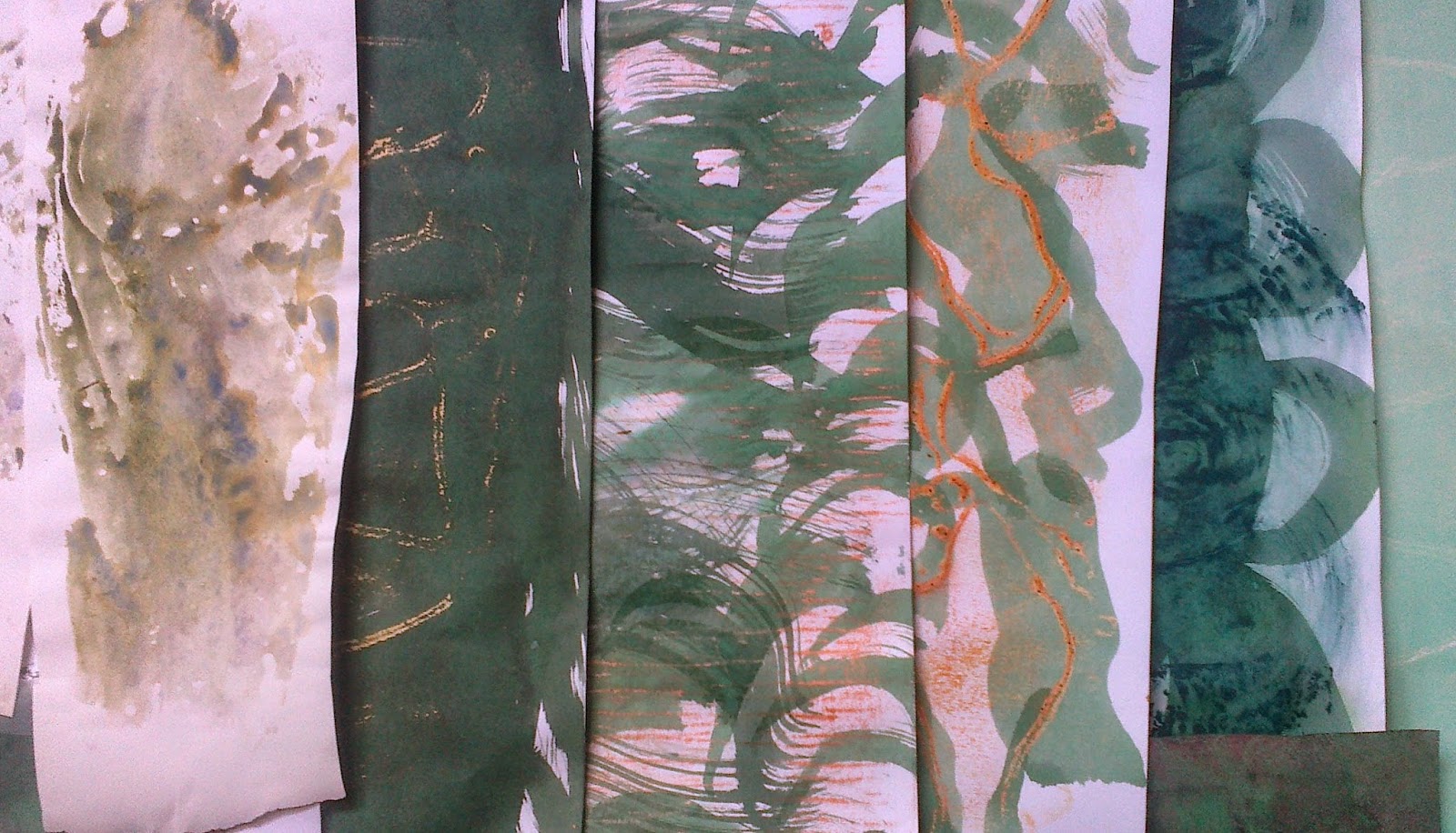
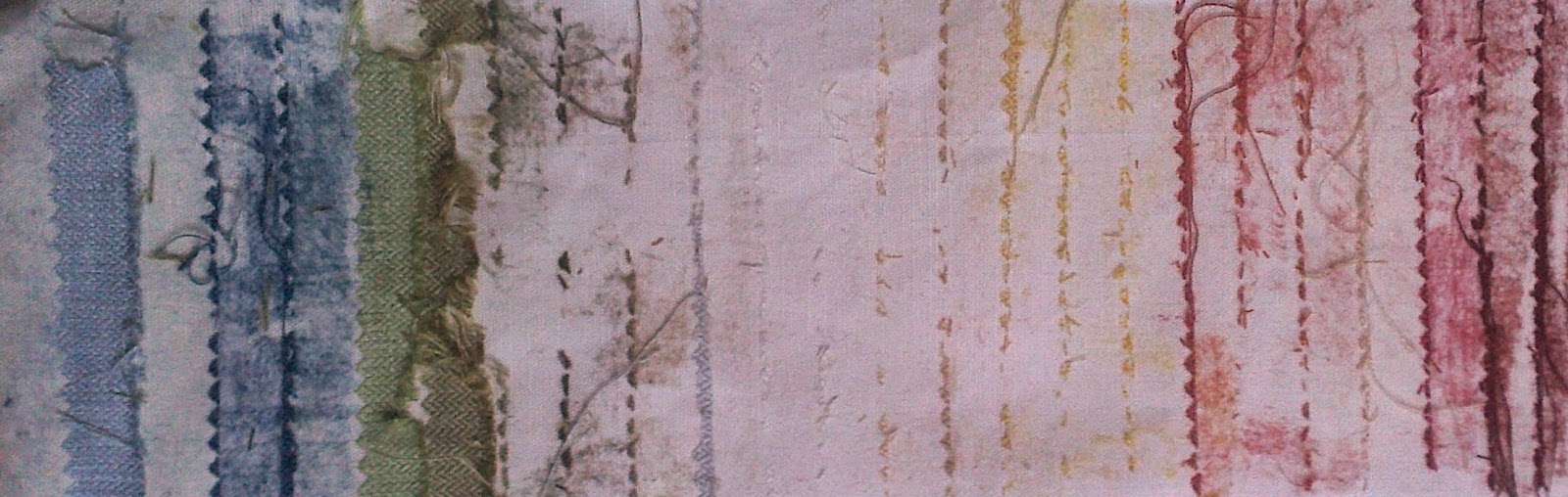
There were still decisions to be made on colour choice, this sample card,10.7 , of the backing to pieces from a fabric shop was on my board but needed to consider tones and highlights. Included the brusho ink colours I had used for making papers as a reference point.
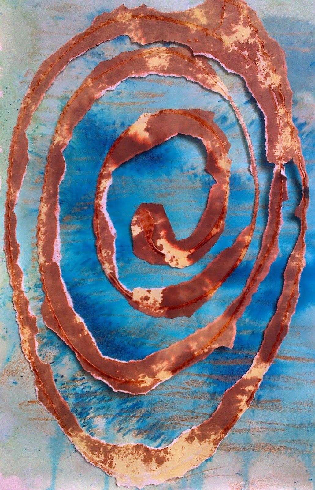
But now down to ripples and spirals, the chosen shapes from Chapter 9. These seemed to offer not only an answer to giving the essential nature of the place I had chosen but also gave scope to explore biodiversity, the conservation theme chosen.
 |
| Ref 6.10.8 |
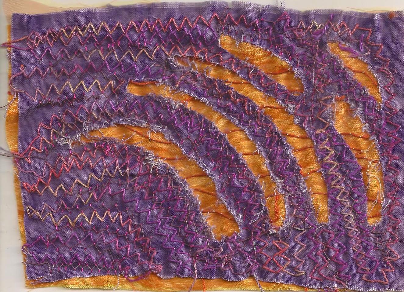
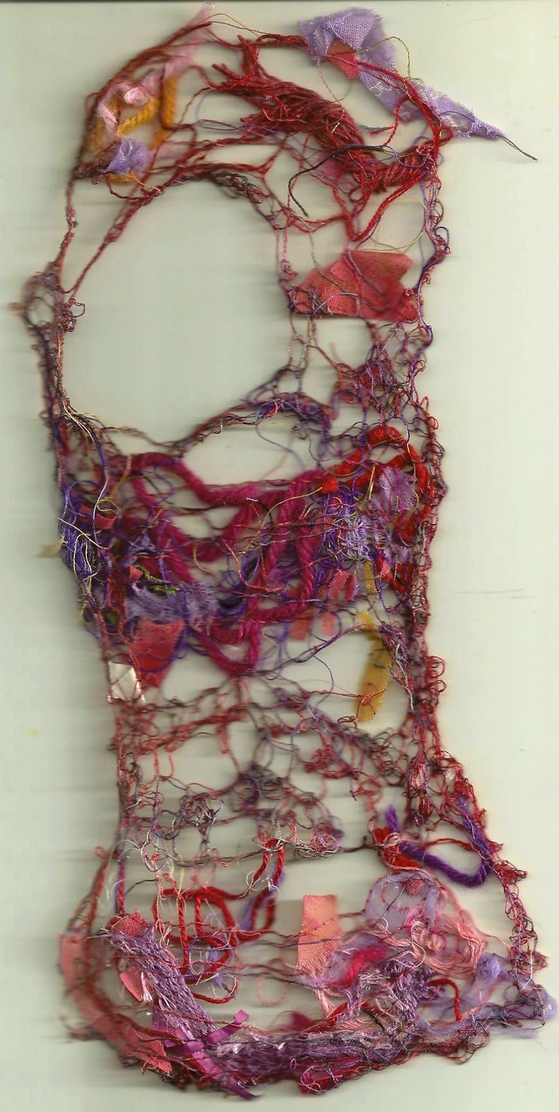
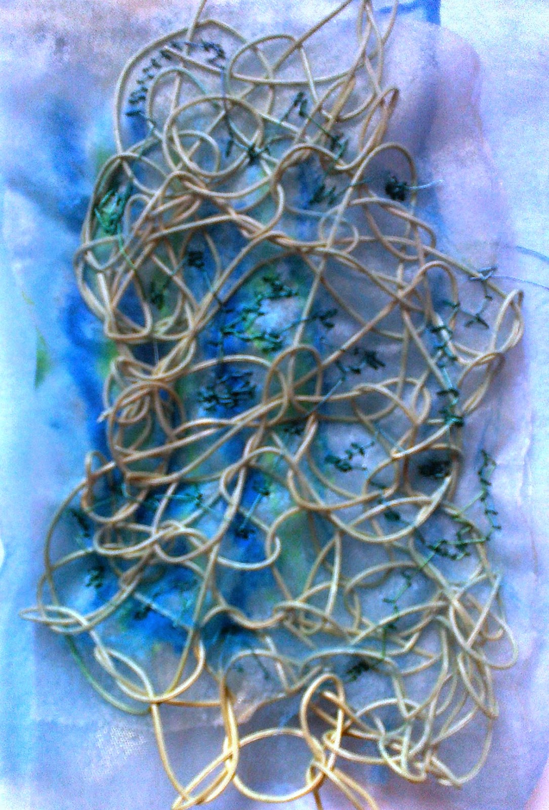
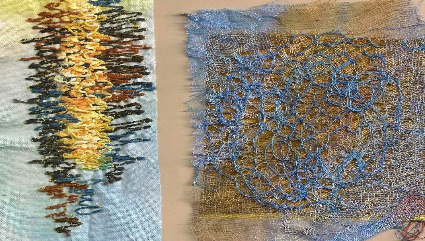
With reminders put on a story board for each panel I set out to review previous samples that could translate these themes from Chapters 5, 7 and 8 . While the colours may not be appropriate for the final piece these previous samples offered a starting point to reworking the paper design 10.8.
 |
| Ref 6.10.8a |
Spirals:
 |
| Ref 6.10.8c |
 |
| Ref 6.10.8d |
 |
Ref 6.10.8b
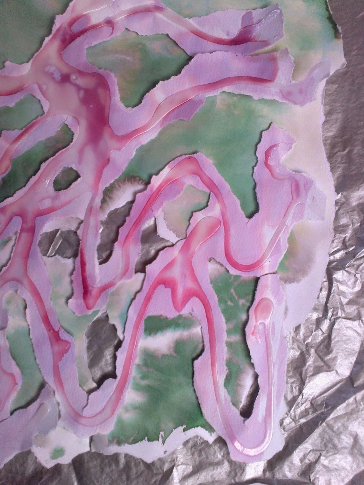
While looking through the samples and thinking of how they would translate up in size decided my samples for this chapter should be made up in a larger scale than these originals ones so that I could see a comparison of what technique worked best.
Sample 8d was put in to remind me to consider 'a flight' above the finished piece as noted in 10.2.
|
 |
| Ref 6.10.9 |
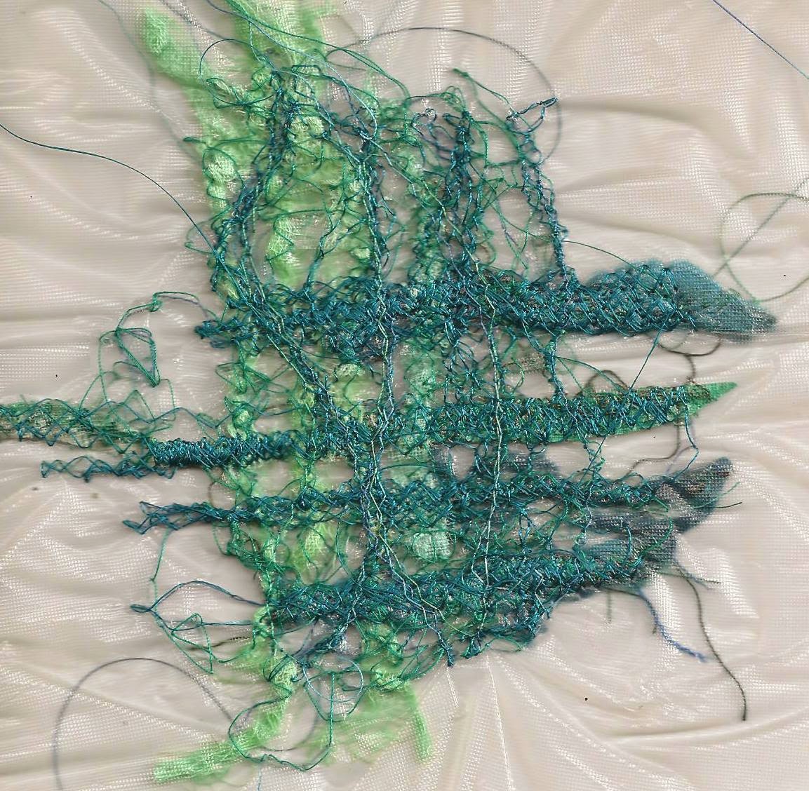
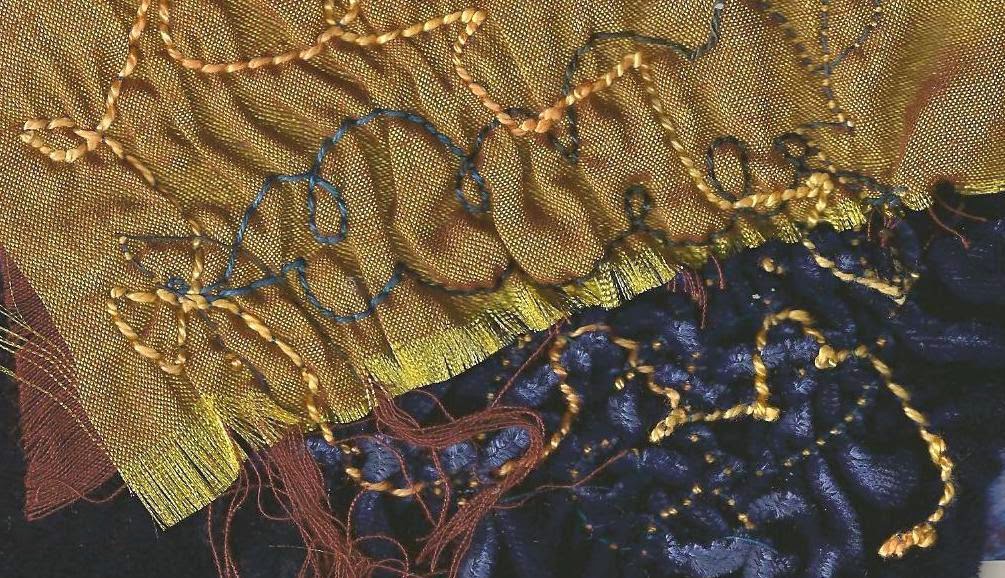
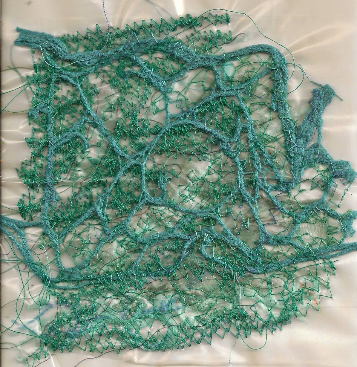
Ripples: In this selection I felt it was important to consider the part ripples play in reflection
 |
| Ref 6.10.9a |
 |
| Ref 6.10.9b |
 |
| Ref 6.10.9c |
and also consider the other methods of getting texture with fabric weights and different stitching, cording , overlay.
If these ideas seem worthy of taking forward would play with colours and stitching to take the chapter forward towards Chapter 11.
Spirals
 |
| Ref 6.10.10c |
 |
| Ref 6.10.10a |
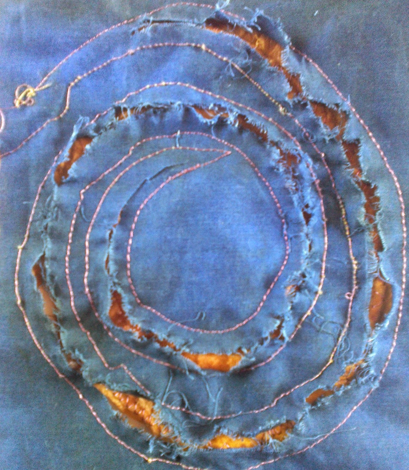
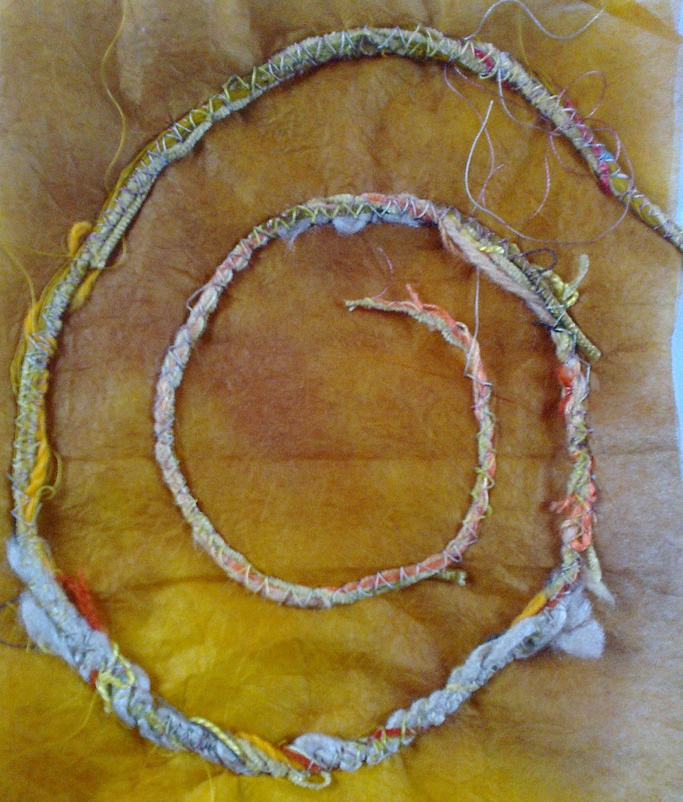
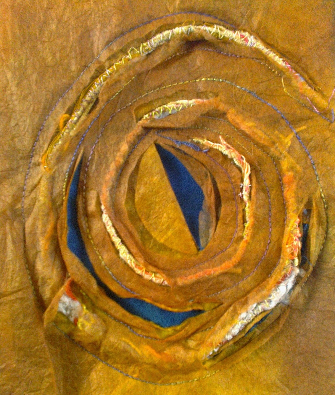
Making a cord from various weights of thread it was attached to three layers of abacus paper, reversed and then sewn to hand dyed blue/green cotton. I then made random cuts in abacus paper and fabric to reveal the cord.
 |
| Ref 6.10.10b |
Ripples
 |
Ref 6.10.11a
|
 |
| Ref 6.10.11b |
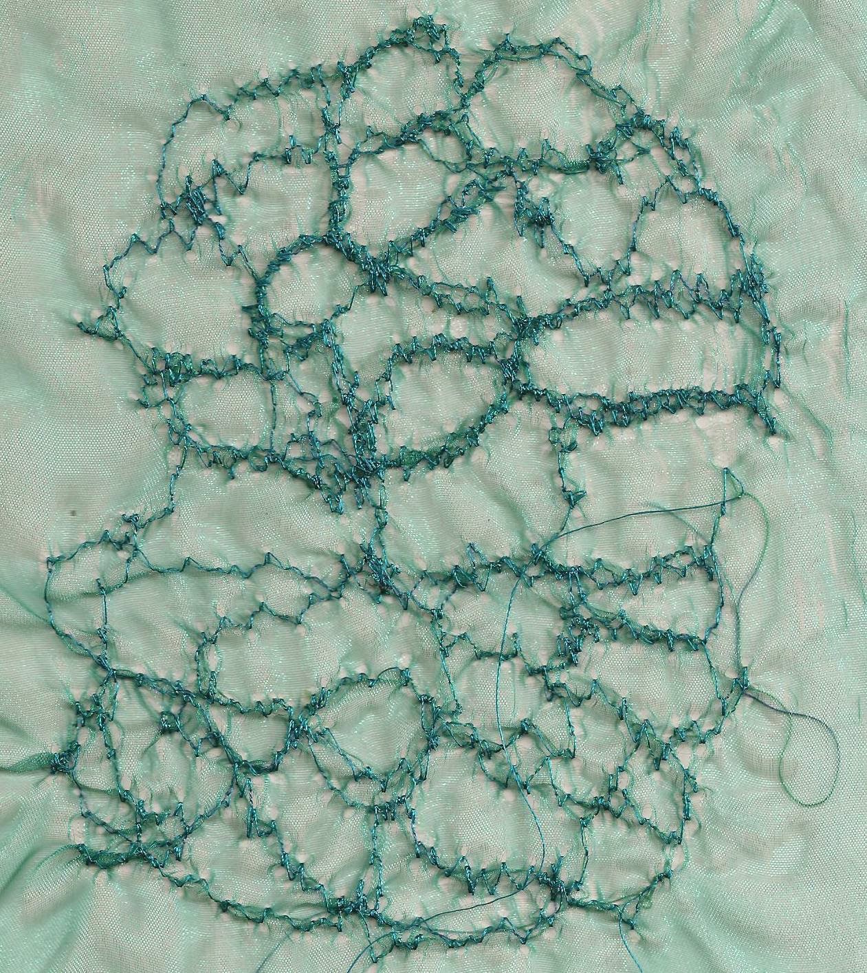
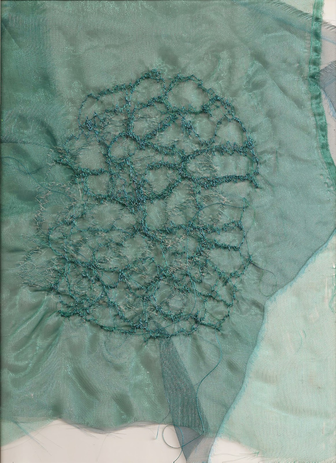
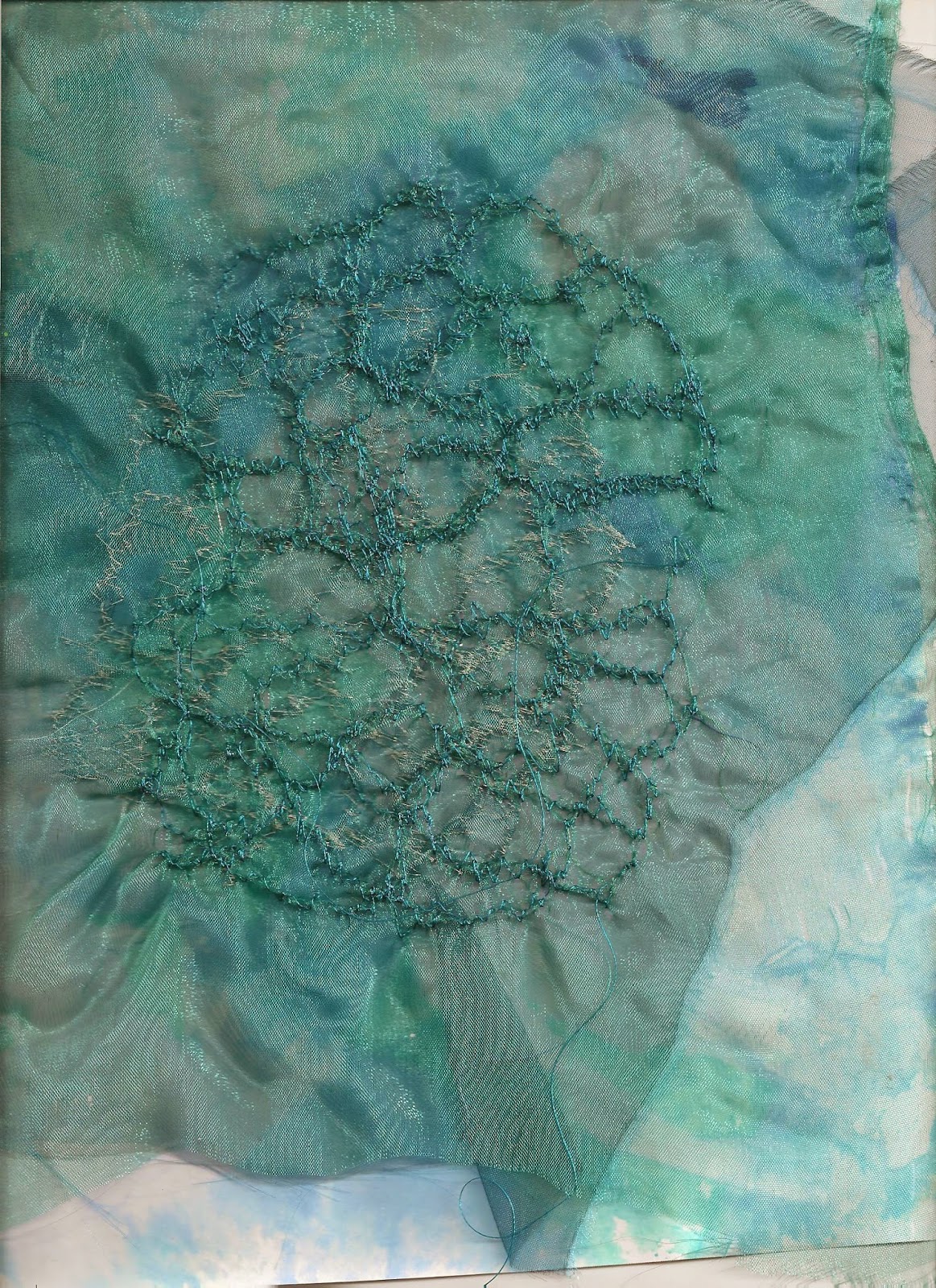
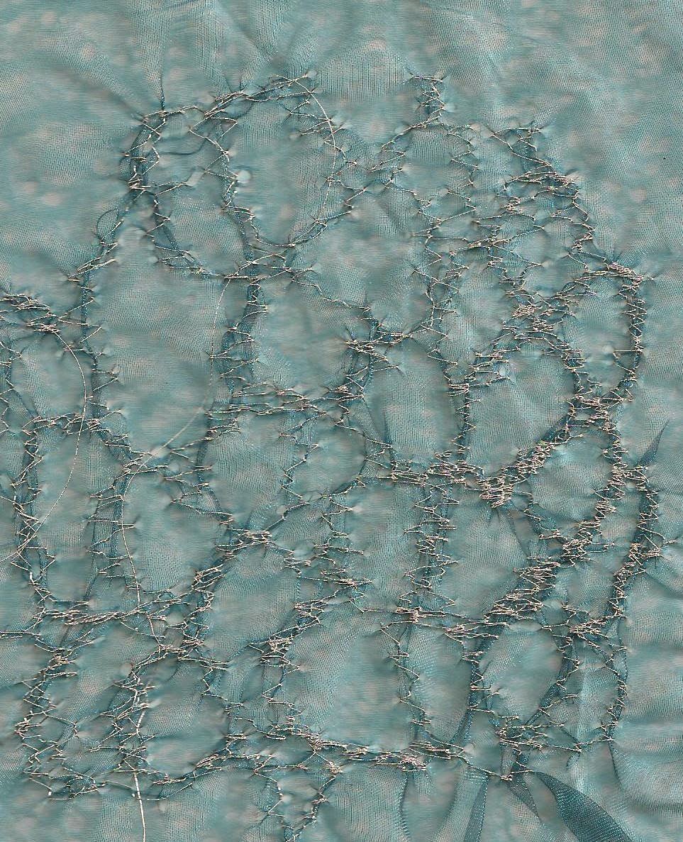
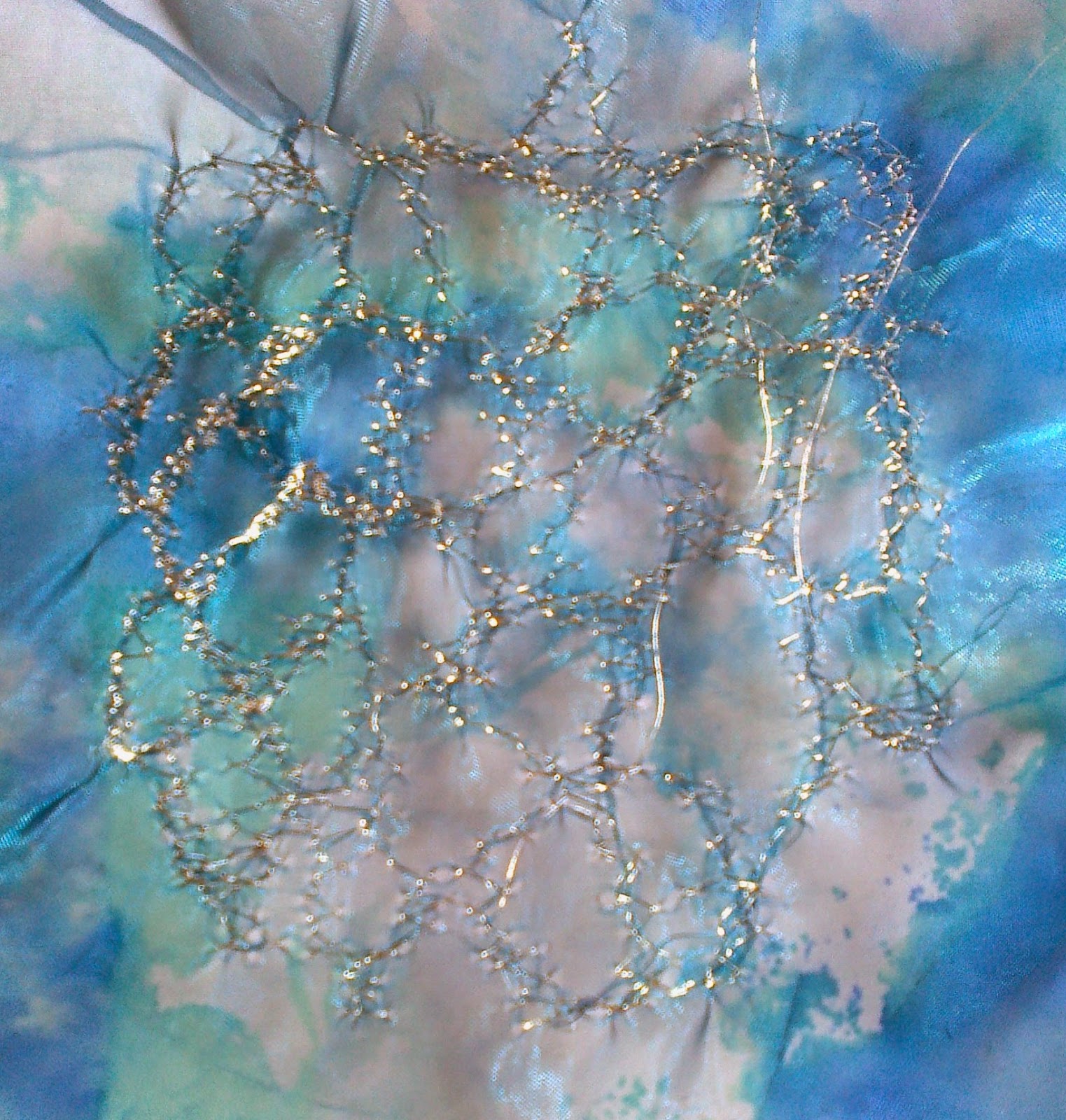
Replicating the ripple template on two shades of nylon chiffon using cotton thread in one and silver thread in the other I then mounted on various papers
 |
| Ref.6.10.11d |
 |
| Ref 6.10.11c |
 |
| Ref 6.10.11e |
 |
| Ref 6.10.11f |
In sample 11e the two sheer fabrics were placed on top of each other. In looking at these pictures I noted that a fray in the spaces would provide interest