Sunday, 29 June 2014

Chapter 12 a: Resolved Sample - initial ideas

Now to pull it all together, thoughts, textures, shapes, paper, fabric, stitch, threads and touch.  A plethora of samples but the need to hit simple concepts that pull them all together and make an impact.  I became bogged down in worrying about final shape and sketched various ideas; vases, picture, cushions, 3D maps and when I thought of a wedge shaped cover for a cheese board knew I was loosing the plot!  Rejected lots of sample drawings and headed for cover! That could be my route out...The sketch bookcover, but perhaps not... 
Ref 5.12.1b
Ref 5.12.1a
A day away from even thinking about the matter at hand...Returning back and going over the  pictures three images stood out.
Ref 5.12.1c
 The third image proved to be the most compulsive!  My idea of the sketch book cover was fast disappearing - its size was daunting and I was coming to the conclusion that I wanted to use my samples in Chapter 10 as a cover!
But a thought that becoming overwhelmingly attractive was the thought of making a piece of jewellery and the right hand image of Ref 5.12.c offered inspiration. The plan would be to ensure that a combination of textures that appeared in the other samples in Ref 5.12.1 c were used.  But then the concern, would this piece be large enough...should I progress this development?  Some paper models would help me decide but I felt that different depths of 'stones' could be worked.  Would separate samples that were linked by threads be acceptable? Perhaps another pause is needed... Could this be the colour theme blacks, bronze and golds. 
Ref 5.12.2
Paper thread and tissue paper on left with threads and fabric pieces machine stitched on soluble fabric.  On the right a range of black fabrics: velvet, cotton, felt interspersed by gold/bronze silks, gold lame and chiffon with silk throwsters and dyed and crochet thread. 

Sunday, 22 June 2014

Design from landscape; Texture and shape


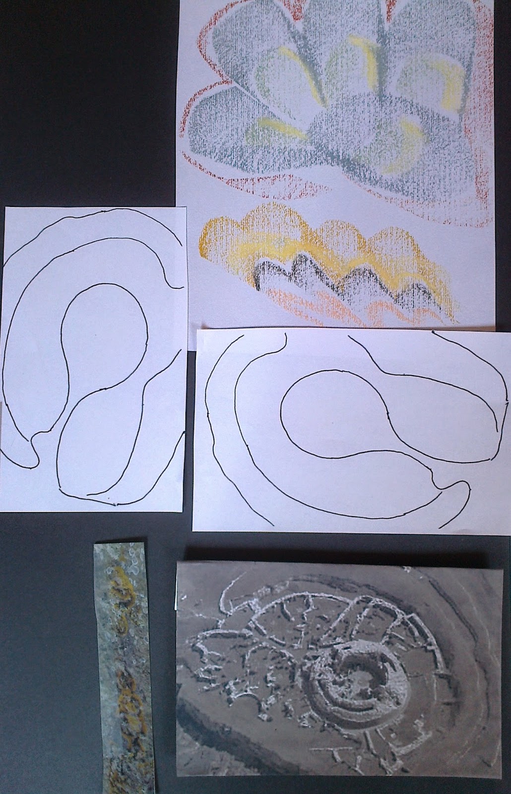
Selecting three images from my original design ideas board I included variation of shapes for possibilities of flat and raised texture.
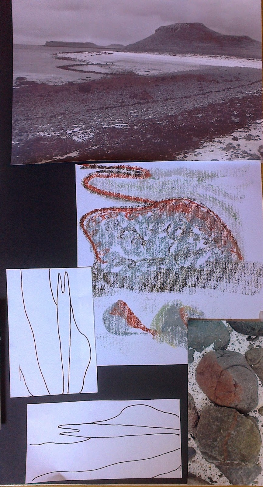
The choices: Coral beach, Skye; Broch of Gurness, Orkney; shore line of Mull of Kintyre
As well as the main picture close up views were used as we had done in Chapter 4 of Module 2.
Ref 5.11.1a

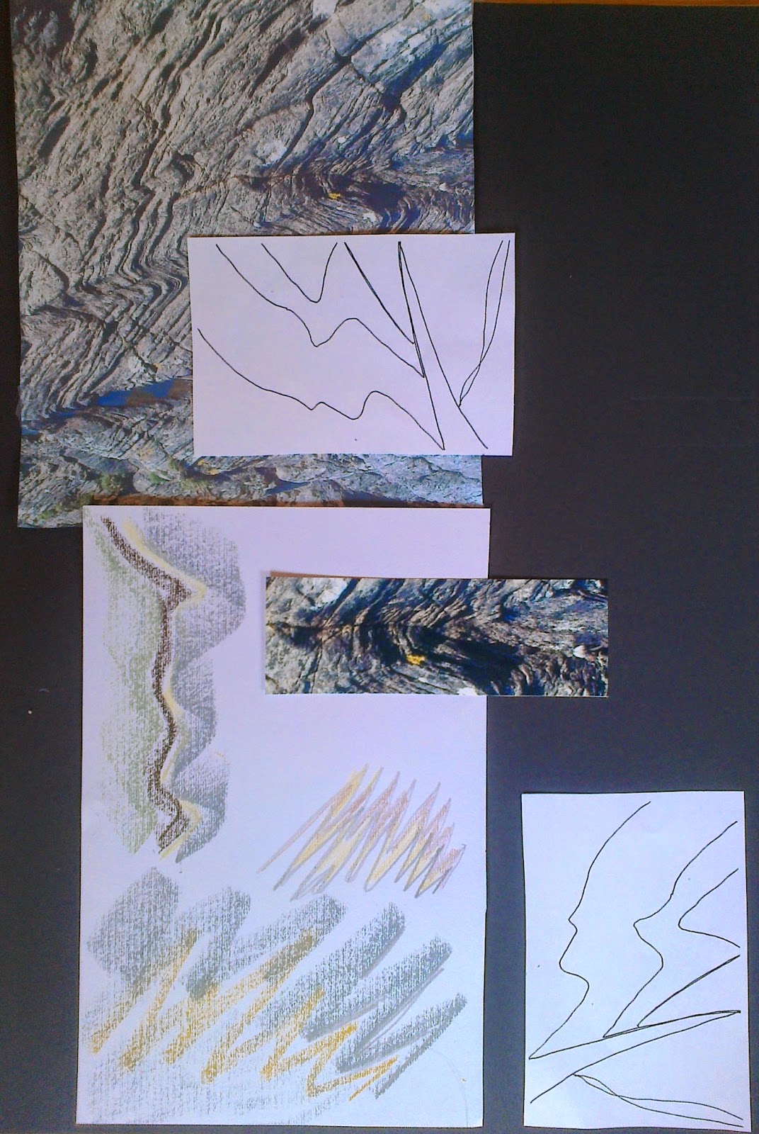
With sketch book in hand the follow results appeared. Selecting an earth tones palette with a touch of green.  General warming up marks were made with pastels and pencils before tackling ones specific to images. The pastels were more user friendly and on the textured sketch pad paper shapes and textures appeared. Before making papers decided to look more closely at photos for shapes and colours and placed them on storyboards to focus on when making my marks.
Ref 5.11.1b
Ref 5.11.1c
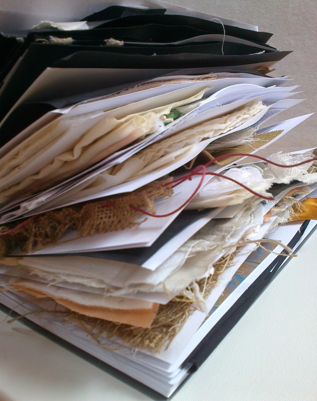
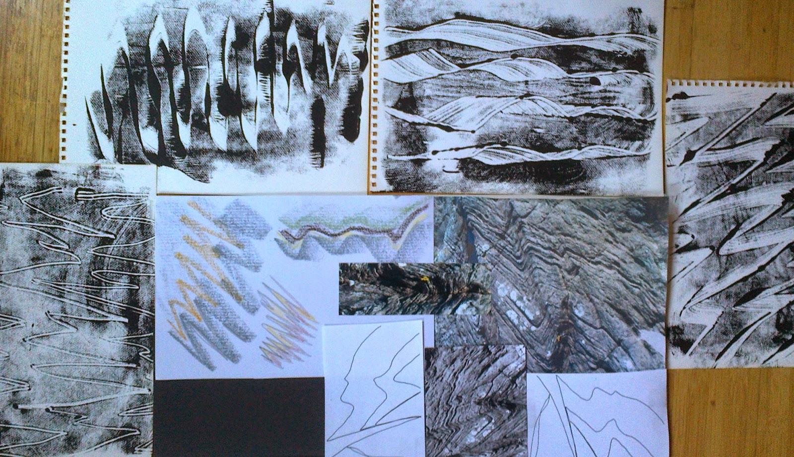
While musing on the pictures I suddenly looked at my Module 5 sketch/sample book!It appeared to be a cross section of the Moine Thrust, which was the geological feature/area I was in when I took my header photo for this Module. I would bear this in mind as the chapter progressed.
Ref 5.11.2

Flat Textures
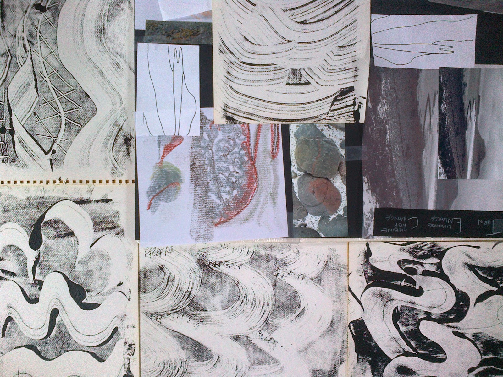
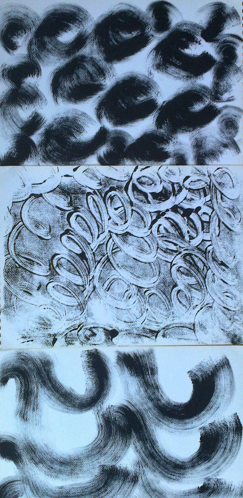
Printing with black acrylic on perspex I made a series of papers
Ref 5.11.3a

Ref 5.11.3b
Ref 5.11.3c

Textured papers
Ref 5.11.4b
Ref 5.11.4a

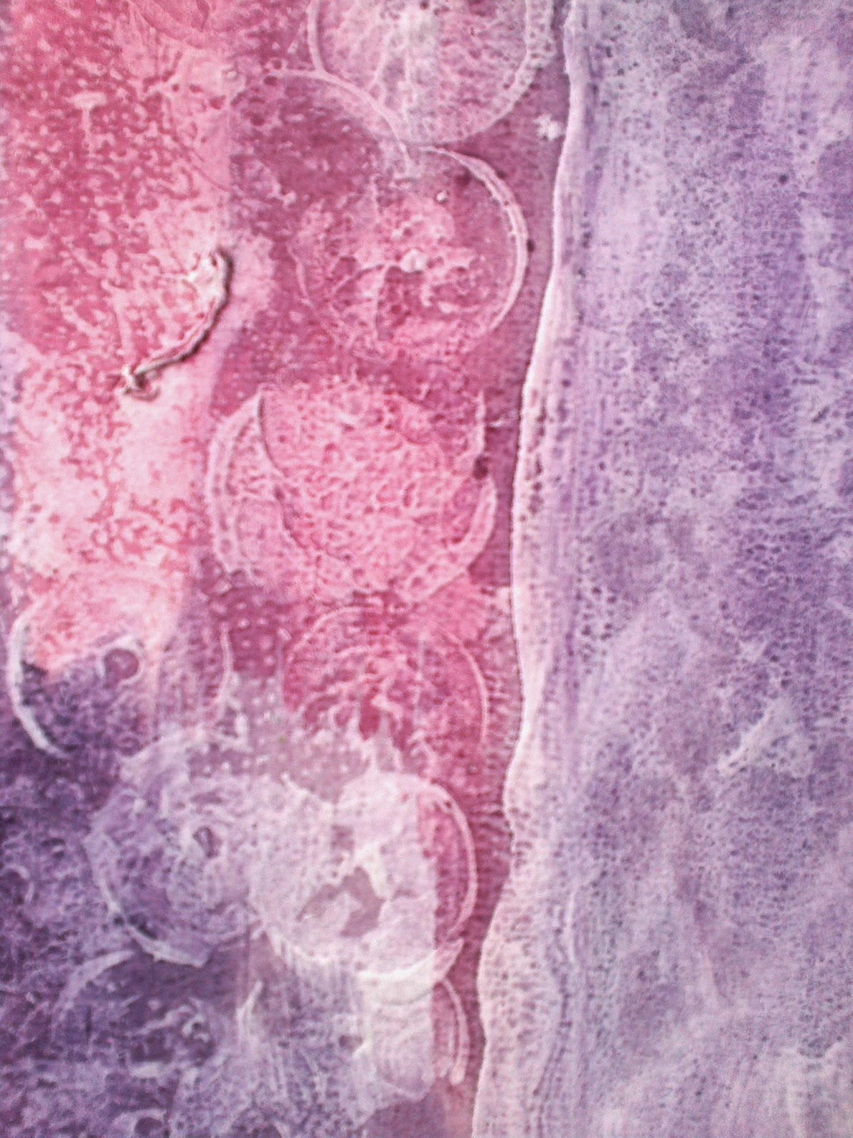
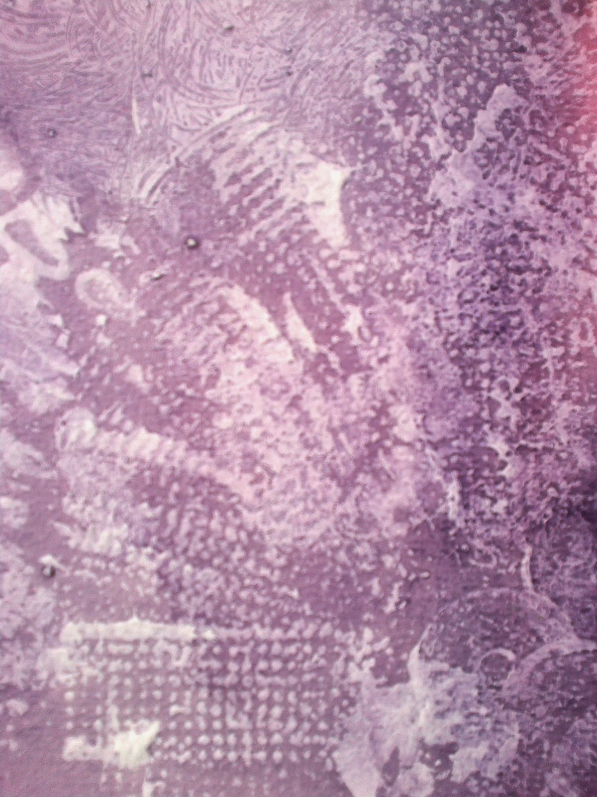
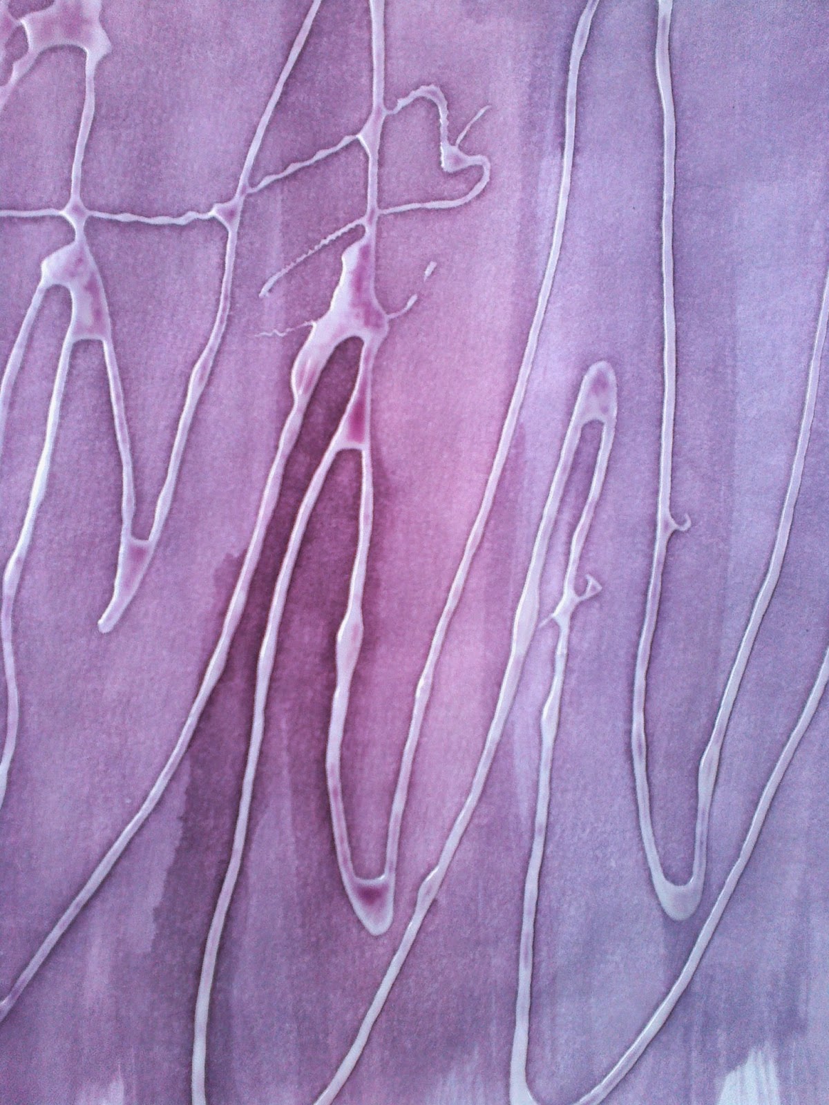
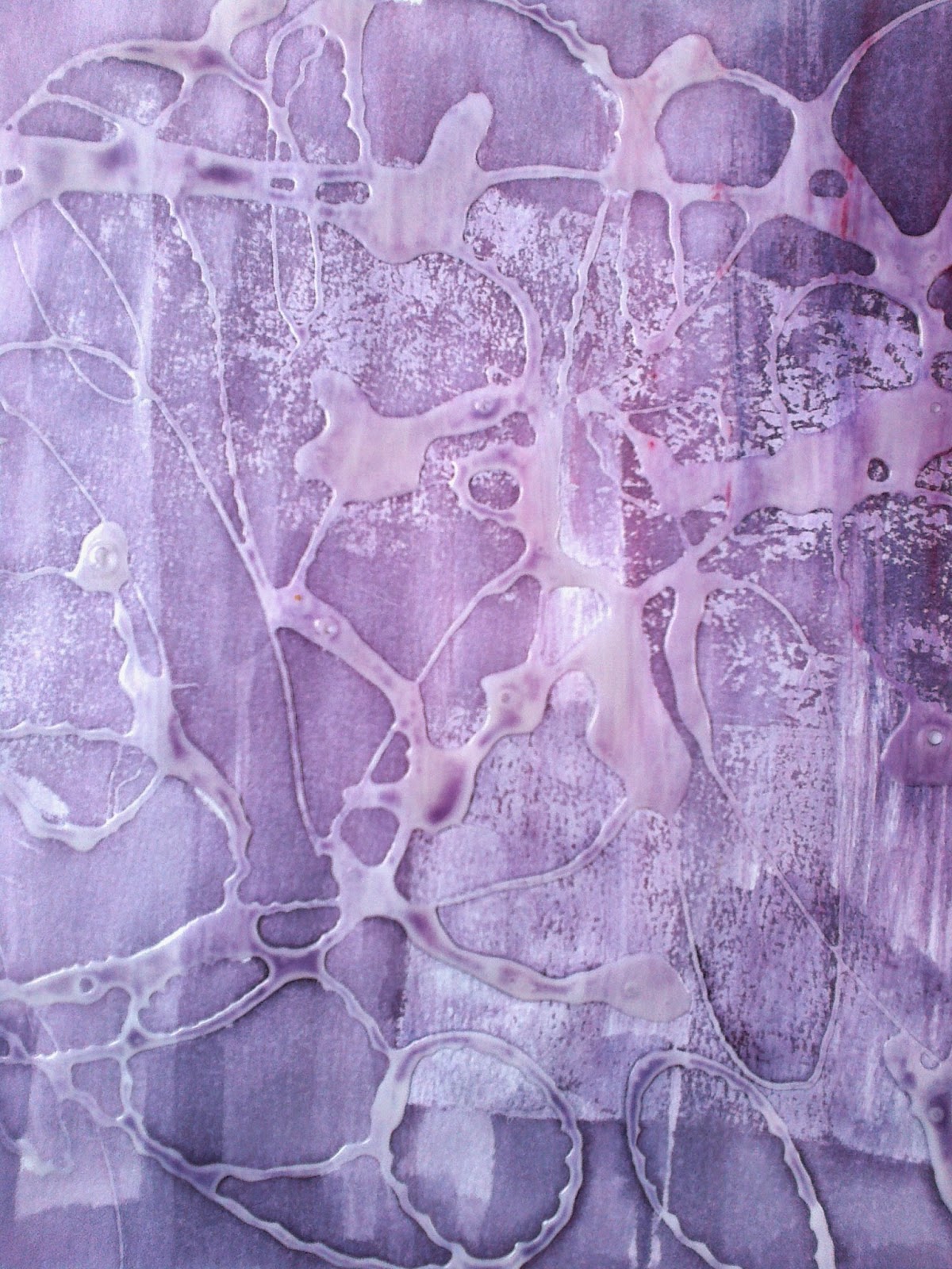
The first adventure for texture was with emulsion paint that was imprinted with stamps and card edges. The second adventure was with PVA glue that was 'drawn' and allowed to dry before painting.  


Ref 5.11.4c

Ref 5.11.4d
The colour  was an experiment for although I had earlier considered earth tones  this adventure came about  when  I was thinking of doing underlaying 'igneous' rock colours...a step to far! When reviewing these papers considered that the method, but in the rights colours, could be used for a base layer for the resolved sample.

Ref 5.11.5d
Ref  5.11.5c
Ref 5.11.5a
Ref 5.11.5b
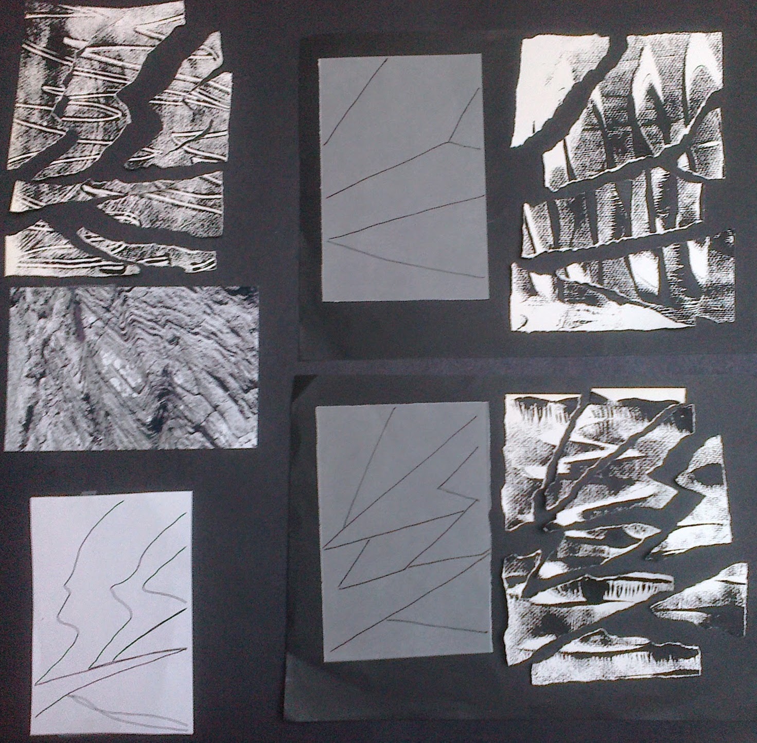
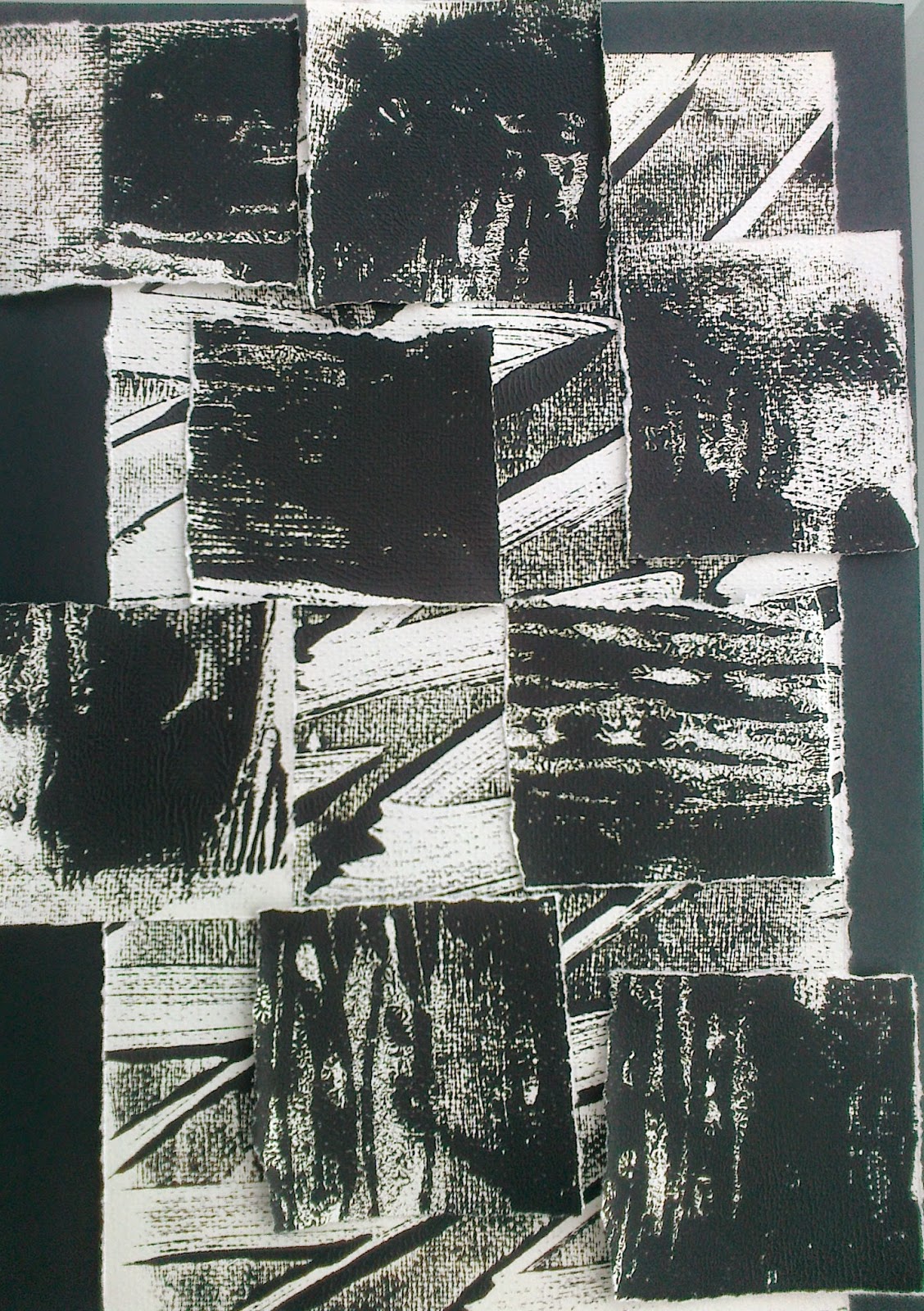
Having selected the papers tearing began...
Ref 5.11.6a
Ref 5.11.6b


Ref  5.11.6d
Ref 5.11.6c
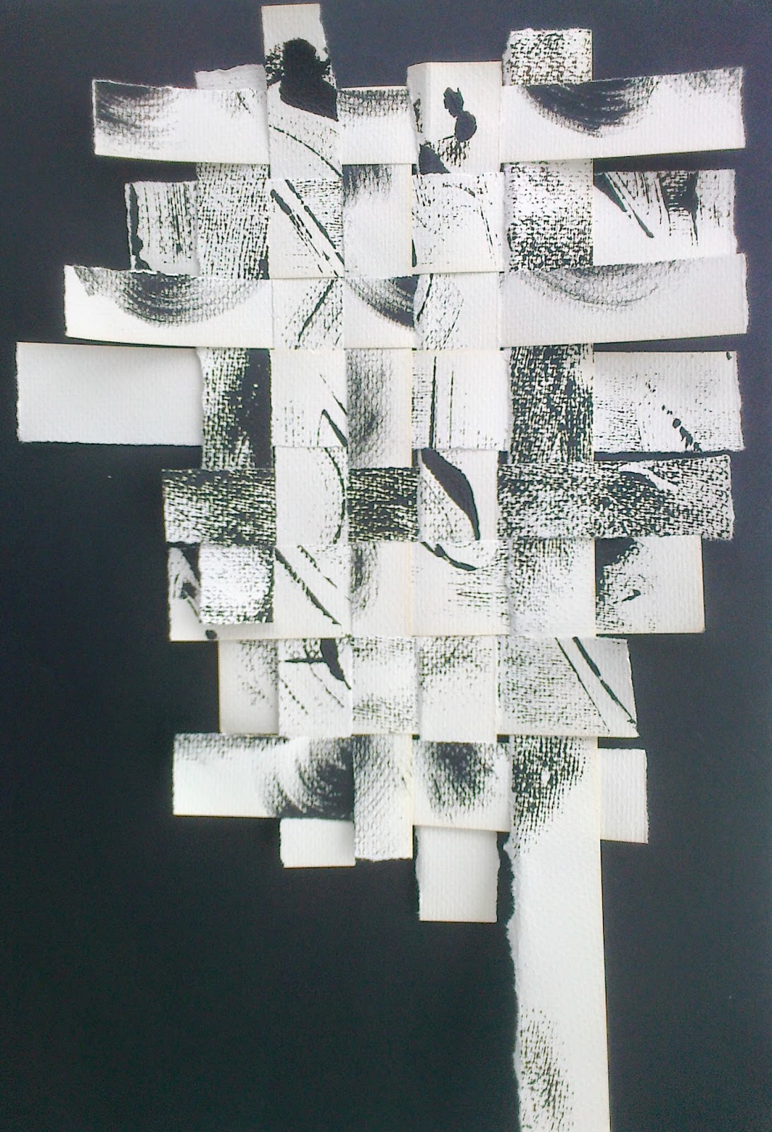
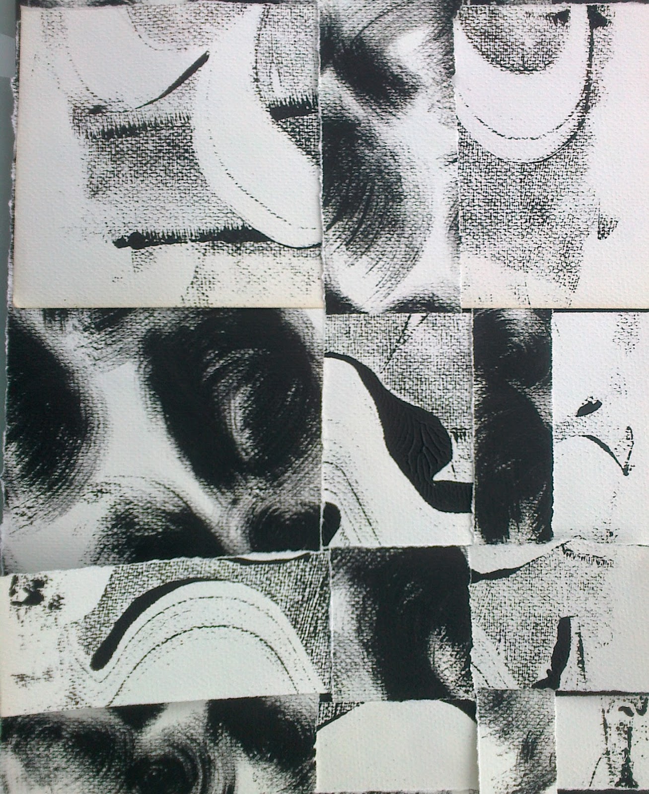
With some of the remaining pieces of paper I played, maintaining straight lines but beginning to see new lines of textures and movements around the pieces
Ref 5.11.7a
Ref 5.11.7b
Ref 5.11.7c
Ref 5.11.8a
Ref 5.11.8b


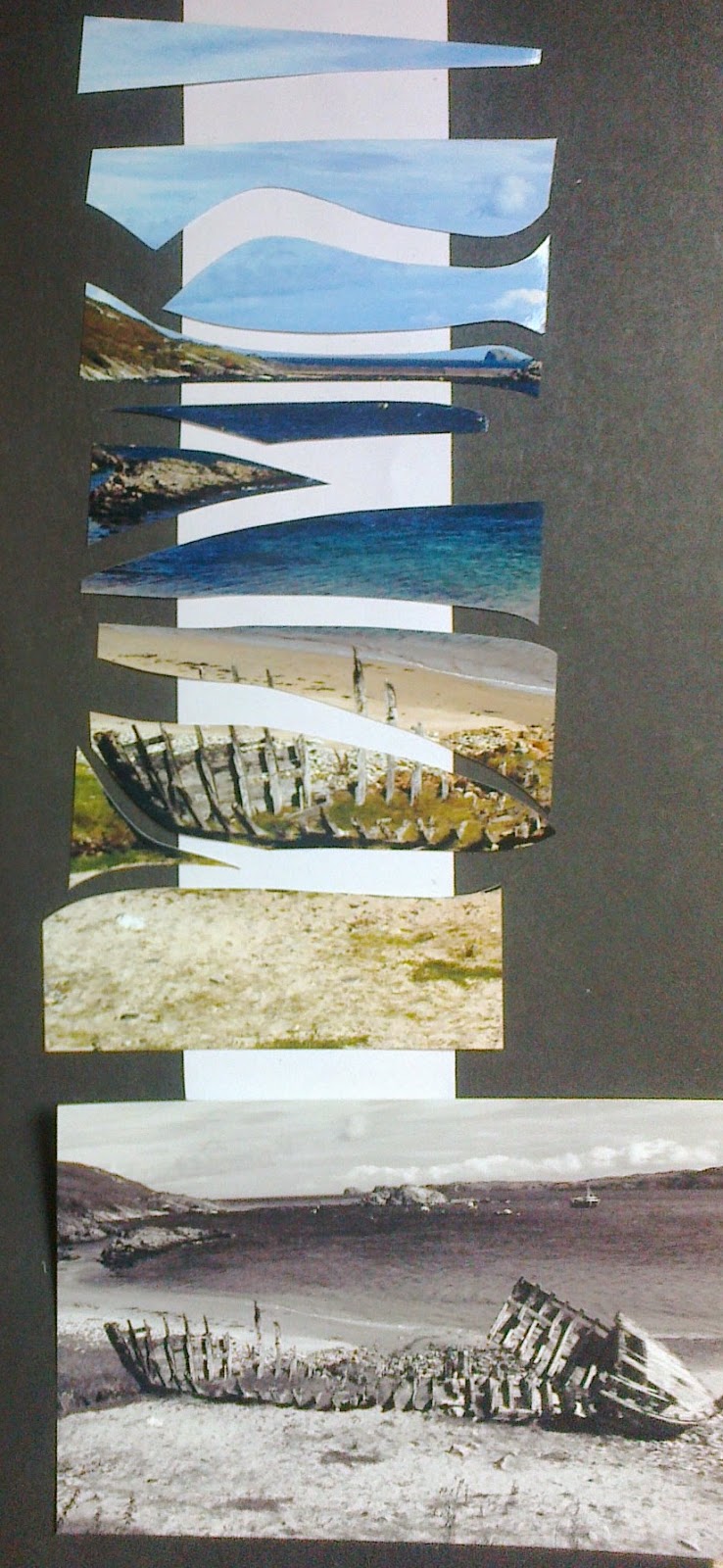
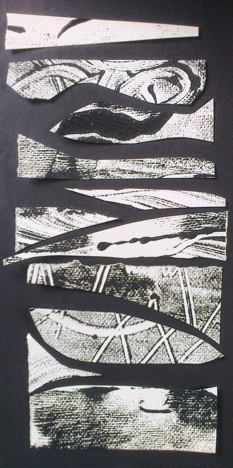
Then I decided to...explore! I suddenly wanted to hone in on the beach photo from my header for Module 5 , references 5d and 6 d above and take a close up narrower view. So I cut the shapes, defined by colour and texture blocks,  and then had a play with some of the textured papers.

I liked the idea of perhaps flipping it on its side; just as the Moine thrust had done, and playing with the different textures or strata and forming a three dimensional shape but that leads me into Chapter 12 and some trial samples. Before all that have just reviewed all my chapters and collected thoughts on my priorities, helped by Sian's comments, will add this to the TEC list and focus on the task ahead... these words emerged.


Wednesday, 28 May 2014

Three Artist

Jenny Raiment
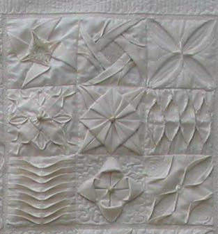
Known as the Muslin Mistress Jenny obviously has a reputation for her expertise in the field of creating textural surfaces. While the procedure for making the pieces concentrates on detail and accurate cutting and sewing I was heartened to read
her quotes , 'Mistakes do not matter the result is just different' from  Tucks, Textures and Pleats and 'You can't go wrong, it's just different' from Tucks and Textures Two, St Richard's Press Limited. The sense of reality that one gets from such remarks and the images of some of Jenny's clothing designs also reveals a sense of fun and enjoyment.
Suduko - whole 
Suduko detail
It was a real bonus to see Jenny and her quilts in person at the NEC show in March.  Judging from the number of people talking to her, the questions they were asking and the fact that she was preparing samples for a forthcoming workshop she is obviously in demand and has a wealth of inspiring ideas.  As I prefer doing Sudoku to crossword puzzles it was topical to see her 'Sudoku 'quilt.
The designs that I have chosen to include are; All Squared Up in which the striking black and white contrasts are used to explore apertures and layers being peeling back.  Jenny's generosity of information is prevalent on her web site and would encourage anyone to have a go with the clear instructions and teasing combinations.

All Squared up
In contrast this piece, seen left, explores and introduces subtlety of colour contrast beside an original black and white image in the top right hand corner. The  touch of colour adds a feeling of movement through the shapes lapping over and under and the stitches and tucks defining variations on a theme that crosses over and under the rectangles that join across the piece.

http://www.jennierayment.com/

Michael Brennand-Wood

A member of the 62 Group, Michael's work combines line, structure and pattern and has, in his more recent work, a distinctive dimension -  components literally come of the cloth in an abundance of small detail.  His work as a curator and textile historian centres on understanding textile techniques and their context with textile history; it is a subject on which he lectures at Goldsmith College, London. The works I have chosen to show are from an earlier period in  his career which offer a foil for the development of later pieces:


Broken English 73 x 95 x 4, 1981
I have encountered difficulty in get images of the following pieces so have given a description and a web link


The light is only perfect for a very short time 1994 reminded me of the sample pieces we were asked to put together in Chapter 7. It shows how small pieces carefully collected can make an impact that as Aristotle noted , 'The whole is greater than the sum of the parts'.  In the past  I have preferred to set out to make a whole piece rather than produce lots of samples but this seems to present a way where you can have the best of both worlds.
Imaginary Landscape Rise and Fall 1999 has a combination of movement and symbolic shapes that have a textural quality.http://brennand-wood.com/pics/022.html


Wayne Higby


Born in 1943 Higby is an American ceramic artist who gained recognition following a show at the American Craft Museum in 1973.

I became aware of the work of Wayne Higby following a visit to the Renwick Gallery in Washington D.C. in 2009.  My interest in geology and landscape was immediately attracted to his incorporation of these aspects in his ceramics.  Since that introduction it has been fascinating to investigate the wide range and scale of his work.  The textural surfaces he achieves through a range of ceramic medium surely holds a parallel to what we strive for in textiles and in particular with this module.


 Focusing on landscape for a source of inspirations the size of his pieces vary from small vessels  and tiles to larger architectural pieces that make their own landscape such as the series Earth Clouds.  Higby says of his work that:

"I strive to establish a zone of quiet coherence – a place full of silent, empty space where finite and infinite, intimate and immense intersect."
This core value is, for me, apparent across all samples and sizes of his work and one I would love to aspire to.
In the late 70's his interest in Chinese porcelain and Raku techniques developed in a life time of studying and exploring the timeless possibilities of this technique. 
While his smaller pieces are often identifiable as ceramic vessels Higby often uses the shape to explore the imagery that inspires him rather than the utilitarian function of the vessel
Stone Gate, shown, below explores the use of space to draw the eye and give contrast to the detail and texture that surrounds it. Again sadly I cannot download images but the following connection should take you to a site.

http://antiquesandthearts.smugmug.com/Covers/Higby/


Stitch to Translate

 
Ref 5.10.1
Ref 5.10.2
Taking the rubbings made in Chapter 9 it was apparent that the images showed up better if left medium size.  The rub taken directly from a stone shown in Chapter 3, ref 5.3.1d and then changed to a negative image gave a good result.


Ref 5.10.3

Looking at the rubbings the following stitches came to mind: variations of bullion knots, loop stitch, an exploration of buttonhole stitch and needle weaving. I also wanted to experiment with Cretan stitch and use broad chain stitch as a solid filling.
Before deciding on stitches to translate the marks the fabric was placed over paper shapes and rubbed with oil pastel. Purchasing a slightly coarse black cotton for this task I felt the weave would take the stitch detail and rub better than the smoother black cotton I had used for stitches in Chapter 9. Learning from my mistake of using too small a piece of fabric in the previous chapter a long strip was made.
Ref 5.10.4
 Photos were taken of each rubbing and pictures were turned to stimulate ideas for stitching.  A strip of black fabric became the playground and different threads were used to interpret the fabric rubbing. The same threads were used for each stitch sample except on sample 4a where boucle and tape were also used to do the Litch stitch.

Ref 5.10.4a
Ref 5.10.4b
For the 4a sample french knot, bullion and Litch stitch were used, thanks Sian for information on the Litch stitch - a great stitch for knobby, knotted threads... and it fills spaces quickly! For the 4b sample I started using Cretan stitch but it soon took a journey into herringbone stitch.
Ref 5.10.4c
Ref 5.10.4d


For sample 4c the twists and turns of buttonhole stitch.For sample 4d chain stitch and open stitch were used.


Ref 5.10.5a
Ref 5.10.5b

In stitching the fabric rubbed images the enjoyment came in filling the negative spaces and turning the images around. It gave a feeling of connecting with those who have carved runes and marks onto stone...using the stone to tell its story of wear and tear.
Ref.5.10.5c

Ref 5.10.5d

For the ease of cross reference I have compared the original sequences below.


Ref 5.10.6 a and b

and now rubbings of the stitched pieces

ref 5.10.7 a
Ref 5.10.7b