Thursday, 25 September 2014

Introduction Module 6

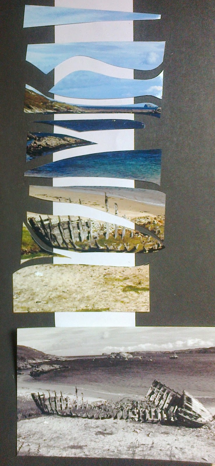
A time to sift through and select a host of my photos that reflect the key themes for Creative Conservation in water and sky images.  Concentrating on colour combinations and textural effects that can be seen in the whole picture and within the detail.
Ref 6.Intro.1
Ref 6.Intro 2
Ref 6 intro 3
Having selected and rejected a host of  personal photos I then explored the work of four artist, looking first at Turner, the images 2 and 3 and Monet below, suggested by Sian. The contrasting images of reflection achieved offer interesting contrasts of style, coupled with the variation of placing of horizons.  The energy that is achieved in the use of colour whether bright or subdued is something to consider

Ref 6.intro 4
Ref 6 intro 5

 Two modern artist that came to my mind, the photographer Ansel Adams;  http://www.anseladams.com/ and  Andy Goldsworthy;  http://www.morningearth.org/ARTISTNATURALISTS/AN_Goldsworthy.html


In looking into Ansel Adams work I found the quote, 'There are always two people in every picture, the photographer and the viewer'. A thought to keep in mind while working through ideas, how to convey and what you want to convey. While writing the blog I also became aware of a modern photographer Mark Robert Davey, and was interested to find his portfolio featured people within the landscape... While studying the pictures I kept in mind that the end project from these studies was to be a wall hanging that addressed the issues of conservation; would I select an issue on pollution, climate change, nature or another concern? 
As images swirled around  suddenly my photo of the sunset over the Isle of Skye bought the phrase Ring of Bright Water  into mind - the story of Gavin Maxwell and his rescue of an otter had actual taken place beside where you now see the Skye Bridge. But then a strong feeling emerged, a more recent sailing adventure on the Caledonian Canal, with the image showing Mike in a moment which made me think of the quote, 'some times I sits and thinks sometimes I just sits!!'  Perhaps a theme of conservation involving peoples reaction and participation...But no decision needed at this time, keep the mind open to even more ideas... 
We were asked to keep in mind that the size of the piece should be A2 to A1 and to consider where we would like to display the item if not in our own home, the gauntlet had been thrown down by Sian now to the first steps on the journey!

Thursday, 11 September 2014

New Module

At the beginning of each module I change the header photo.  The picture was taken in Loch Corusk when I was touring the Western Isles.  This is where Turner painted his inspiring series.  It was a glorious day and memorable experience as had been the day that was shown in this picture of Meness Beach that was used for Module 5

Wednesday, 10 September 2014

Admin Module 5

 Administration Module 5
STORAGE AND HEALTH AND SAFETY ISSUES DISTANT STITCH Module 1, 2 , 3, 4 and 5 ( new additions red for Module 5)
As the course is taking place in my home the following three criteria have influenced the following decisions regarding storage and health and safety issues:
  • My own convenience and safety
  • The convenience and safety of my family, and friends who may visit
  • The well being of the environment in which I live – a remote rural location where we have a private water supply and septic tank.  I endeavour to recycle paper, fabrics  and am know for collecting ‘thrums’- waste threads in Scotland - from not only my own work but our monthly sewing groupies inevitable come armed with bags of their thrums for me. In trying to maintain a low carbon footprint car use is considered carefully and as craft suppliers are a sixty mile drive away I do use the internet! But again I try to look to my collection first before pressing the order button!
 STORAGE
I maintain two work areas:
  • a wet area within the garage, where there is easy access to water
  • a dry area in an upstairs study where there is access to a computer/printer and sewing machine, threads, fabric, books and sketch pads/pencils. My ironing area is in another part of the house
As an excuse for my hoarding tendencies I need to have a variety of storage options.

Wet Area
With grateful thanks to Mike who not only allowed me a space within ‘his domain’ the garage, but also built the bench and shelves and cut various boards and acrylic panes I have:
  • a bench,  150 x 70 x 70cms
  • stool
  • two shelves
A series of three plastic containers for paints/printing inks, fabric medium and stamp/mould making and adhesive materials allows easy, visible access.
Rollers are hung on wall, brushes are kept in containers and cutting tools are kept in original boxes.
A plastic sheet is used to cover work surface- particularly useful when Mike is having a wood working day or when I have a printing/painting day
Apron and shirt are hung for easy access
When cleaning paper making equipment ensure plug holes have a filter system over the top in order that stray pulp does not block sink.
To ensure there is no cross contamination of colours occurs when using containers that have dyed paper or fabric in them ensure that they are covered when not in use.
Dry Area
With great appreciation again to Mike for making me three mobile tables and a bookshelf I am able to expand and contract the area I take up relatively easily. 
Storage is in colour blocks as we use the area for living and like to keep it ‘attractive’:
  • A series of glass cookie jars hold my threads, for sewing; separate Kilner jars hold more varied weight threads; old glass sweetie jars hold fabrics.
  • A 4 ring binder sketch book to log my progress for upload onto blog with A5 rough note pads at my side for thoughts and ideas
  • A4  plastic display folders hold Distant Stitch module chapter notes and templates made and not included in sketch/log book
  • A3 plastic display folders hold papers and fabrics that have been printed for project
Ease of access on working samples
To ensure that materials for the project I am working on are easily accessible I have made and covered two cardboard trays:
·        one for threads being used on project
·        one for fabric that could be useful in the project
and specifically for Module 2 were lots of pieces of paper were used a plastic envelope for papers
·        a story board, serves as a billboard for each chapter . Key pieces are kept on it for reference and inspiration

     As I have progressed I have identified a need for flat storage of A3/2 pinboards on which I lay ideas flat and incorporate fabrics, threads and other items to 'play on' working through ideas as I go along. Thank you Mike for your carpentry skills!

    When starting work for the day read through work sheets of the current chapter, plus the following chapter to ensure you have all equipment and materials that will be needed close to hand, this not only saves time but allows you to follow thoughts that come to mind. It is worth considering what you will do if items are left over, e.g. dye – could other threads, fabrics or papers be used to add to your stock cupboard or use in later chapters of the Module.  I find it useful to have waste paper, fabric and threads to hand to experiment on before doing something with ‘treasured’ pieces.


HEALTH AND SAFETY
The key concerns that have arisen when undertaking Module One include:

Ensuring that I work in a space that is:
·        light, well aired
·        cables for any equipment are well concealed reducing any hazard when moving around the work area
·        all items to be used on the specific part of the project are close to hand
·        and, take regular breaks to help stop fatigue.

Dyes and colourings: 
My main colouring agents have been:
·        acrylic and water colour paints, pencils and inks.  Concerns on using an old set of inkjet printer refills made me research the product and Appendix A gives the advice that I followed.  As the containers had sharp ‘injection needles’ empty refills were disposed of at the local Doctors Surgery where they have a ‘sharps disposal’ facility.  Any other waste was disposed of away from the water system.  When using inks ensure that the tops are screwed on after each use in order to avoid spillage and contamination.
·        Dylon fabric dye has been used.  The warning that it is an irritant are heeded and gloves are warn when working with the dye.  The fact that it can be an irritant to eyes, might cause an allergic reaction and one should not breathe in the dust  makes one vigilant while and after using the dye.  As the hints include the fact that the dye may run after several washes I only use this dye on items that will not be washed thereby ensuring no contaminated water gets into the water system.  When mixing this dye I only make sufficient quantity for immediate thereby reducing storage issues or waste disposal. In instances where too much has been made and I have insufficient material to dye contacted Dylon who have informed me that it can be disposed of in our land drains.
·        Bleach is toxic and should be used with great care.  It can not only damage clothes but make an impact on the environment.  When used to lift colour from dyed fabric I placed a small amount on a china plate to ensure no waste remained.  It is advised that your wear gloves when using bleach and work in a well ventilated space.  While I do have a face mask I was able to open doors so did not use it in this instance. A little bleach goes a long way so decant into small containers. When using bleach to take off colour be aware that it takes a few moments to lift off colour so move along and don’t over do it!
As I need to replace my stocks I have looked into more user friendly items.

·        When using brusho powders sprinkle sparingly at first and build up colour depth gradually.

Adhesives:
·        Glue sticks, sellotape, double sided tapes and PVA  is easy to use and apart from ensuring it does not stick on work surfaces.  However, I have found that is best not to use PVA on typed paper and place in sketch book as it diffuses and turns some images green!!!
·        When working with papers I have used a spray temporary adhesive.  This is a highly flammable substance in a pressurised container and should be kept away from heat/flames or electrical equipment that are in operation.  It should be used in a well ventilated space and in short bursts without extended spraying.

Cutting implements:
·        Scissors – the work has alerted me to the fact that my scissors are not particularly sharp!!  I have found a  person who will sharpen them so hopefully not only will my cutting be easier but also more accurate.        
·        Knives - The main concern centred on my craft knife which was used on flat, stable surfaces with a cutting board underneath the item.  The protective cover was replace as soon as any cutting had been completed
·        Olfa Rotary cutter should be kept with black click cover on, do this between each cut, do not place on fabric or table without cover on when not in uses to ensure that it does not have sharp edge protruding.  This can cause injury. When using to cut into fabrics or papers it should be only used on stable surface and one should push away from the body. When handing to other people ensure cover is on.
·        Seam ripper – While seemingly innocuous this little implement is sharp and when used for cutting channels one is exerting pressure and the cutting edge can slip off line so one should be sure that they are treated with respect.

Sewing implements:
·        Sewing implements and accessories, again simple things like pins and needles are stock and trade in sewing but in the wrong position they can cause discomfort and wounds.  To minimise risk of needles and pins dropping into carpets or chairs I always have a pin/needle cushion to hand and tend to ‘count them out and count them back’ i.e. I use glass topped pins and only have the needles I need to hand.
·        When working with beads maintain them in a lipped container with velvet to help position them and avoided spillage on the floor.
·        Selected the relevant sewing needle for the task to ensure that you do not strain fabric or your hand to pull it through the fabric 
·        Sewing machine – to ensure smooth running of machine, particularly when using frequently or running thick thread, it is important to ensure that spool area is cleared of dust.  When sewing various layers or thickness of fabric loosing tension and using a slow speed seems to be good practice.  Ensure that needles are not blunt.

Module 5 Time Records
159 hours were worked over 75days making an average of 2.12 hours on days worked
Module 5 Supplier Cost Amount used Cost for module 5
Item
A4 Sketchbook W H Smith                         5.99
Beads/threads stock replacement cost 4.80
Fabric and dye stock replacement cost 12.00
Reference books Amazon                         12.00
Sub total stock for module 34.79
From previous purchases
Glue sticks   one third                                1.00
Double sided tape               3.99   two third 2.66
Cartridge paper display kept
Printing inks Cartridge save 15.0015%           5.00
Printing paper W H Smith                          1.25
Presentation folders A2
A3 Amazon                                3.25           1.75
Threads
Total Module 5 £46.45
Module 5 Reference and Publications
Reference book Sources of inspiration, Carolyn Genders A & C Black
The Art of Manipulating Fabric, Colette Wolff Krause
The Constance Howard Book of Stitches, Batsford
The Embroiderer’s Workbook, Jan Messant, Batsford
Creative Embroidery Jan Beaney & Jean Littlejohn, Batsford
Tucks & Textures Two, Jennie Rayment ,St Richards Press
Tucks textures and pleat3, Jennie Rayment, St Richards Press


Module 5 Authentication


Sunday, 17 August 2014

Chapter 12...resolved?

All change!  Clarity of thought, aided by Sian, has led me away from getting to involved in creating a functional piece and am going for an interpretation of strata in a landscape/portrait style pieces using a combination of sections. I ventured down the route of exploring ideas with Gimp, the computer programme, which I enjoy and set off on an interesting adventure to complete this piece.
Ref 5.12.3b
Ref 5.12.3a
With these pictures beginning to help me concentrate on the methods to use it was good to muse on the different levels and sampling that could be used for each section.
With three key words kept coming to mind; texture, layer and contrast the selection began amongst my papers, fabrics and threads.
Concerned not to over process the piece kept in mind the words in the manual ' to limit selection to a maximum of four methods'. Texture could be produced, by stitches and fabric finish. Levels could be achieved by padding and cutting through, allowing sections  to show their layers with possibly the highest point being seen outlined in pink with slope being shown in orange. Contrast by colour selection and the thickness of fabric or thread.
Ref 5.12.3c
Ref 5.12.4
Ref 5.12.5
But before a cut is made thought it best to review all my chapters to date and reread Sian's comments on each chapter.  The following points were noted and place on a crib sheet; Digital manipulation - an interesting feature; stitch - how and with what?; edges - ragged, frayed, pulled out, consider use of stitch and sheer fabric, can reverse become the front?
  So now to sit down and play with fabric and shapes. Wanted to get key shapes and sequences of fabric layers into my head to muse on. If I was too take my digital image literally I could fall into a trap of too much detail and too many small pieces that would be difficult and fiddly to work on
Ref 5.12.6
Ref 5.12.7

First faltering steps on layering :
top layer: machine stitched thrums on soluble fabric
second layer: yellow velvet 'knocked back' with black FuseX
third layer : rust felt
Lots of fidgeting and then machine stitched, in long zig zag stitch. Then attached in machine running to stitch to fourth layer of black felt. Note to self - I would pull out some of these running stitches later. The next decision was to add a fifth double layer of bronze silk which would be revealed with cut through channels and fraying. 
Ref 5.12.8
As I looked at sample pieces realised I wanted to stuff them rather than use vilene, wanted to keep the pieces rounded, would possibly restrict stuffing just two of the pieces. Still in my mind was the thought of cutting through these pieces.  But before making too many decisions on this first series I  wanted to construct lower layers that these pieces would 'sit' on. Abaca paper, slubbed yellow silk layered over black felt was the decision. 


Ref 5.12.9
Ref 5.12.10

Three hours later and that concept was abandoned. Its all thanks to a power cut!  I had been stitching away and was getting frustrated and started cutting up and re stitching , see ref 5.12.9 and POW off went the power for 4 hours courtesy of hurricane Bertha. I decided it was all getting overly complicated and that reverse applique could be more effective stitching into more layers of fabrics I had already used see ref 5.12.10.  
Ref 5.12.11
It seemed to pull the piece together when looking at it through a frame.  The scale of the piece to be stitched, the bottom right hand corner, suddenly became apparent.  I was not wanting to frame the piece but seeing size relationships cleared my mind. Machined lines into the piece as soon as power came back on.  Stitching the bottom corner stabilised the work and made for easier handling and hopefully the flow of stitching patterns across the picture.  The four dimensional pieces had just been tacked in position.  Selecting threads from these four pieces I started hand stitching and cutting through the layers. 

As work progressed, realised a groove was appearing needed the needle to be moved off the record a little more frequently! Was I falling into a trap of stitching too much and getting involved in too much detail?  The idea of a relationship of texture, layer and contrast across the piece has produced a very tactile piece that is great to run your hands over but whether it is as attractive to the eye is  questionable either way up! My mantra that , 'less is more' seems to have been proved by producing the opposite - the explanation, indulgence!

Ref 5.12.12a
Ref 5.12.12b
The decision for the final look: to give more stuffing to the shaped pieces on the right hand side and to mount on a black felt stretched over a canvas board allowing a 2 inch border!

Ref 5.12.13

Sunday, 29 June 2014

Chapter 12 a: Resolved Sample - initial ideas

Now to pull it all together, thoughts, textures, shapes, paper, fabric, stitch, threads and touch.  A plethora of samples but the need to hit simple concepts that pull them all together and make an impact.  I became bogged down in worrying about final shape and sketched various ideas; vases, picture, cushions, 3D maps and when I thought of a wedge shaped cover for a cheese board knew I was loosing the plot!  Rejected lots of sample drawings and headed for cover! That could be my route out...The sketch bookcover, but perhaps not... 
Ref 5.12.1b
Ref 5.12.1a
A day away from even thinking about the matter at hand...Returning back and going over the  pictures three images stood out.
Ref 5.12.1c
 The third image proved to be the most compulsive!  My idea of the sketch book cover was fast disappearing - its size was daunting and I was coming to the conclusion that I wanted to use my samples in Chapter 10 as a cover!
But a thought that becoming overwhelmingly attractive was the thought of making a piece of jewellery and the right hand image of Ref 5.12.c offered inspiration. The plan would be to ensure that a combination of textures that appeared in the other samples in Ref 5.12.1 c were used.  But then the concern, would this piece be large enough...should I progress this development?  Some paper models would help me decide but I felt that different depths of 'stones' could be worked.  Would separate samples that were linked by threads be acceptable? Perhaps another pause is needed... Could this be the colour theme blacks, bronze and golds. 
Ref 5.12.2
Paper thread and tissue paper on left with threads and fabric pieces machine stitched on soluble fabric.  On the right a range of black fabrics: velvet, cotton, felt interspersed by gold/bronze silks, gold lame and chiffon with silk throwsters and dyed and crochet thread. 

Sunday, 22 June 2014

Design from landscape; Texture and shape


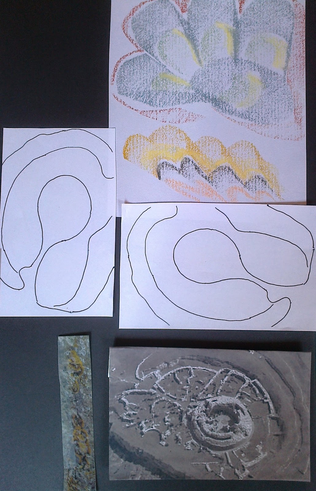
Selecting three images from my original design ideas board I included variation of shapes for possibilities of flat and raised texture.
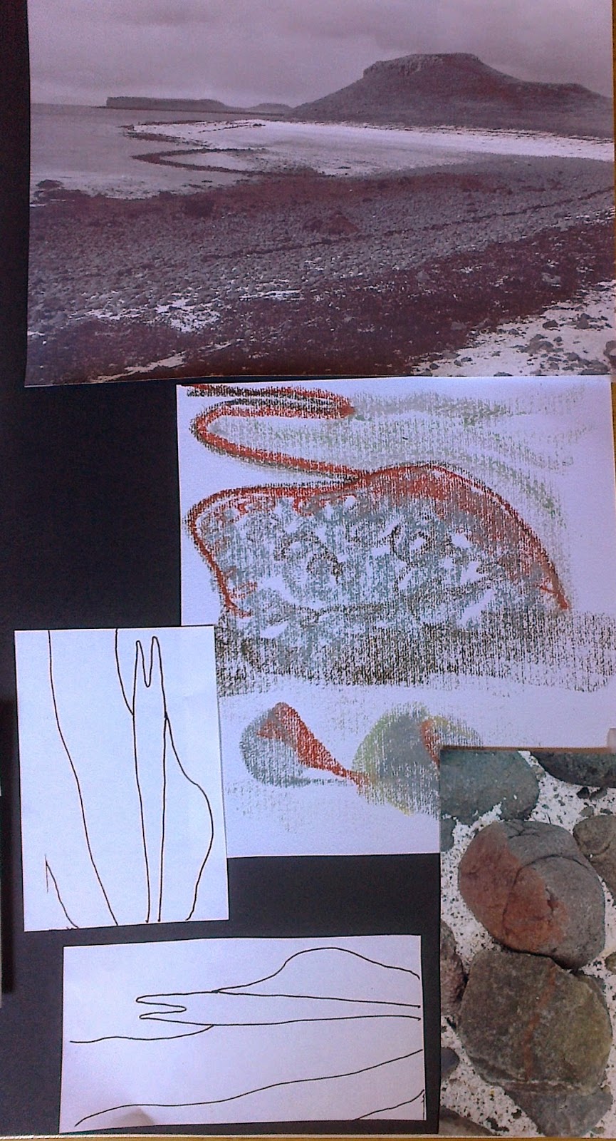
The choices: Coral beach, Skye; Broch of Gurness, Orkney; shore line of Mull of Kintyre
As well as the main picture close up views were used as we had done in Chapter 4 of Module 2.
Ref 5.11.1a

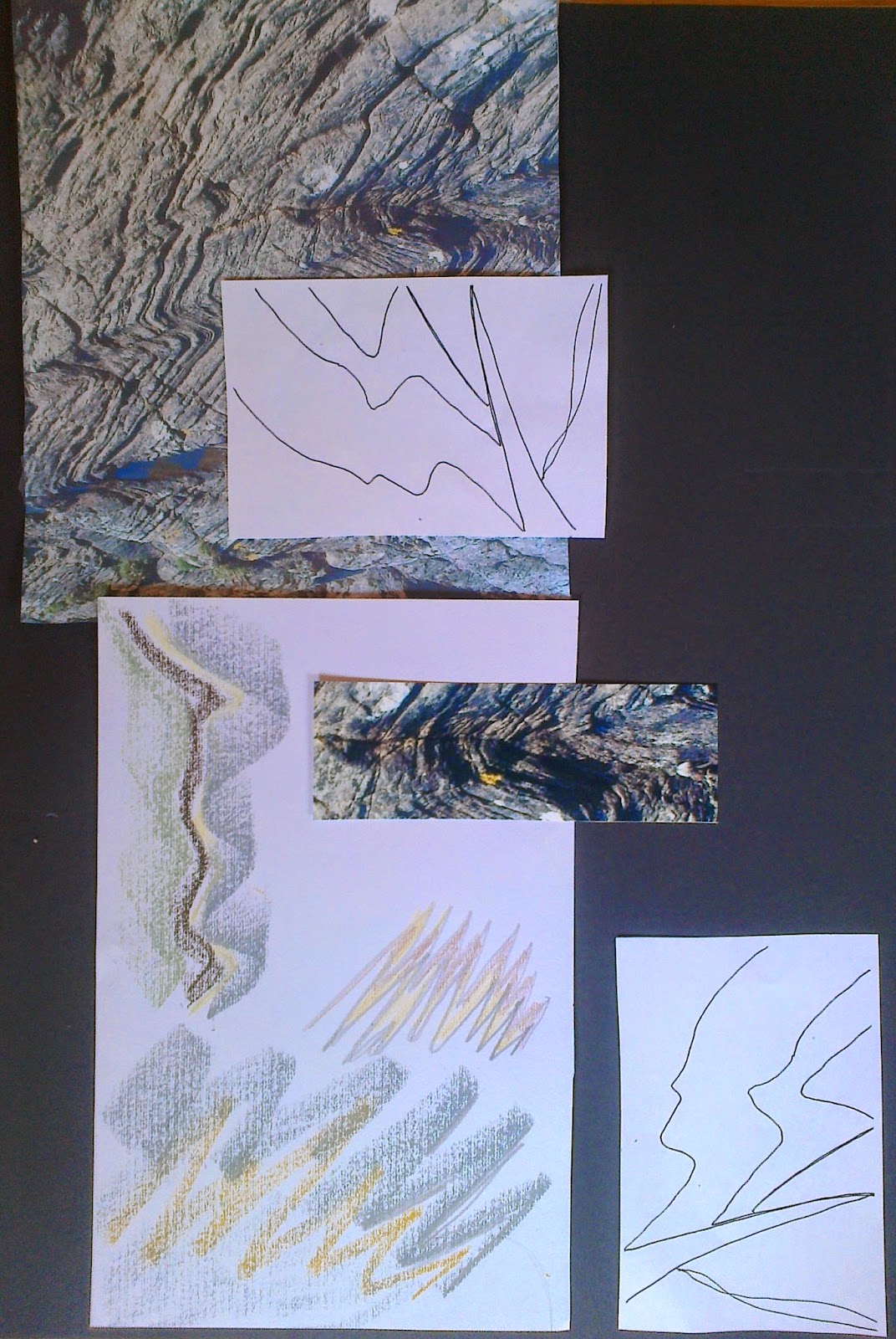
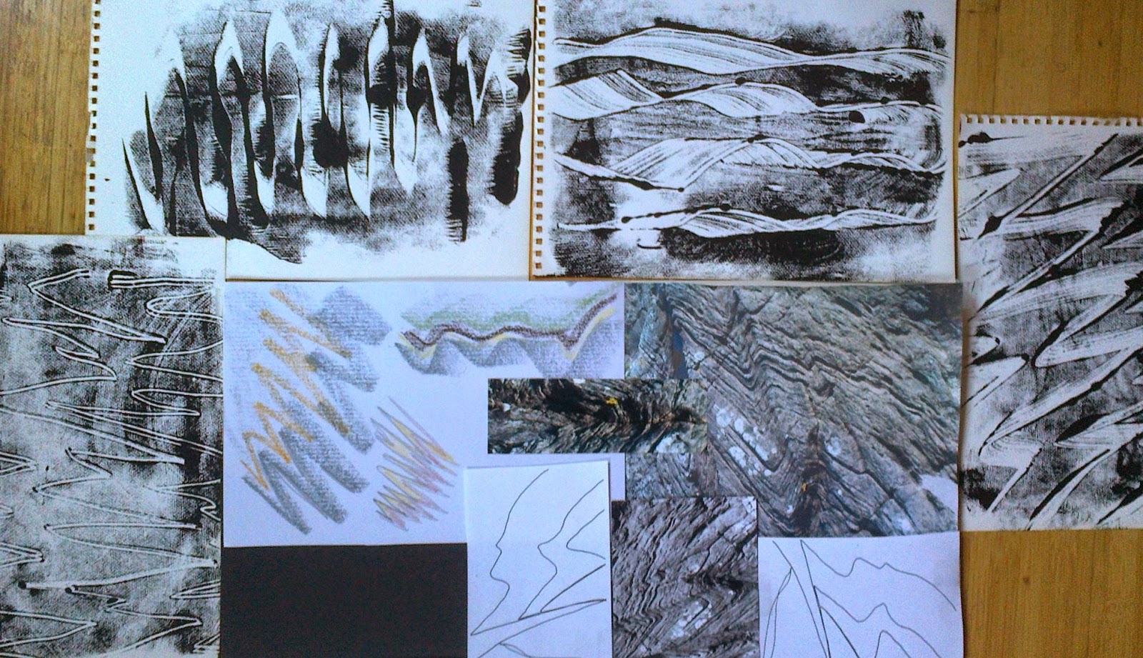
With sketch book in hand the follow results appeared. Selecting an earth tones palette with a touch of green.  General warming up marks were made with pastels and pencils before tackling ones specific to images. The pastels were more user friendly and on the textured sketch pad paper shapes and textures appeared. Before making papers decided to look more closely at photos for shapes and colours and placed them on storyboards to focus on when making my marks.
Ref 5.11.1b
Ref 5.11.1c
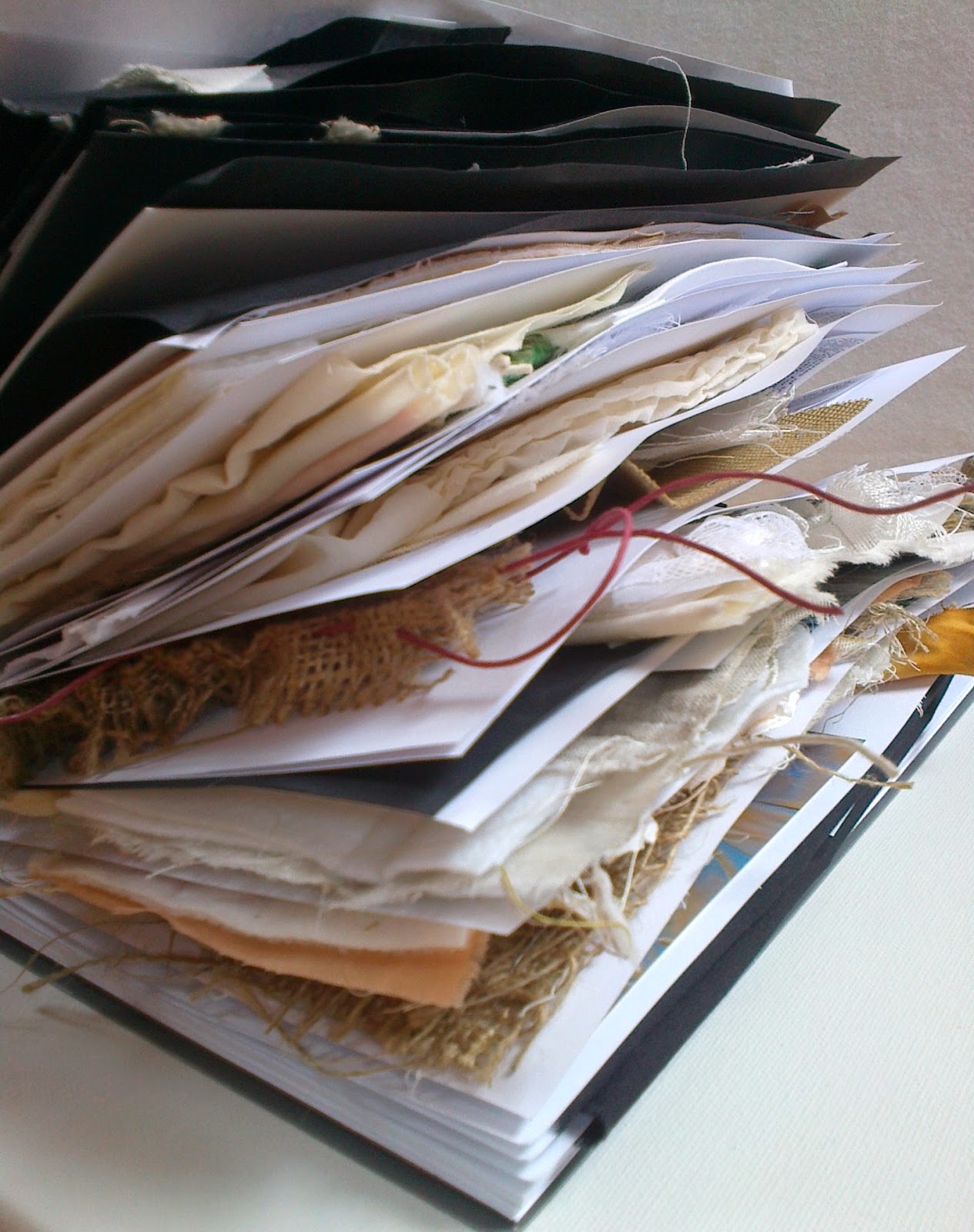
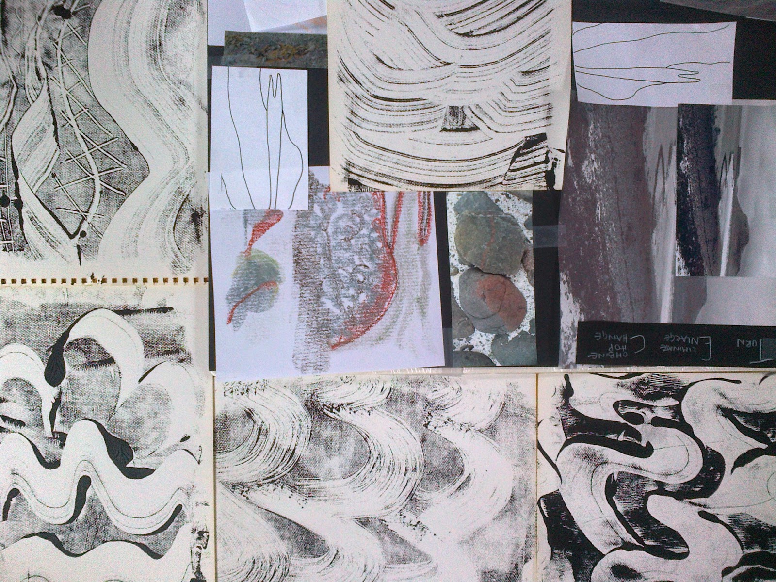
While musing on the pictures I suddenly looked at my Module 5 sketch/sample book!It appeared to be a cross section of the Moine Thrust, which was the geological feature/area I was in when I took my header photo for this Module. I would bear this in mind as the chapter progressed.
Ref 5.11.2

Flat Textures
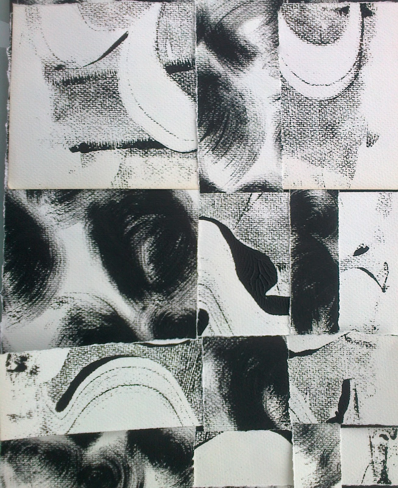
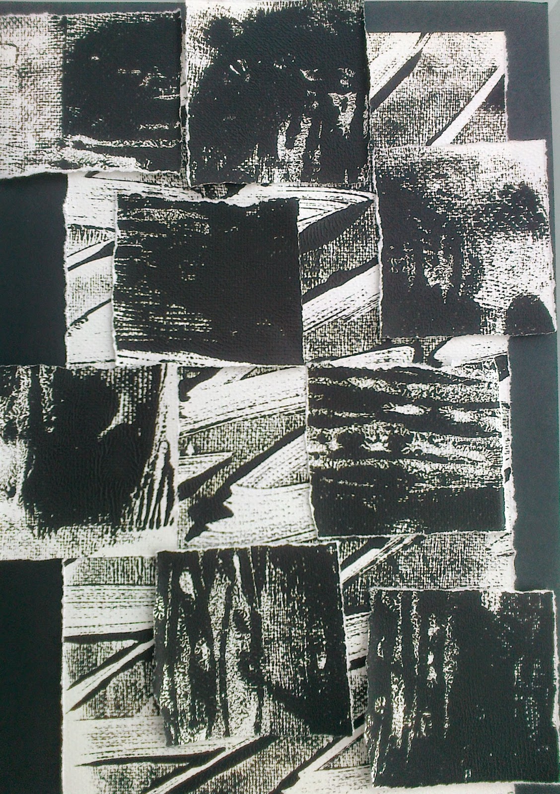
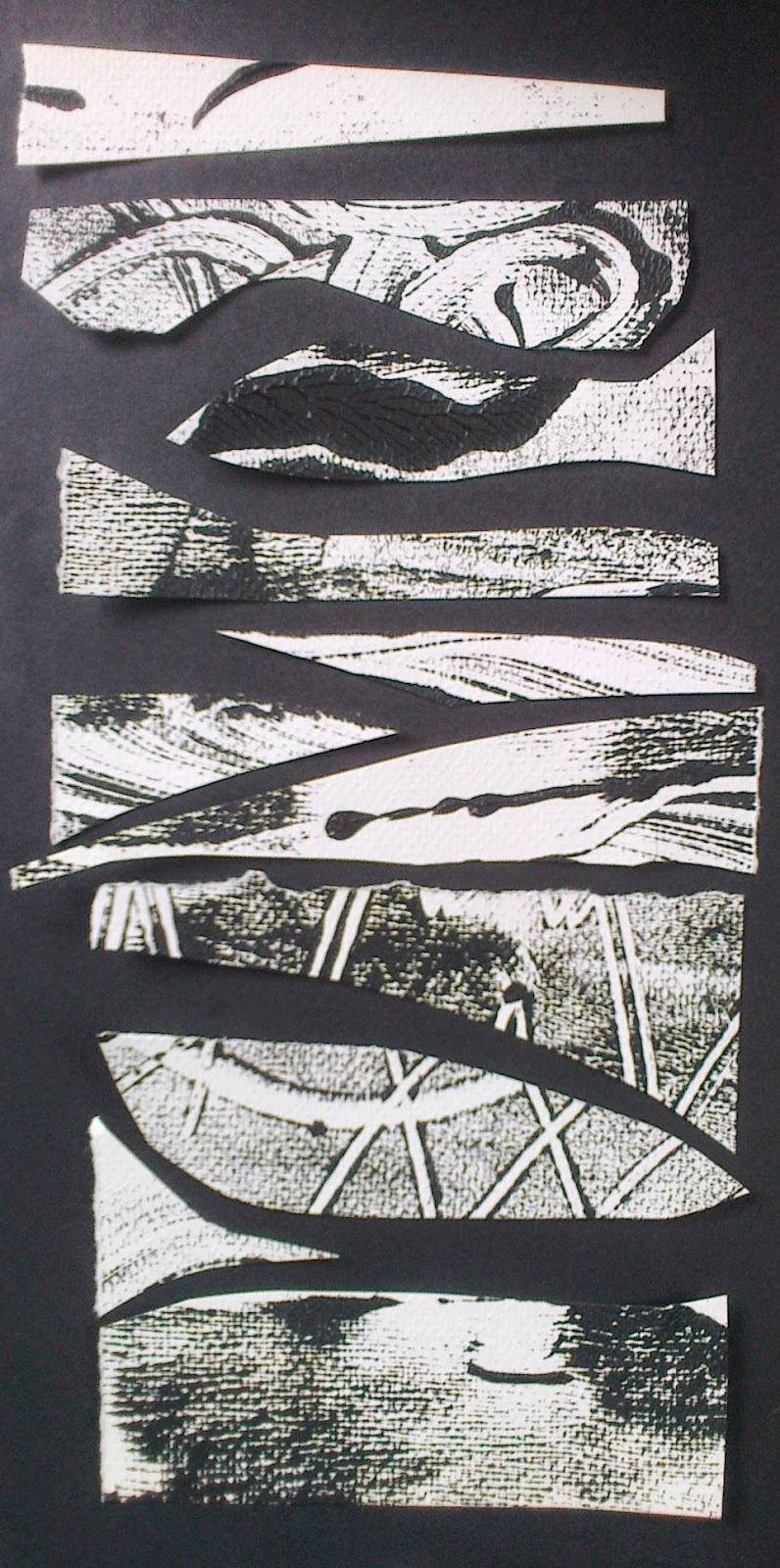
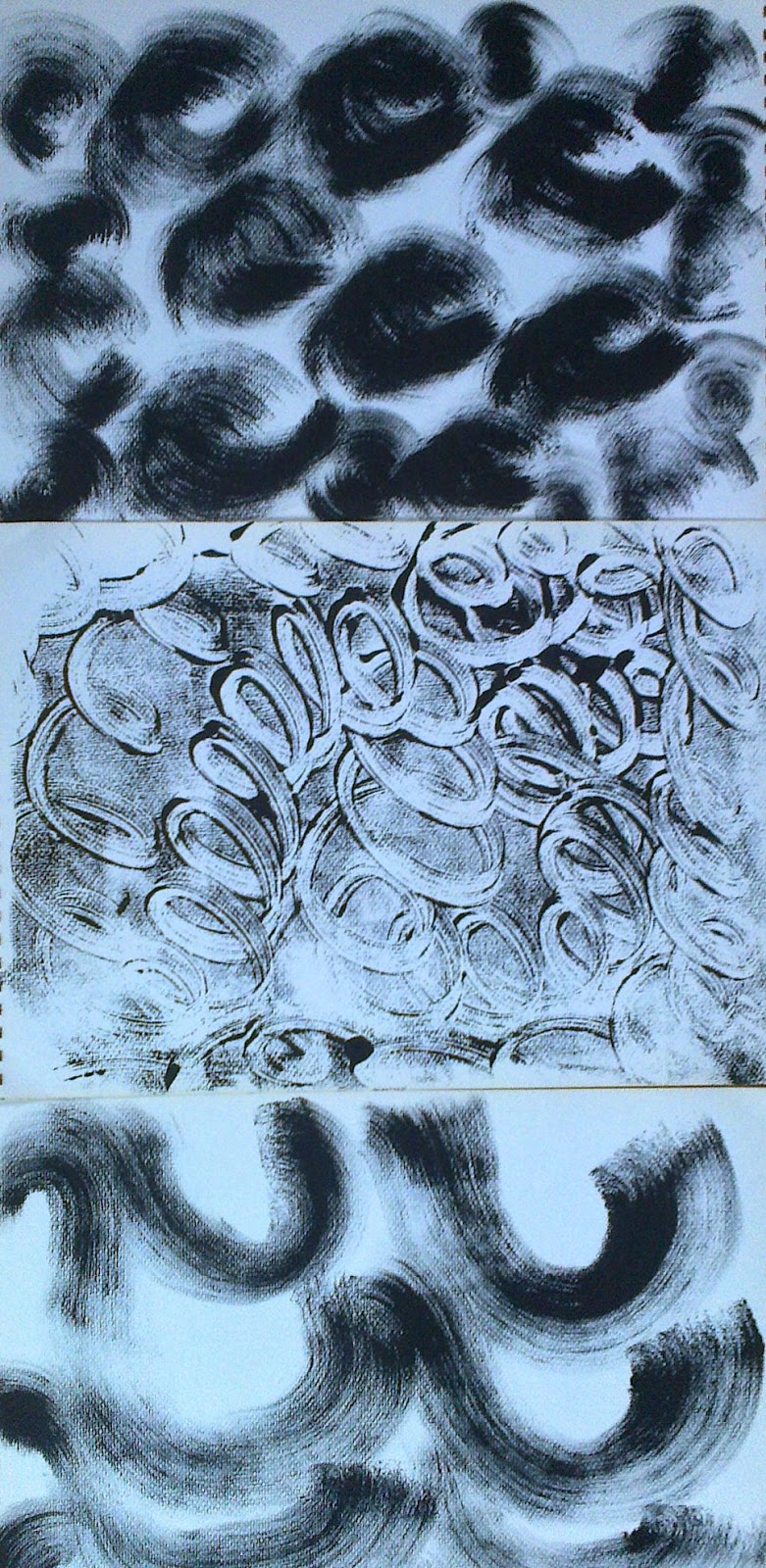
Printing with black acrylic on perspex I made a series of papers
Ref 5.11.3a

Ref 5.11.3b
Ref 5.11.3c

Textured papers
Ref 5.11.4b
Ref 5.11.4a

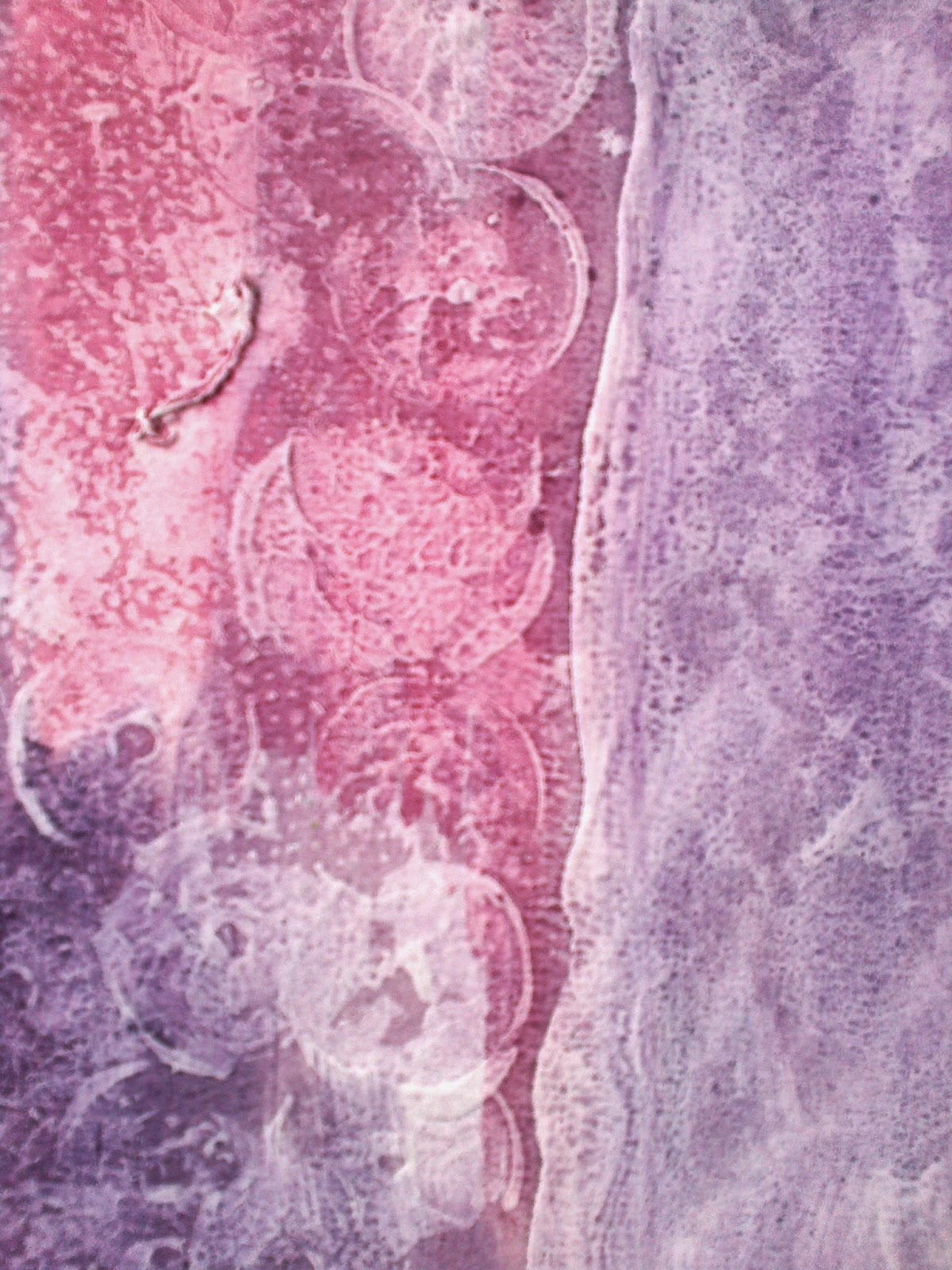
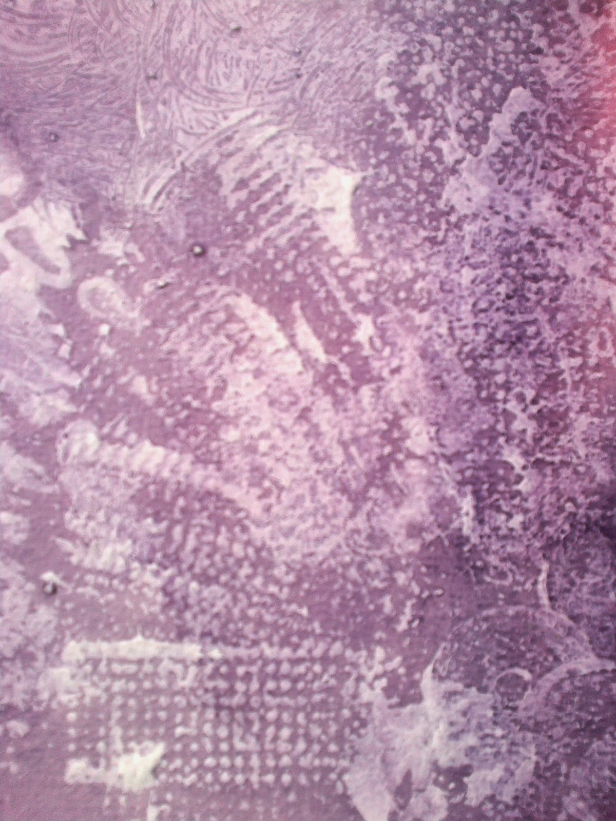
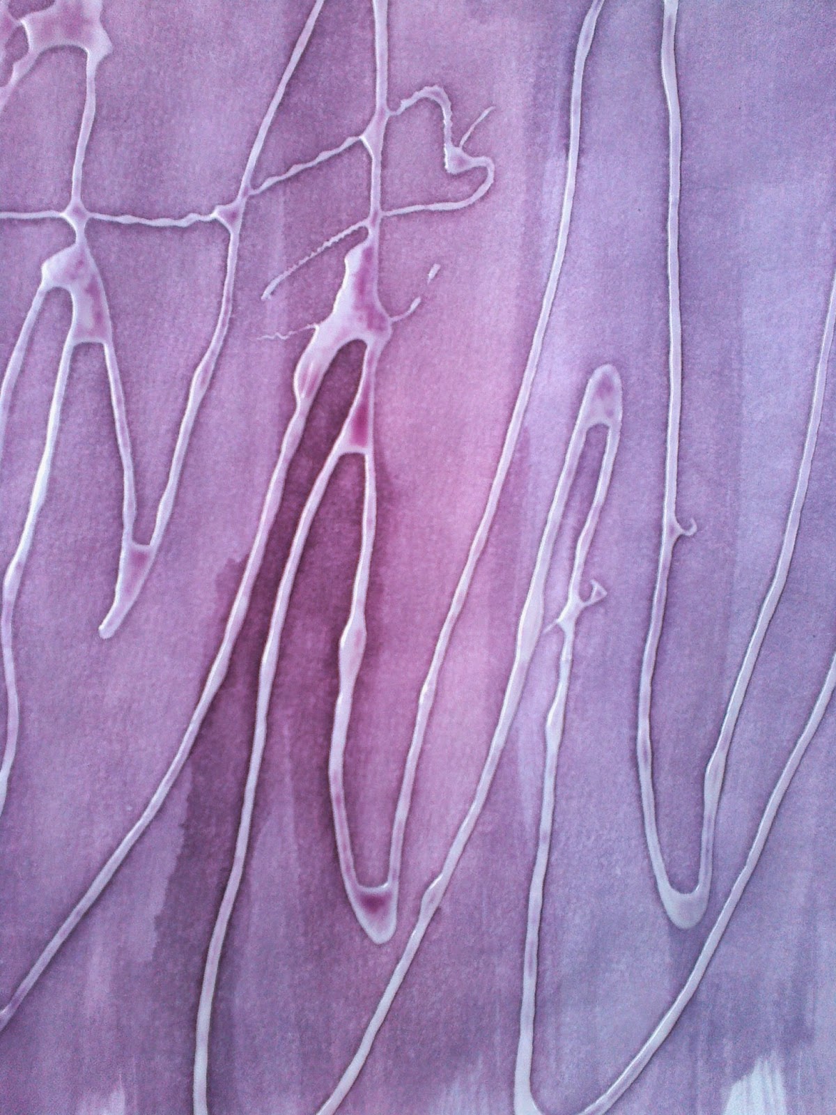
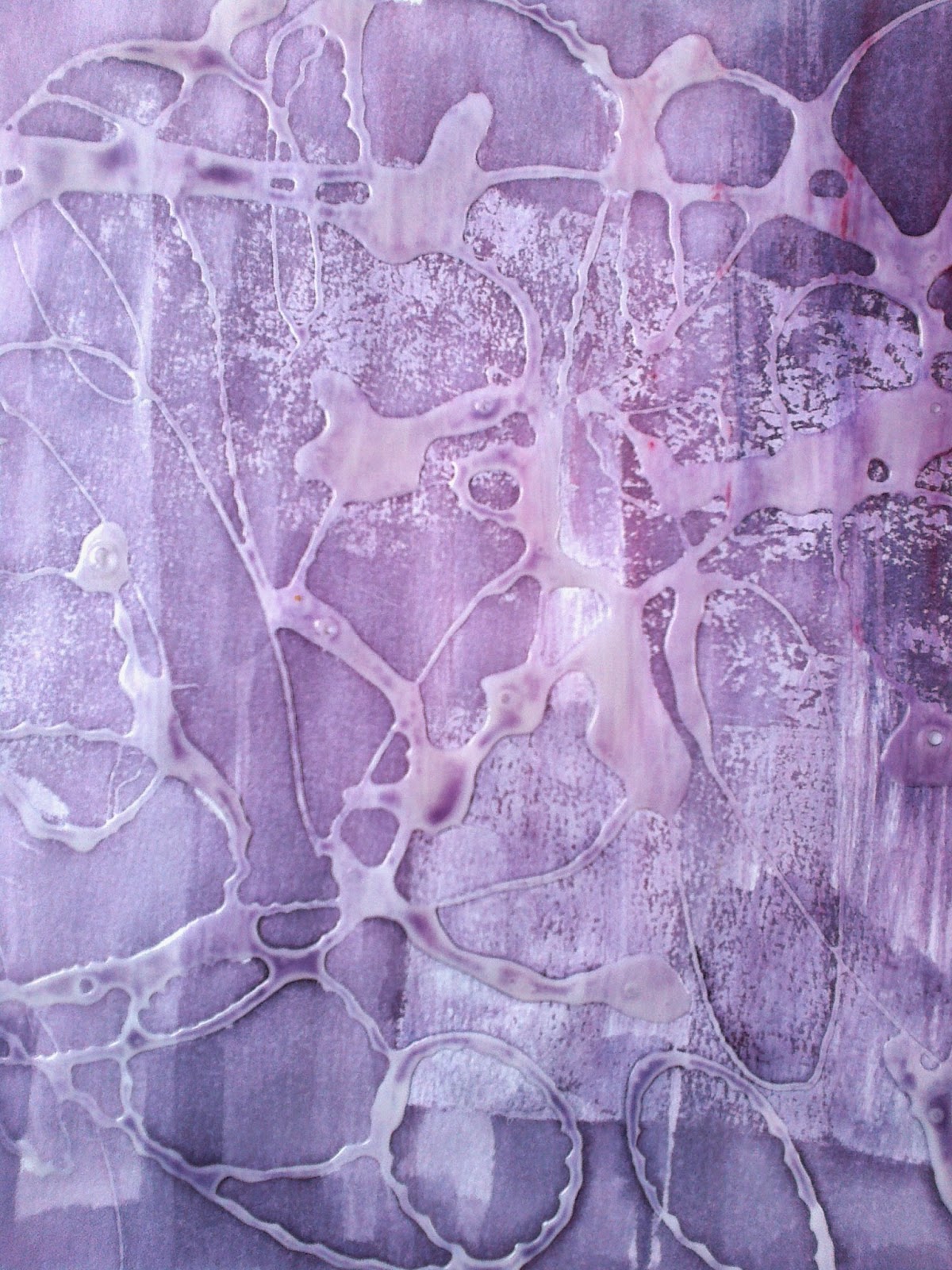
The first adventure for texture was with emulsion paint that was imprinted with stamps and card edges. The second adventure was with PVA glue that was 'drawn' and allowed to dry before painting.  


Ref 5.11.4c

Ref 5.11.4d
The colour  was an experiment for although I had earlier considered earth tones  this adventure came about  when  I was thinking of doing underlaying 'igneous' rock colours...a step to far! When reviewing these papers considered that the method, but in the rights colours, could be used for a base layer for the resolved sample.

Ref 5.11.5d
Ref  5.11.5c
Ref 5.11.5a
Ref 5.11.5b
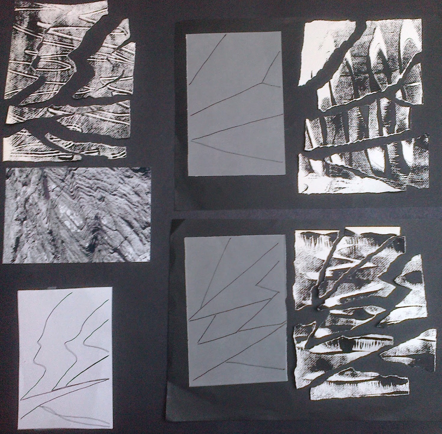
Having selected the papers tearing began...
Ref 5.11.6a
Ref 5.11.6b


Ref  5.11.6d
Ref 5.11.6c
With some of the remaining pieces of paper I played, maintaining straight lines but beginning to see new lines of textures and movements around the pieces
Ref 5.11.7a
Ref 5.11.7b
Ref 5.11.7c
Ref 5.11.8a
Ref 5.11.8b


Then I decided to...explore! I suddenly wanted to hone in on the beach photo from my header for Module 5 , references 5d and 6 d above and take a close up narrower view. So I cut the shapes, defined by colour and texture blocks,  and then had a play with some of the textured papers.

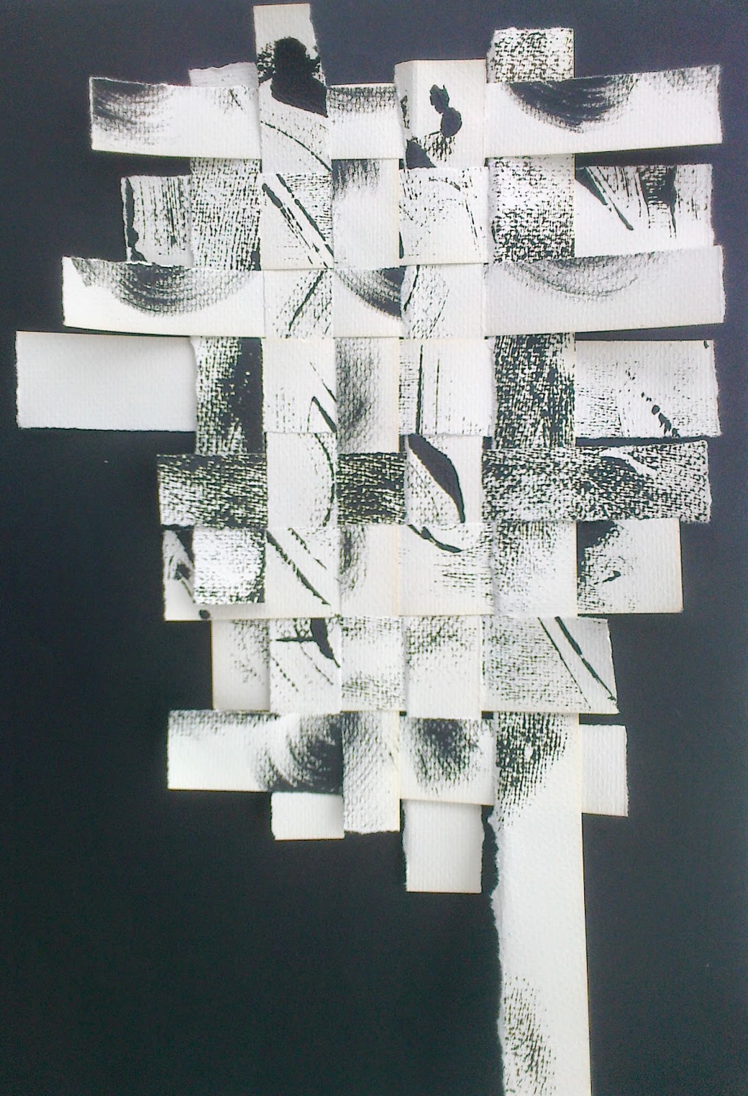
I liked the idea of perhaps flipping it on its side; just as the Moine thrust had done, and playing with the different textures or strata and forming a three dimensional shape but that leads me into Chapter 12 and some trial samples. Before all that have just reviewed all my chapters and collected thoughts on my priorities, helped by Sian's comments, will add this to the TEC list and focus on the task ahead... these words emerged.