Chapter 1 Drawing Methods
Surrounding myself with drawing implements and ideas of colour for this chapter I also collected together various papers on which to trial drawn marks that complemented the photos.
 |
| Ref 6.1 colours |
Drawing implements: pastels, oil pastels, biro felt tip pens, pencils, charcoal, a rubber, coloured inks and ink pads, bleach, stiletto, sticks, sponge
Papers: watercolour board, Copy paper 70g, sugar paper, greaseproof paper and sketch pad paper 135g, acetate, bubble wrap, food wrap.
Trying to relate marks to textures and patterns in photos I made two L shaped frames that I moved around the photos to look at detail as well as the whole picture.
Image 1 The reflections from the shore in Ullapool.
 |
| Ref 6.1.1 |
 |
| Ref 6.1.1a |
First tentative steps with felt tip pens.. a bit feeble, top right in 6.1.2 achieved best result of the three options as it was on textured watercolour board that diffused the lines. The oil pastel and soft pastel on grey sugar paper gave a pleasing effect but enjoyed tearing of a strip of watercolour paper and using it to build up lines of oil pastel on greaseproof paper. Before experimenting with other implements decided to look at next four photos using same implements
Image 2 Turkish water over a stone
 |
| Ref 6.1.2 |
 |
| Ref 6.1.2a |
 |
| Ref 6.1.2b |
Think the must successful interpretations are the one on left of 6.1.2a using fine felt tip on plain photocopy paper that takes it inspiration from small ripple and then the same effect being worked over with pastels on the bottom right. I also enjoyed the bottom image highlighted in detail on 6.1.2b where I changed the angle of the pastel to achieve a sweep and then a detailed 'stitch'. In this instance the top image on watercolour paper didn't capture the mood of the water over the large stones
Image 3 The Skye Bridge at sunset
 |
| Ref 6.1.3 |
 |
| Ref 6.1.3a |
Using just pastels on the strip of samples below the photo in 6.1.3a I started with greaseproof paper on the left - an interesting oily effect on one side of the paper and dull on the other, pastels on sugar paper and then watercolour paper and copy paper, with pencil marks on copy paper to the right of the picture
Image 4 Storm clouds rising in Turkey
 |
| Ref 6.1.4 |
 |
| Ref 6.1.4a |
Concentrating on the power of the cloud 6.1.4a shows top drawn image using side of a pencil which was then replicated below with a pastel over which I used small square silver stamp pads which I swept over the pastel. The swirling oil pastel which looked for a similar effect on watercolour paper was then scratched with the top of the pencil with a small stroked pastel used on the sugar paper. The image on the left used the edge of a paper gradually moved down the paper to reveal unworked areas of paper.
For the next series of photos I decided to try heavier markings of crayon to explore the techniques of sgrafitto (scratching) and frottage - rubbing.
Image 5 Reflections Loch Fyne
 |
| Ref 6.1.5 |
 Before using a stiletto to etch the sketch used the combinations of contrasting oil pastels on watercolour paper, then using same paper with felt tipped pens over rubbed with oil pastels and then on copy paper watercolour pencils over rubbed with oil pastels produced some textured effects but the photos don't seem to reflect the potential. A reminder to self when using felt tip pens as under layer leave some paper uncovered for reflection as getting through to bare paper with stiletto was extremely hard! The final piece ,which was march larger when started, used just one colour of oil pastel on coloured sugar paper . Using different pressure to make the mark I then scratched a shoreline!
 |
| Ref 6.1.6a |
 |
| Ref 6.1.6 |
Image 6 Silhouettes off Oban, for this sample decided to concentrate on the sky colours for my experiment, building up layers of oil and watercolour pastels and washing with ink pad. As I worked pencils into the surface their scratches left a marks, hardly noticeable in photos they gave an impression of long stitch marks. Pleasing but not as dynamic as Sian's samples, perhaps I should try some frottage. Taking the silhouette of the hills and the sky a string sample card was made on which I then proceeded to rub pencils and pastels across the surface. The most successful being the pencil as I liked the way the colours defined strokes but also merged, the pastel looked a bit messy. The turquoise ink stamp rub with top layer of pencil was more dramatic but less detailed.
Image 7 Shoreline looking to AnTellach.
 |
| Ref 6.1.7 |
 |
| Ref 6.1.7a |
For this sample I had done an ink and oil pastel 'sketch' which I had scored but rather unsuccessfully ( see top left of 6.1.7a) and decided to us a plastic embossed stamp that I had in my store cupboard, it captured water marks but how would it look? With copy paper, a candle, and various inks, oil pastels to hand placed copy paper over the plastic and rubbed a candle over the paper. The first rubbing, left under the photo, looked more like pebbles than ripples so more energy was put into the rubbing and then oil pastel and ink laid over the rubbing. As a contrast I inked the plastic stamp and then pressed it onto the paper (bottom of storyboard)... it does look more manufactured. The rubbed sample has an impression of authenticity and is much more tactile! A candle will now be a permanent implement in my art box.
 |
| Ref 6.1.8 |
Trialling bleach marks my first attempt on watercolour paper was singularly unsuccessful with no impact being made, except a bleeding of colour when using a cotton bud. But success with brusho coloured copy paper, a thin cardboard edge dipped in bleach produced not only clear patterns but a revelation of a range of contrast tonal colours. Note for a later date to go in my dyeing book, examine the colour contrast within the brusho range of inks and bleach...
 |
| Ref 6.1.9 |
Looking at other 'papers' for drawing onto the concept of bubble wrap offered something I hadn't done before. Setting off with a green, light and dark blue oil pastel the fun began - bubble side up! Rubbing produced interesting colour mixes but also drew round the 'bubbles' to emphasise the shape. Then turned paper over and rubbed the surface onto copy paper, not only the addictive sound of popping bubbles but a pleasing sequence, 6.1.9.
 |
| Ref 6.1.10 |
 |
| Ref 6.1.11 |
Using acetate from overhead projection slide tried sponging emulsion using both sides of the sheet and also cutting a stencil in image 11. The bottom image of each of these images was sponged on rough side of acetate, the top image was sponged and printed from acetate onto paper. I enjoyed the stencil in image 11 and felt that adding oil pastel to edge allowed me to imitate stitch marks.
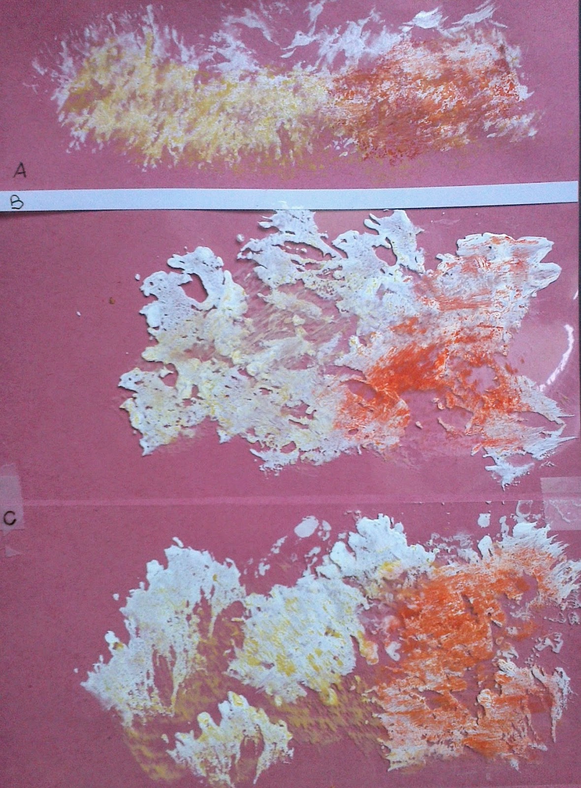
I had emulsioned a child's cardboard book to give different surfaces and the resultant oil pastel rubbed surfaces are shown below, 6.1.11, a,b and c.
With all this rubbing I had lots of 'crayon crumbs' and crayons that needed cleaning off as they had traces of other colours on them, so placed them on polythene wrap and included some threads and pressed them into a sandwich! 6.1.12 .


No comments:
Post a Comment